A brand to help the arts connect
Working in partnership with Undivided, we have created a new positioning and visual identity for Warwick Arts Centre.
Great Arts Centres are more than just a theatre, gallery, concert hall mashup. They’re not just places to put works of art, they’re places that put art to work, harnessing the power of performance, storytelling and creativity for the greater good of society.
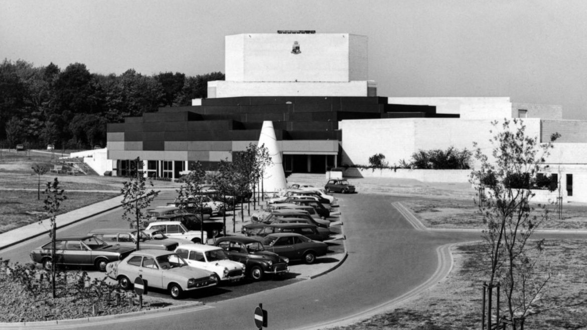
The Warwick Arts Centre was born into this tradition. Second only to London’s Barbican in scale, Warwick Arts Centre has been drawing great musicians, artists and performers from across the world to the heart of England for over 40 years.
But times change and Warwick Arts Centre knew they had to change too. They needed a new sense of purpose and a fresh identity that could do justice to the investment they’d made in their venue and digital platform, and they needed to reaffirm their role in the world and the role of the arts in people’s lives.
The importance of art in difficult times
We started work together just before Covid, collaborating with the arts centre’s leaders, creatives and front of house team. As the pandemic tightened its grip, and venues mothballed across the country, the importance of art and culture really hit home. So often it was the arts that brought people together through the isolation of lockdown and it became clear to us that, in our world of warring identities, growing division and alienation, we could all do with more of this.
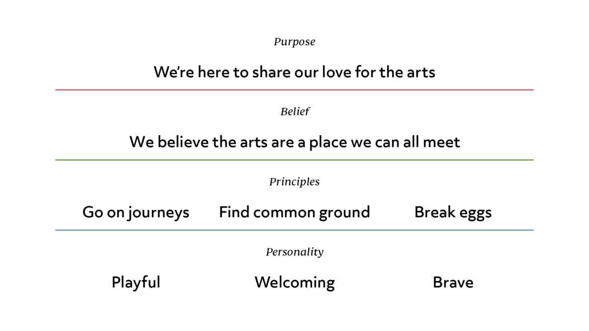
So, we built a new brand positioning around art’s power to connect us and framed the arts centre as a space where people from all parts of society and all walks of life are welcome.
A brand with open arms
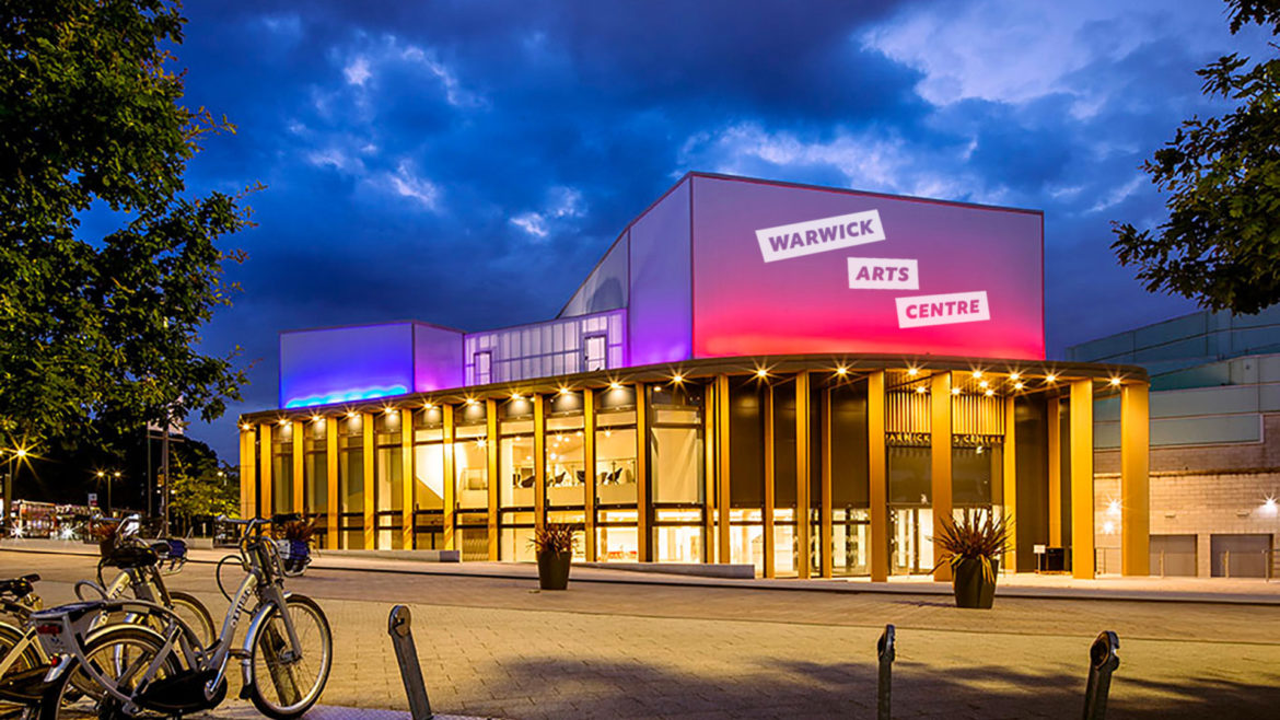
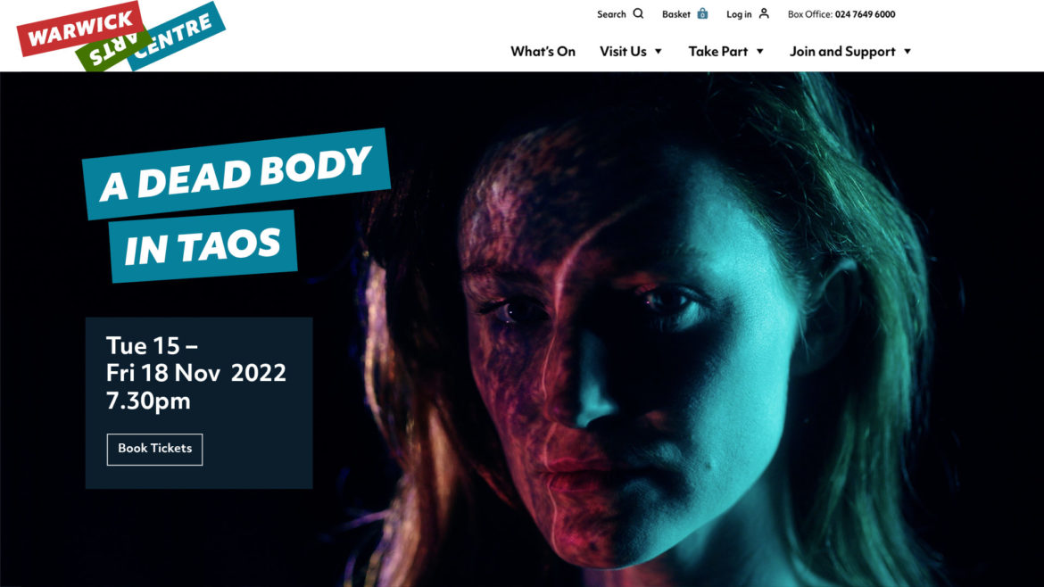
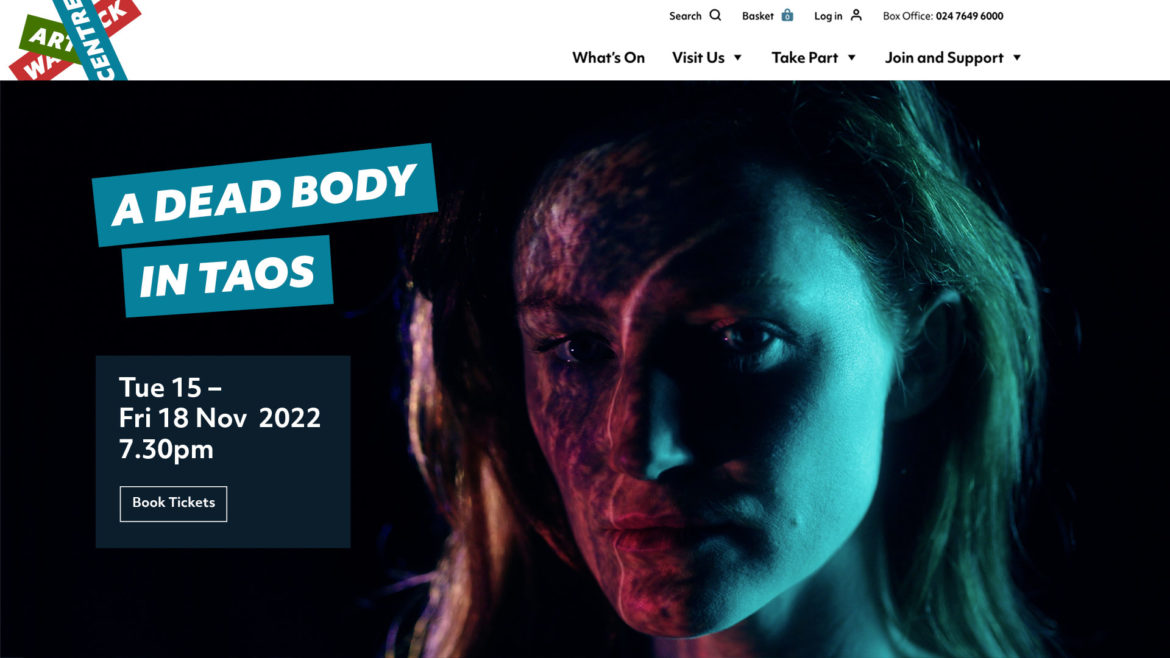
Our new visual identity had a tricky job to do. Firstly, we needed to present Warwick Arts Centre as a world class cultural venue, on a par with anything you’d expect to find in London, Berlin, Paris or New York. At the same time, the arts centre had to be utterly welcoming, absolutely universal and completely un-standoffish.
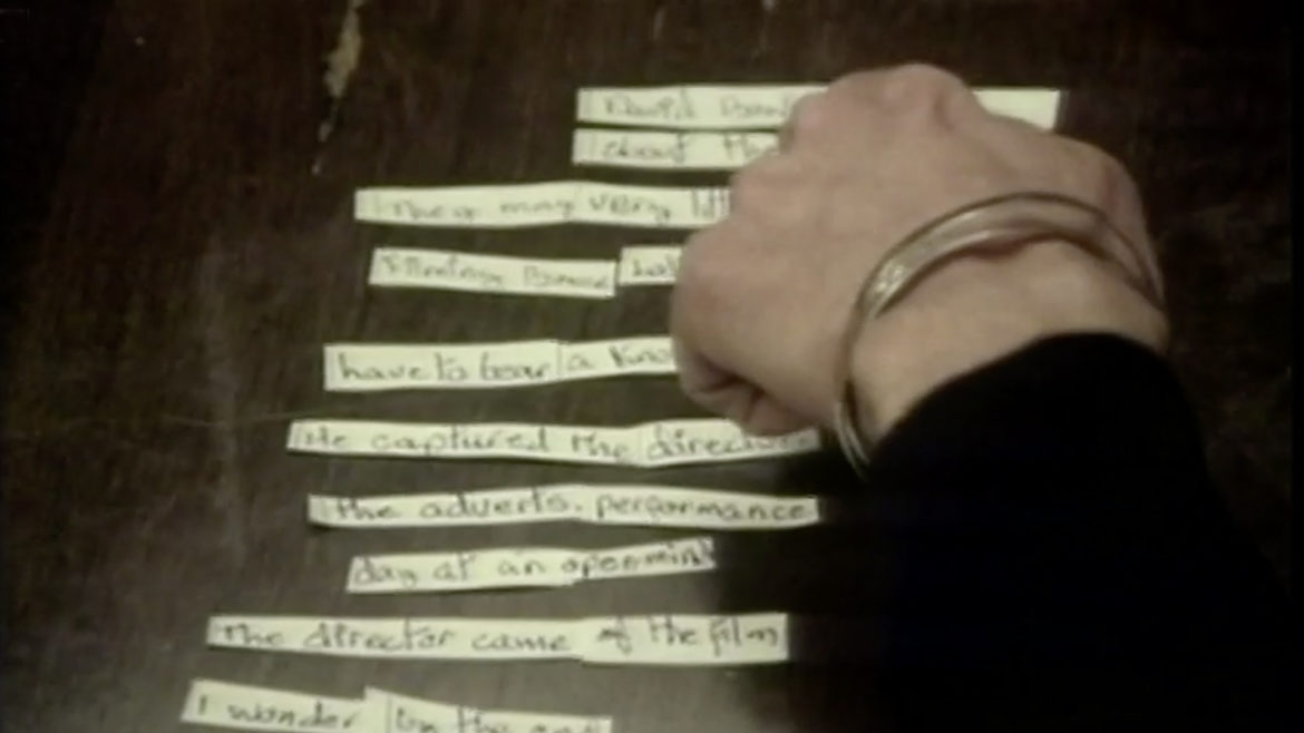
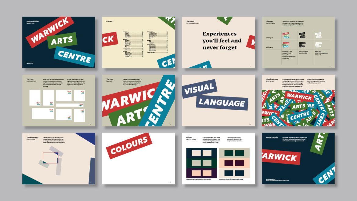
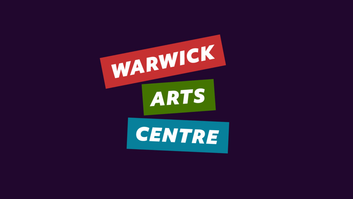
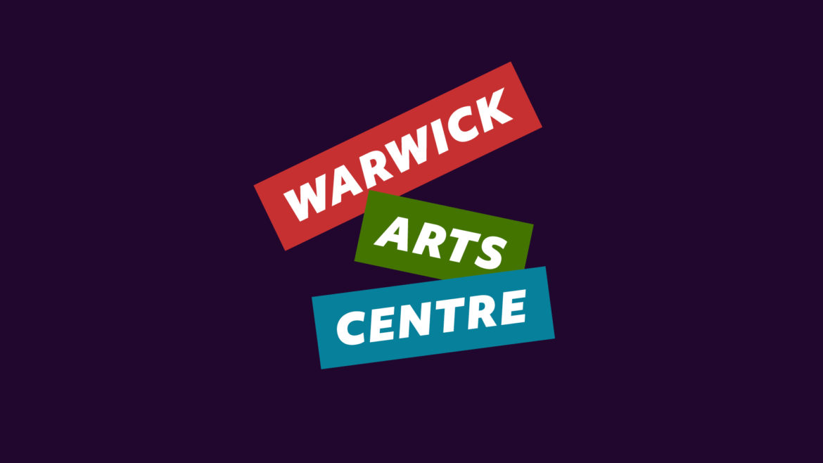
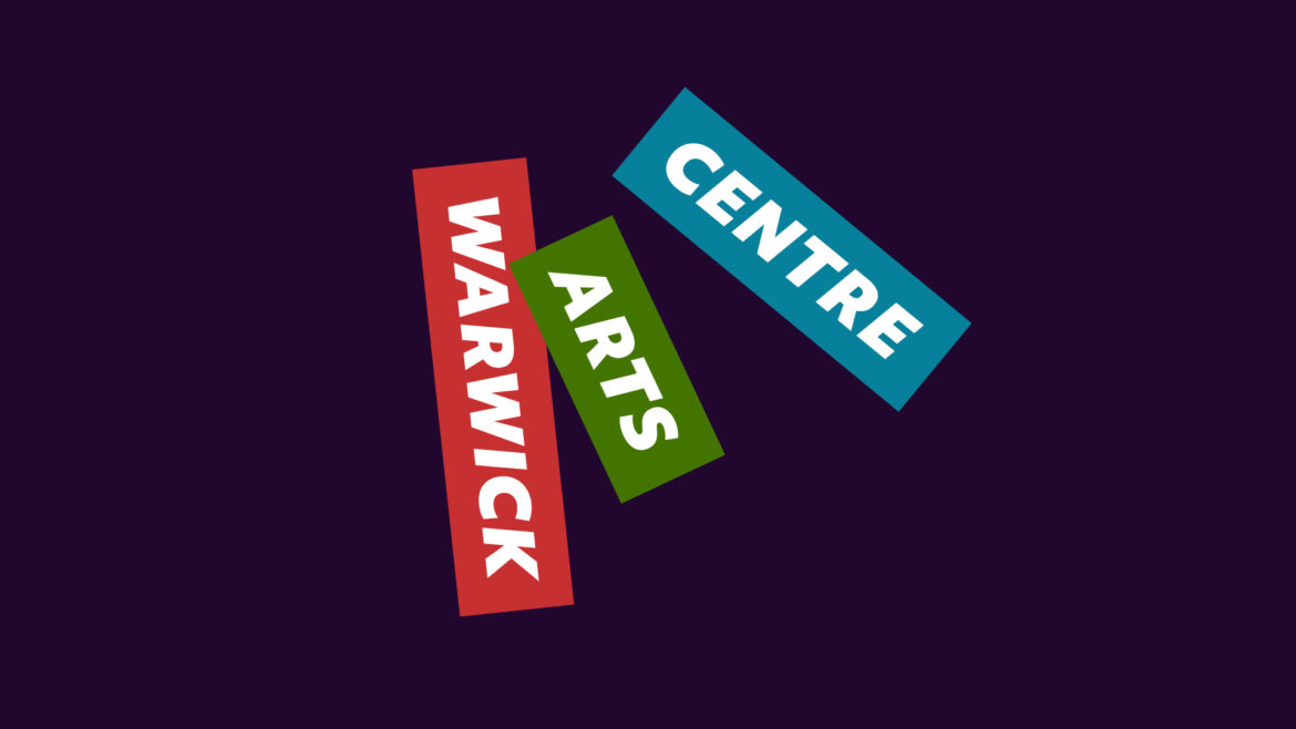
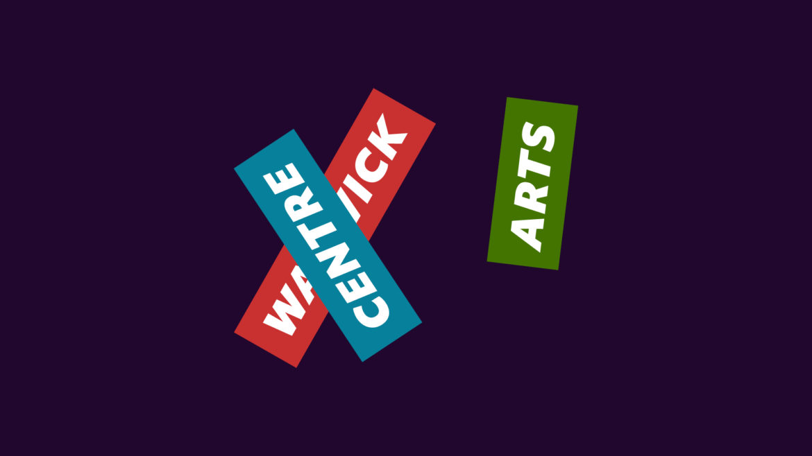
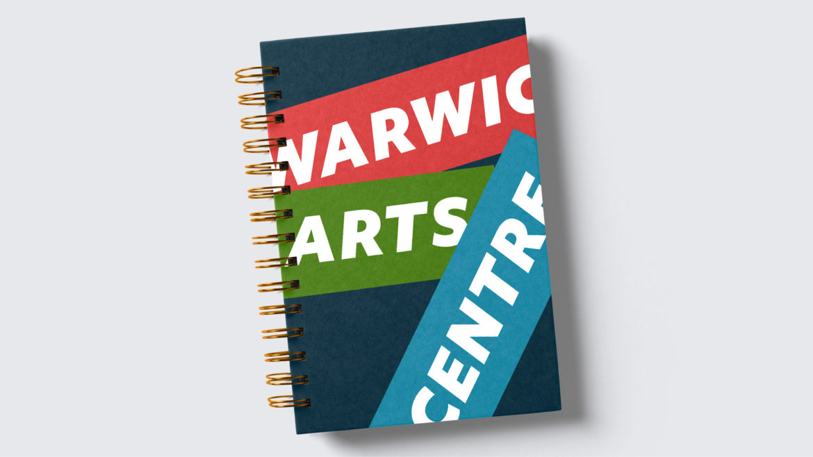
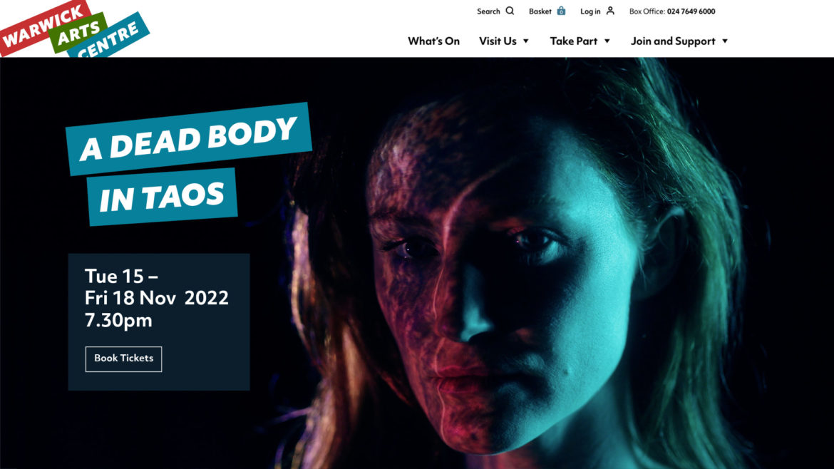
This feeling led us to think about David Bowie, an artist who managed to be both purist and popular. From time to time, Bowie used the ‘cut-up technique’ to create random and surprising combinations of words and ideas for his lyrics – this mixture of happenchance, intuition and inspiration felt like a really accessible and engaging way to think about the artistic process. So, we designed a cut-up logo and we threw it around with cut-up typography and cut-up pictures of performers, artists and their art to create a joyful, emotional and unexpected new brand.
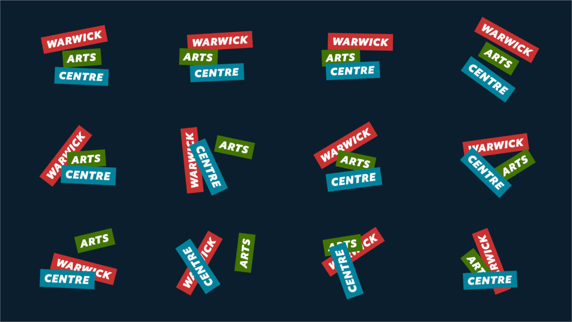
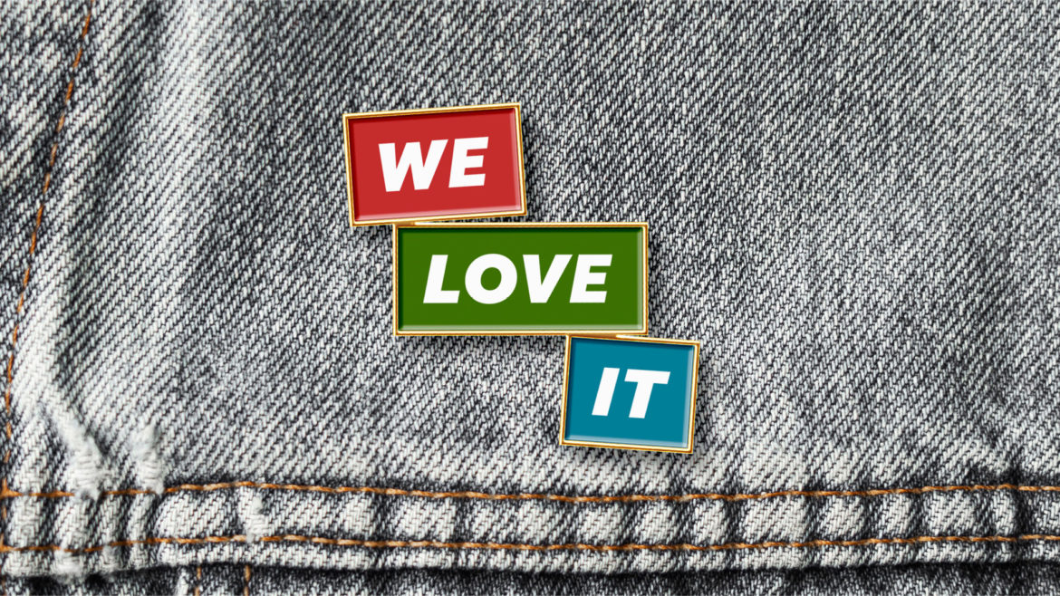
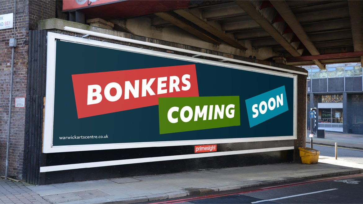
An enjoyable sense of chance
We have made a set of logo variations and designers are invited to create more. This means that the logo can be implemented in a way which relates to its environment: sometimes more serious, sometimes more playful, always with an enjoyable sense of chance.
Art for aficionados and newbies
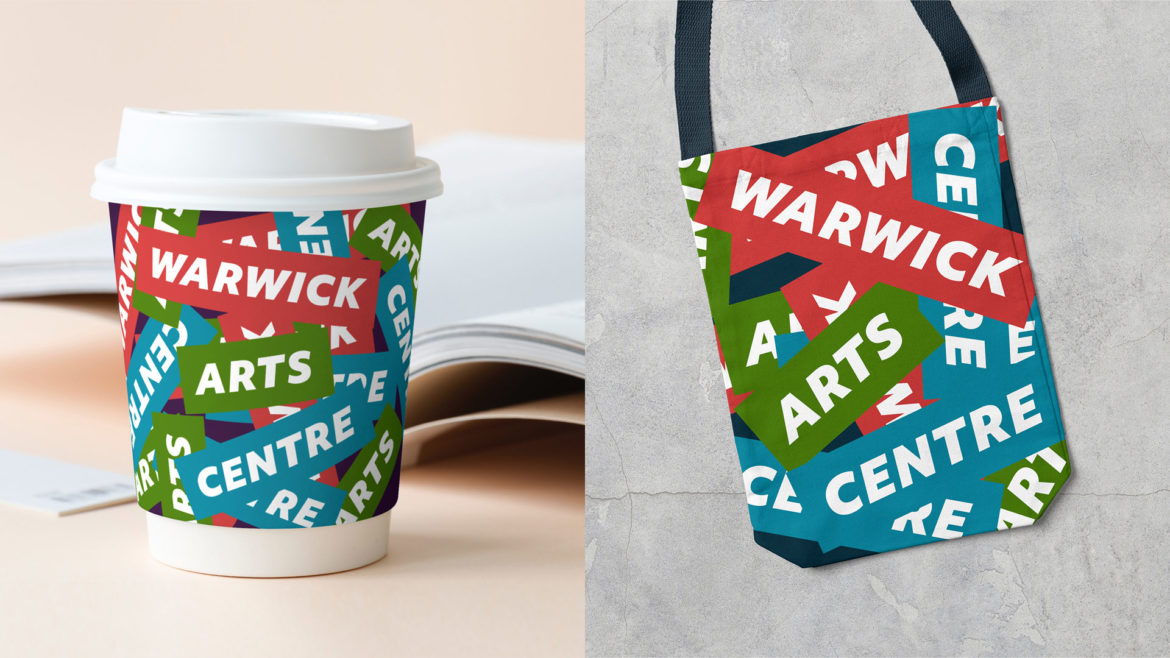
The bold colours and typography of the logo blocks combine to create a buzzing sea of activity in this brand texture, which nods towards the language-led art of Barbara Kruger, and to ticker-tape parades and confetti. We designed it with our mission in mind – to attract both art aficionados and art newbies to Warwick Arts Centre.
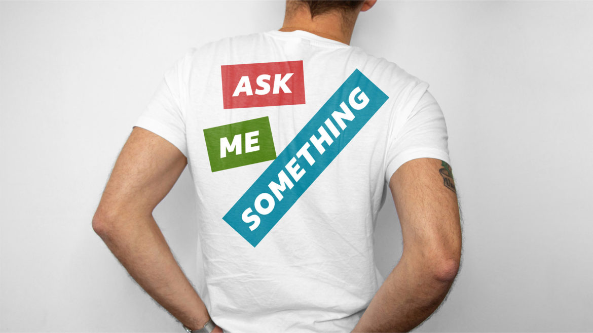
Cheeky
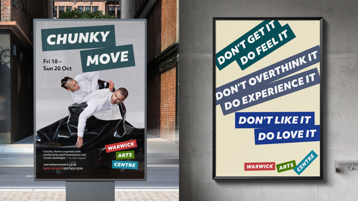
A lot of attitude can be expressed with the positioning and scaling of the logo blocks.
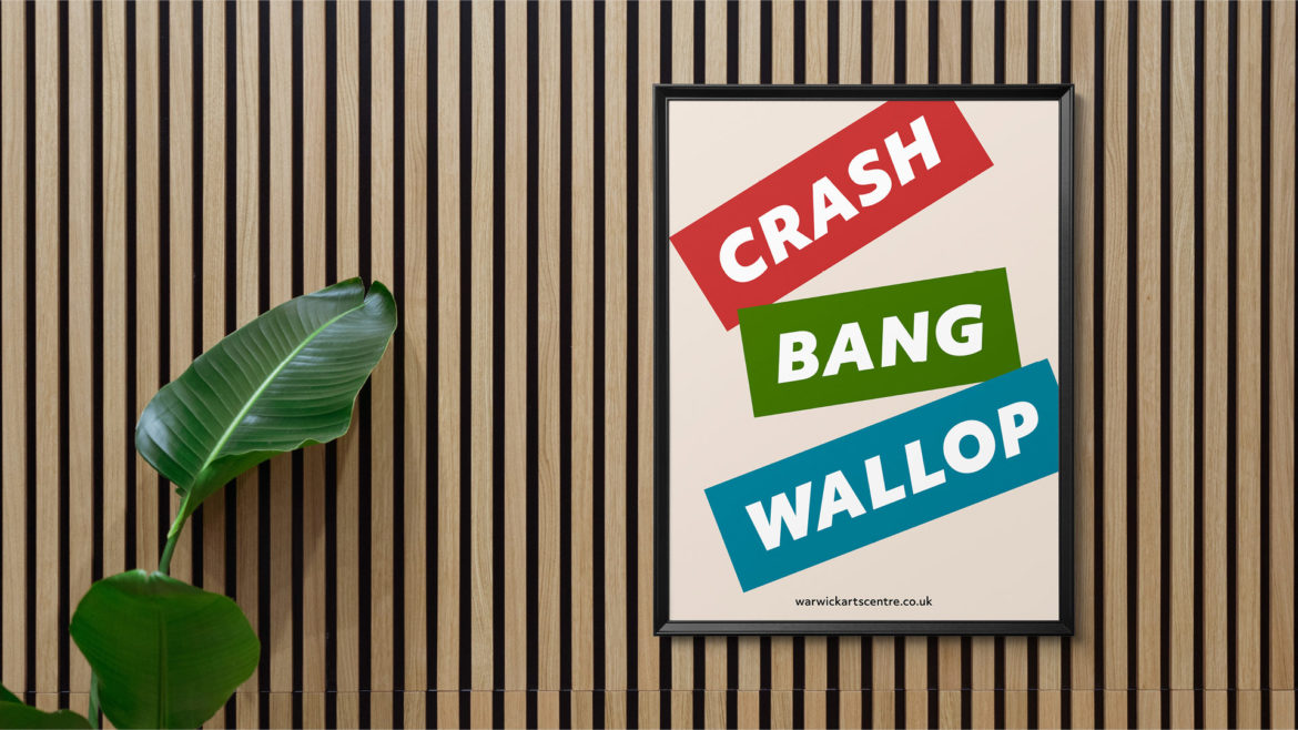
Subverting the logo
Historically, branding has usually been about consistency. This identity challenges the idea that a logo must always look the same. Sometimes we go as far as swapping the name for an alternative message. We choose carefully when we can subvert the logo in this way. The interesting thing is that the distinctive red, green and blue blocks, along with the white typography, always tend to communicate Warwick Arts Centre.
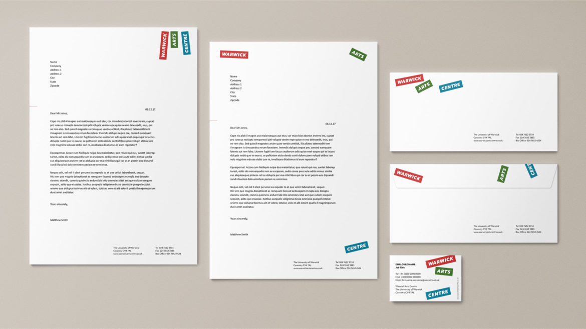
Logo-style headings
Headings can adopt the style of the logo. When they are part of the same layout as the logo, they draw from the secondary colours in the brand palette.
Style guide
Our identity for Warwick Arts Centre is fluid. A sense of chance gives rise to a feeling of creativity and energy. In order to ensure that the brand works in the real world, we have created helpful assets, and a style guide with guidance on how to implement the ‘fluid’ and the ‘fixed’ parts of the identity.