Updating an icon
Working in partnership with Undivided, we have created a new visual identity and positioning for ITN. This is the first major rebrand for the production company since the early 2000s, and the first major change to its iconic logo since 1970.
The past and the future of the ITN logo
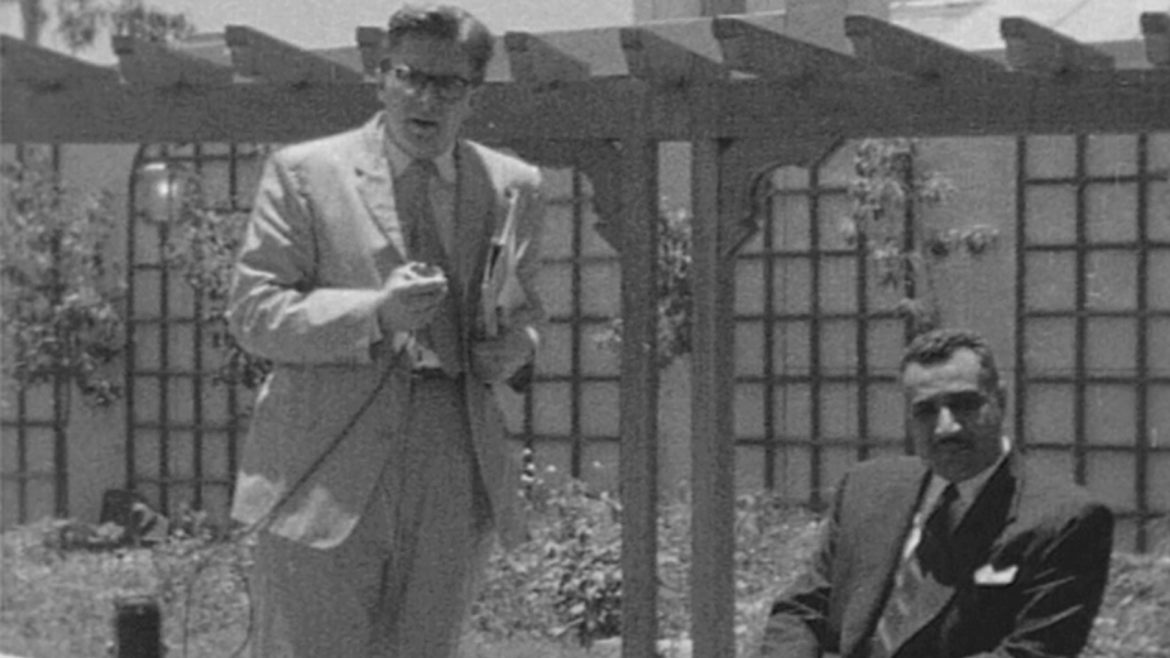
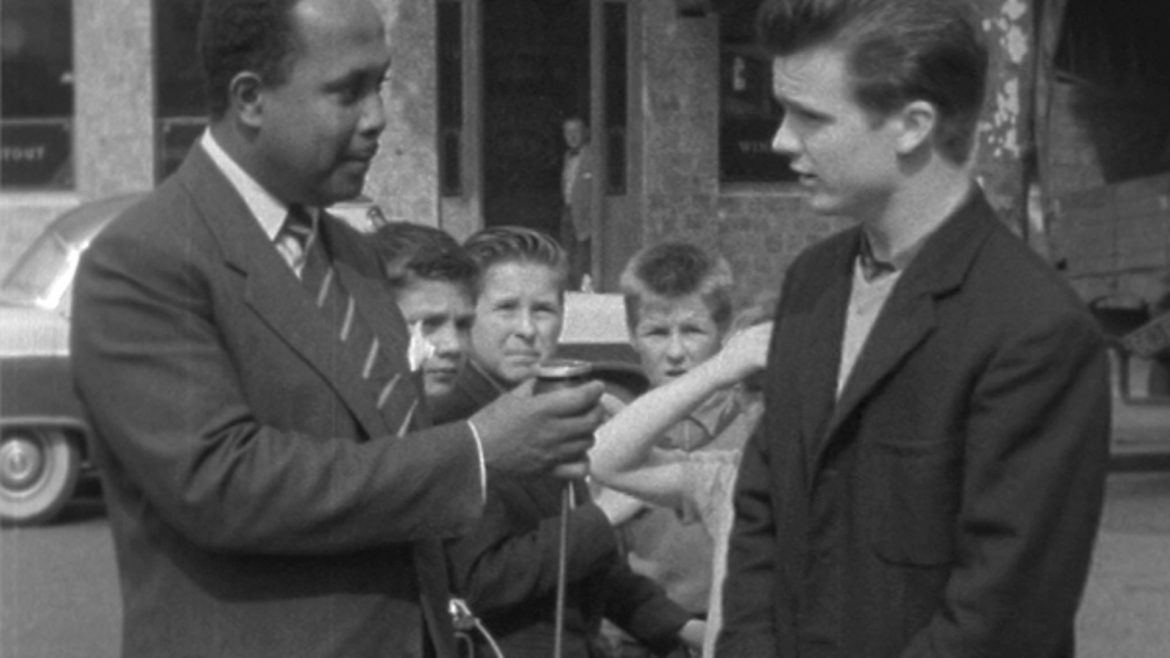
65 years at the heart of our national story
ITN has been at the heart of Britain’s political and cultural life for over 65 years, broadcasting daily news and current affairs shows across the ITV network, Channel 4 and Channel 5. Always embodying the highest public service standards of accuracy and independence, ITN also earned a reputation for innovation and audience engagement, pioneering much of the world of news we know today – with the first live newscasters, the first women reporters and presenters and the first warzone coverage.
Shaping the future of factual
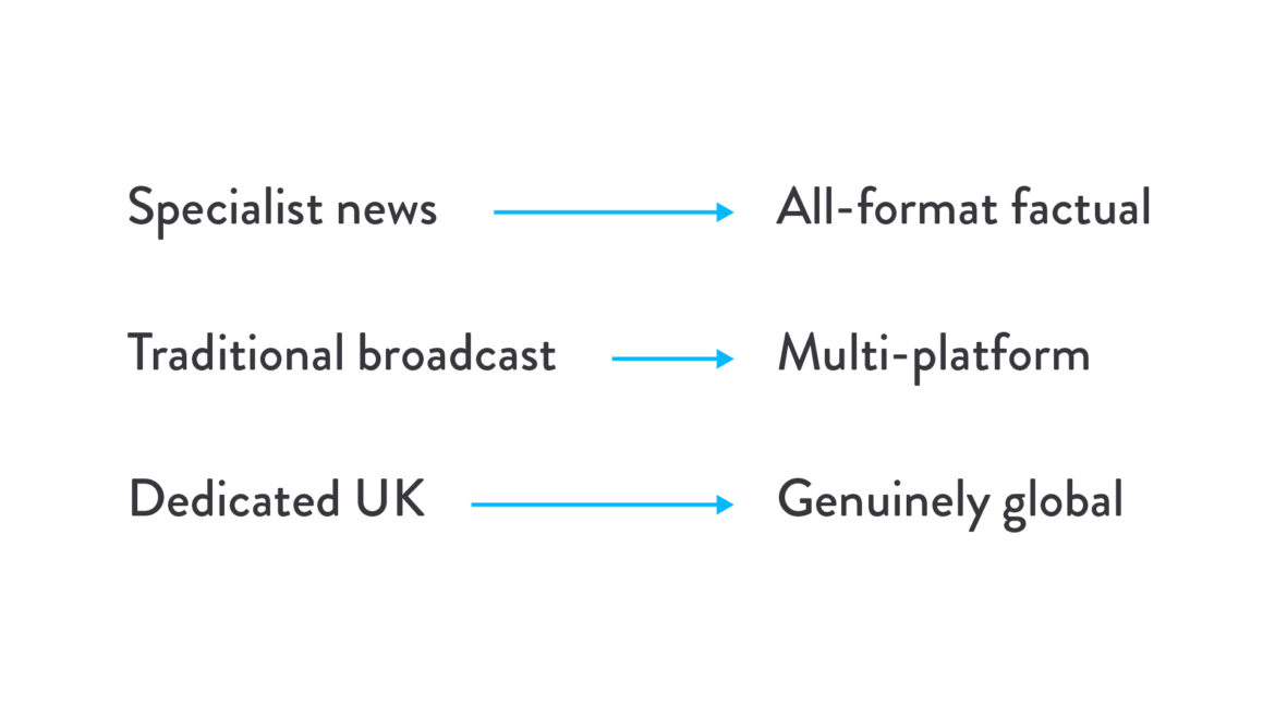
Today, ITN is building on its reputation for impartiality and innovation in news and current affairs and expanding its offering into documentaries, sport, short-form and branded content. The ambition is to broaden ITN’s reach and range, to embrace the explosion of new routes to market across global streaming services and help shape the future of factual.
This strategy calls for three shifts in business culture and market positioning: from specialist news to all-format factual, from traditional broadcast to multi-platform, from dedicated UK to genuinely global.
Time for change
The old ITN brand, with its famous linked letter forms, had been in place since 1969, with only minor changes over the years, making it one of the longest standing brands in UK broadcasting and something of a cultural icon. For all its solidity and power, research showed that the brand was locked in the past and too closely associated with ITN’s news output. The time was right to make a change.
Bringing truth to life
Working with leaders, employees and customers, we created a new brand positioning built around the purpose statement and strapline – ‘Truth to Life’– to signal ITN’s shift from pure news to all format factual and emphasise their ability to tell true stories with more emotional intelligence and impact. We knew this mission to bring the truth to life had the power to unite all parts of the organisation around a compelling and differentiating commercial proposition. At the same time, it would also underpin ITN’s determination to be a force for good in the world.
A brand that responds
Our new visual identity takes the idea of bringing truth to life and builds on the strength of ITN’s old logo to create a new mark that reacts emotionally to the world around it. We knew we needed to reflect the responsive, emotional intelligence that sets ITN apart, but we couldn’t just walk away from 60 years of rock-solid news heritage.
So, we decided to build the new logo around the original, simple ITN letterforms to signal a continued dedication to accuracy and impartiality. But this time we set free the rigid, angular line around the letters so that it can move and respond to stimulus like a living cell. It’s a way of showing how ITN connects with and adjusts to different audiences without undermining its commitment to the truth.
The logo in motion
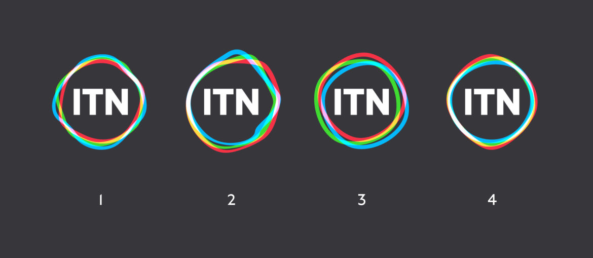
Above all, the thing that separates this logo from its predecesors is that it is alive. It moves in response to its physical and emotional environment. Whilst at rest, the logo is the simple, single-colour, soft diamond. But as soon as there is some sort of stimulus, its form distorts.
As the single white line comes to life, it splits into three coloured lines. These are red, green and blue – the primary colours of light, which create all the colours of the light spectrum when mixed together in varying amounts, and pure white when mixed together at full strength.
These colours are the essence of everything that we see in the world, and it felt powerful to make them part of ITN’s new identity. The red-green-blue colour model is how TVs and digital screens work, and we also felt that these colours were meaningful in relation to the past and future of ITN as a screen-based media organisation.
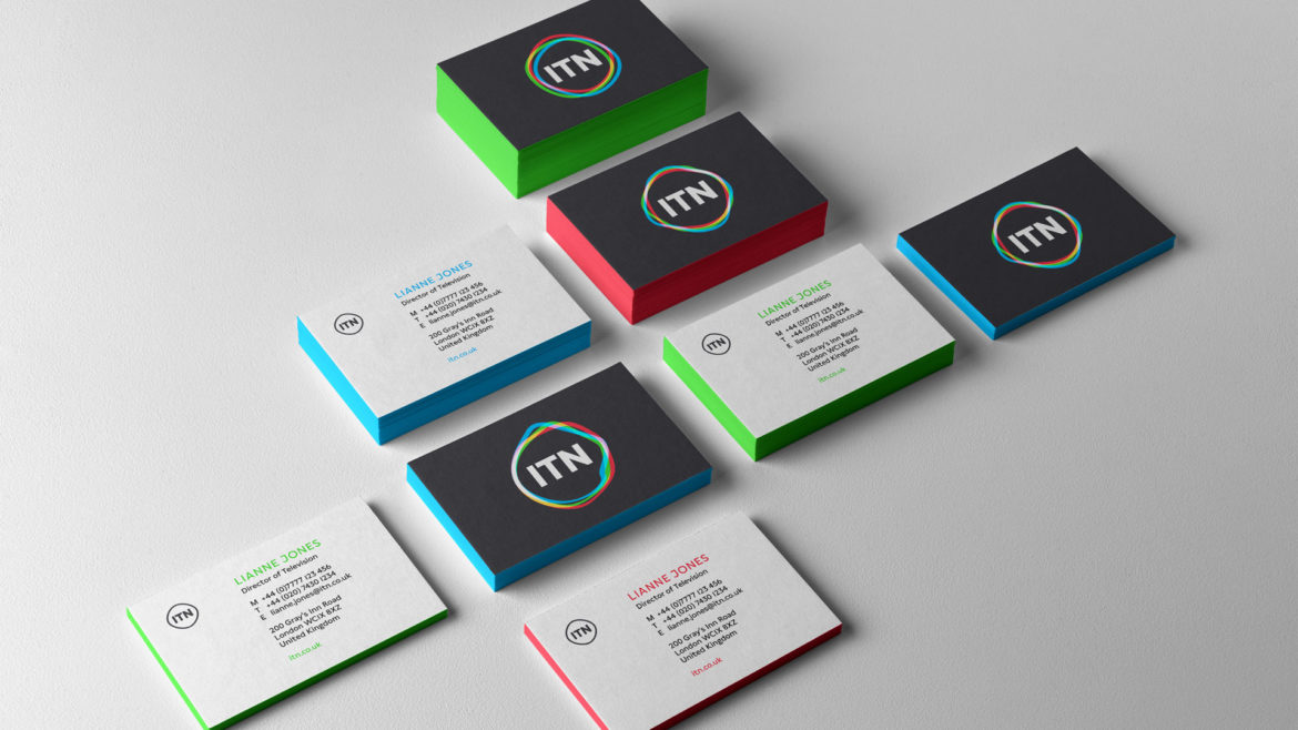
A logo-centric identity
This is a logo-centric identity, and in many brand communications, the logo is top priority. For this reason, we wanted the give the logo a sense of motion, even when in print. We created four static logos, each a snapshot of the moving logo reacting to something different.
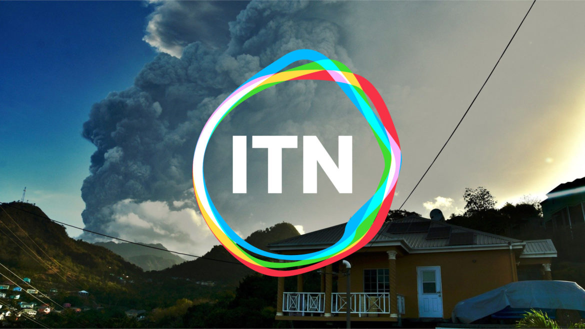
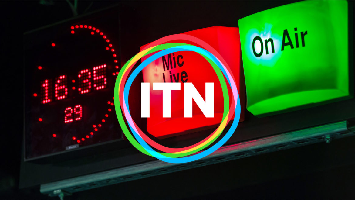
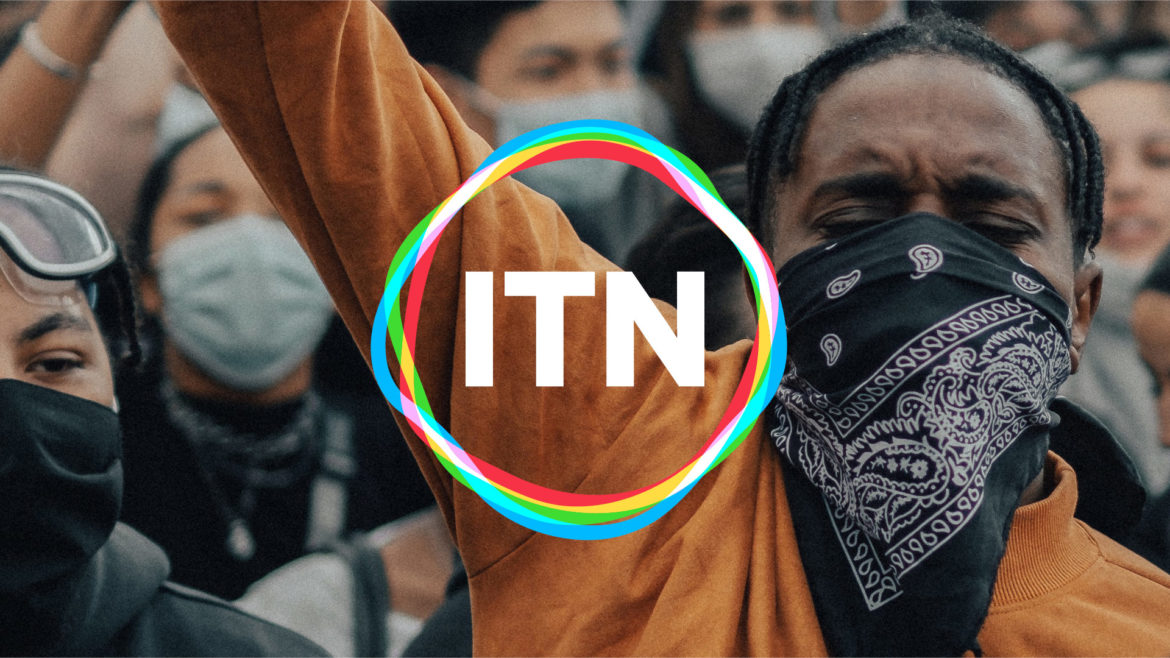
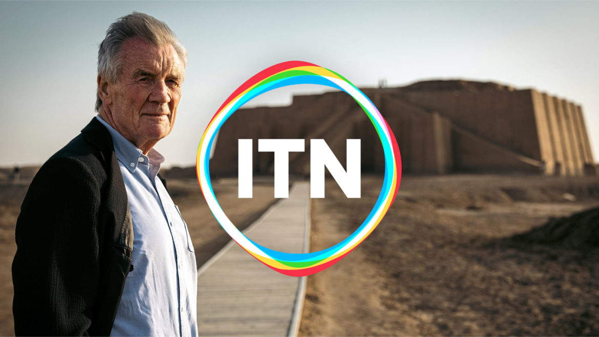
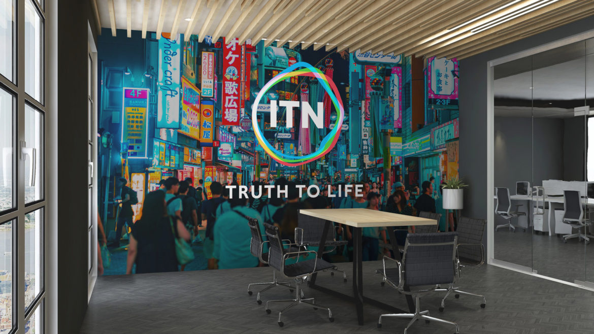
Scenes of life
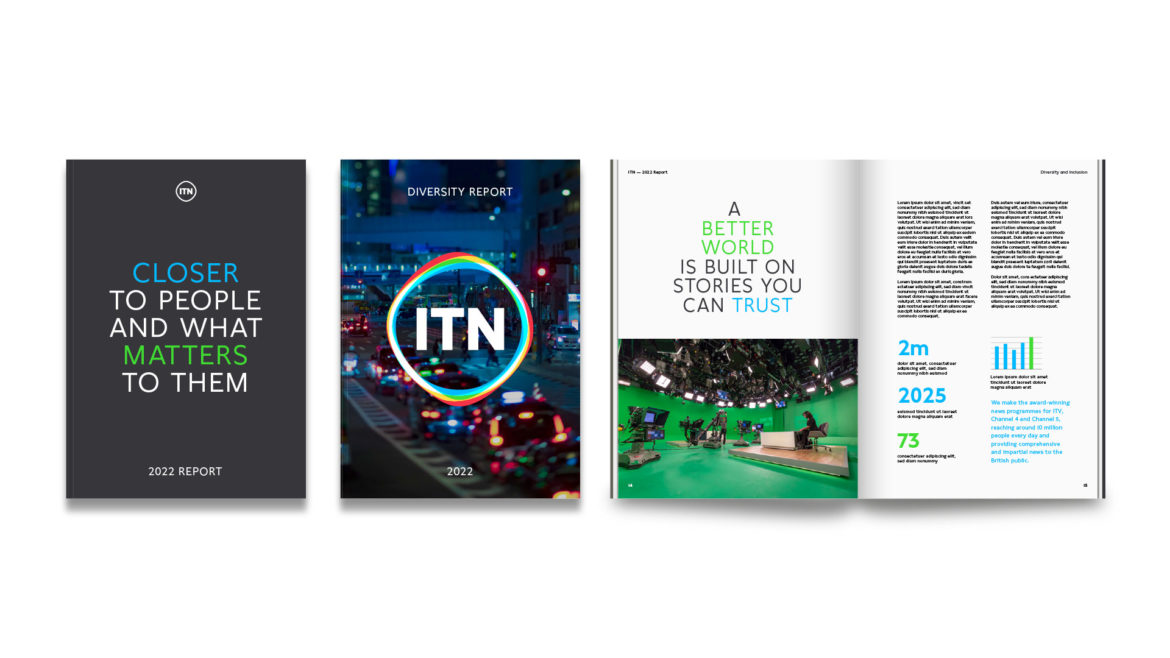
This visual identity shows that ITN brings the truth to life. Imagery is key to communicating this message. Both in static and moving situations, the logo emotes over full-bleed, iconic images. Some of these images are great moments of ITN content –historical and current, and other images show life from outside ITN’s production world: human activity, nature, culture, war, sport, tragedy, joy, history, politics, love, the family home or cities buzzing with noise.
Typographic brand texture
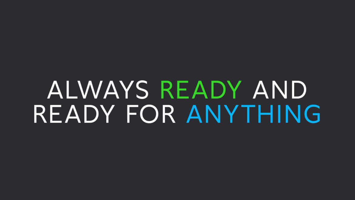
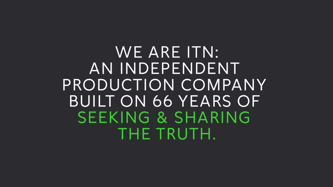
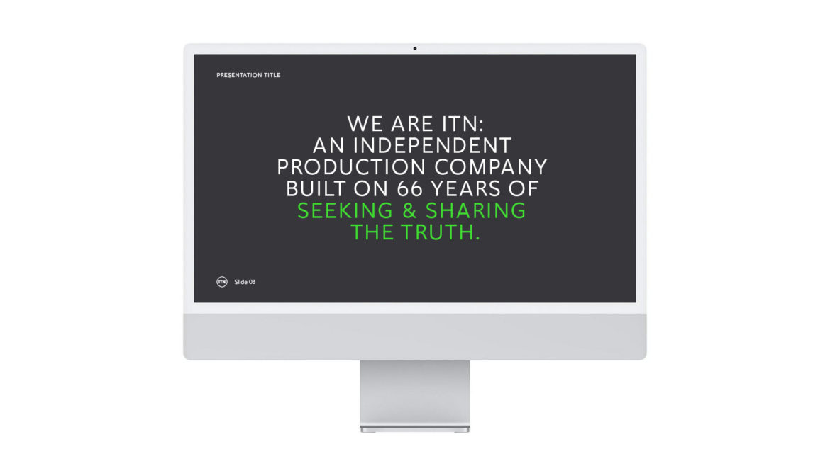
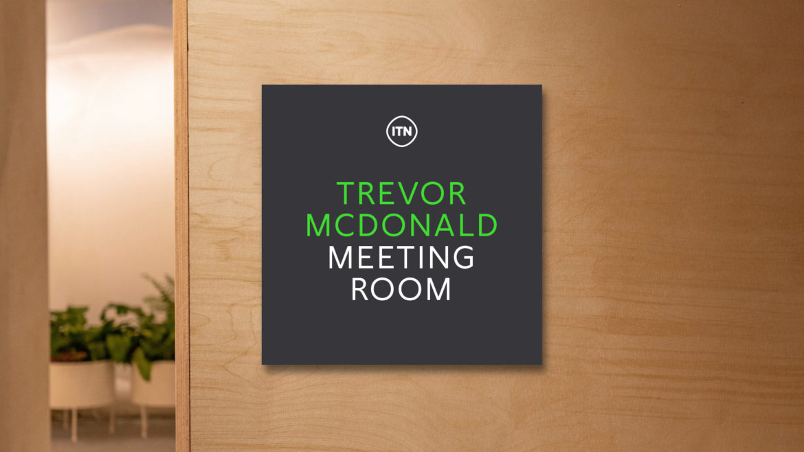
Simple, centred statements play a key part in the identity. Important words are highlighted using the red, green and blue colours of the animating logo. These big phrases convey important messages on walls, in reports and on the website. But their distinctive look means that they are helpful even before their message is read. They act as a kind of brand texture, improving the reach and authority of the identity. Unlike an abstract pattern though, these typographic textures says something meaningful, and do not compete with the logo for supremacy.
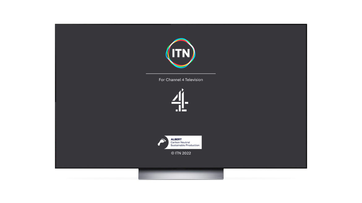
The brand in use
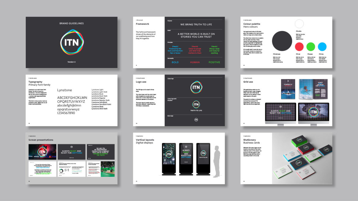
Below are some examples of the new brand in use.
Thank you
Thank you very much to Stefan and Laura at Undivided – it’s been brilliant working with you. Thanks also to my amazing collaborators: Oscar González-Diez, Iancu Barbarasa and Eleanor Ridsdale Colussi.
We worked closely on this project with ITN’s Head of Brand Communications, Ben Haynes, and Director of Corporate Communications, Lisa Campbell. Thank you to them for their ambition and energy.
The client, on working together
“Undivided and Rudd Studio were impressive in the way they really got under the skin of ITN, engaging with staff and stakeholders to truly understand our purpose and personality. It’s been a creative, rewarding and hugely enjoyable partnership and we couldn’t be happier with our new identity, which excites our people and positions ITN for future success.”
Lisa Campbell. Director of Corporate Communications, ITN