A personal brand
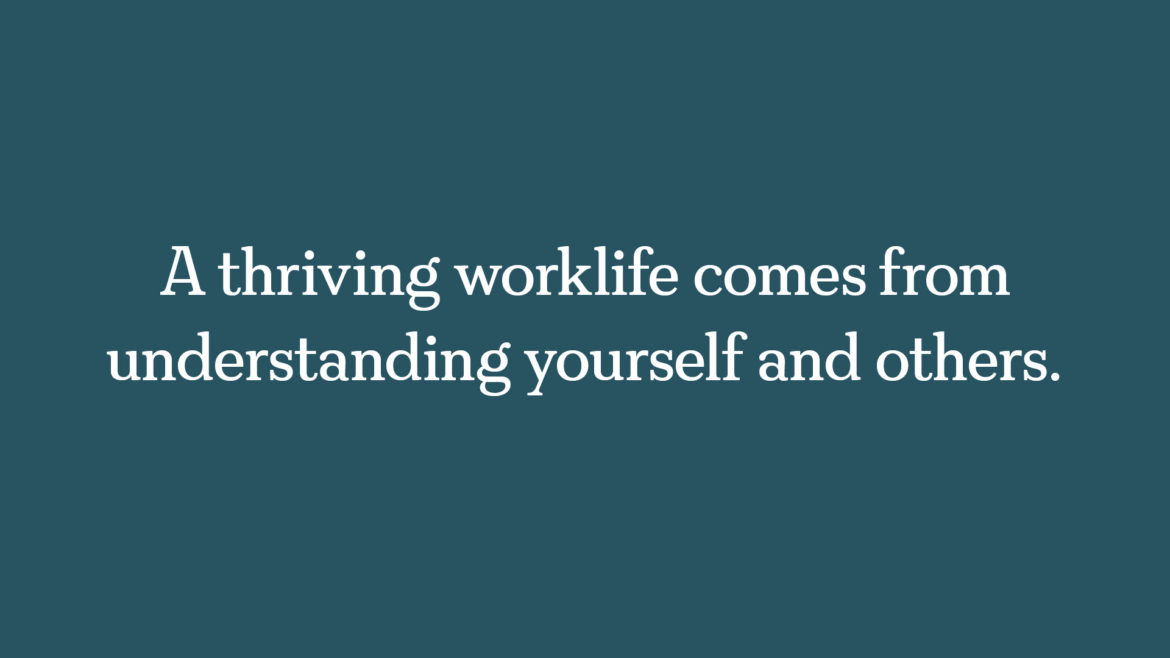
I have recently enjoyed designing a brand and a website for Roisin van Ravenhorst. Roisin is an executive coach who helps people thrive in the workplace by helping them to develop their leadership, relational intelligence and communication skills.
In general, I have designed identities for organisations rather than individuals. In this case, it was interesting to get under the skin of one person’s ideas: both their business vision and their ‘spirit’.
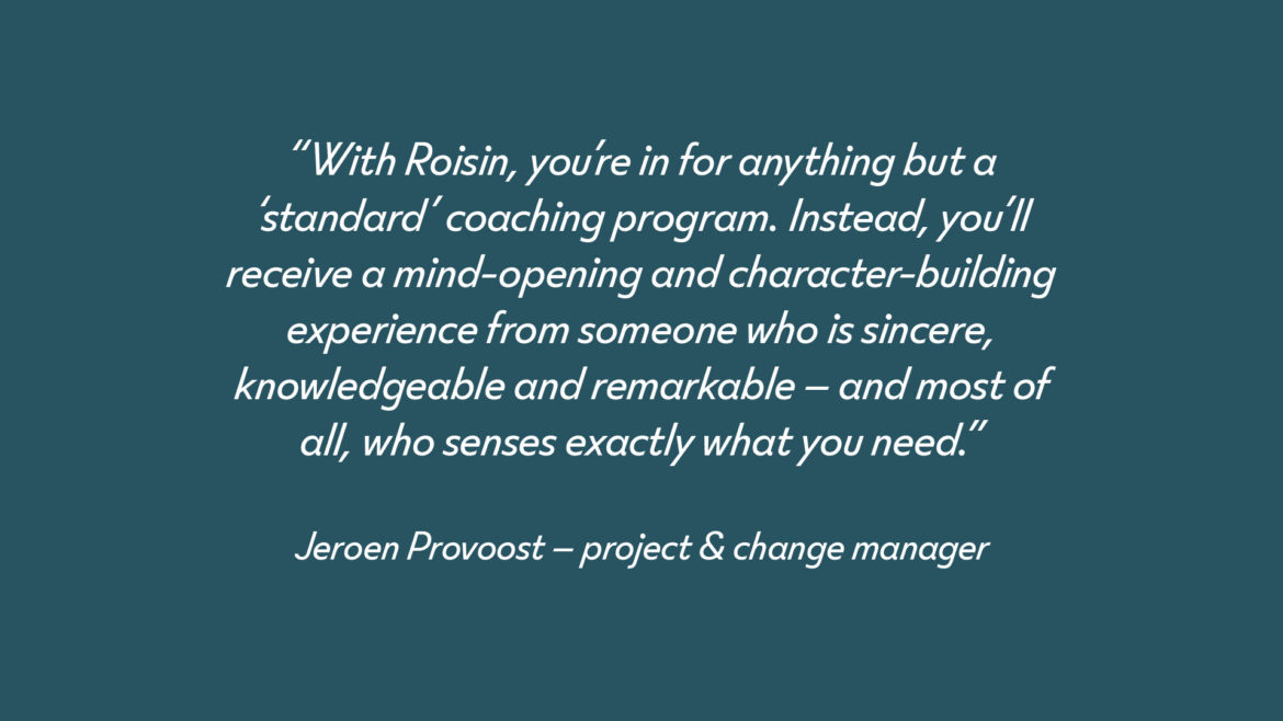
I believe that working with the right clients is the single most important thing a designer can do to ensure good creative outcomes and, paraphrasing Adrian Shaughnessy, to be a graphic designer without losing one’s soul. It worked great with Roisin. Not entirely unexpected, as she happens to be my life partner.
The Raven’s Nest
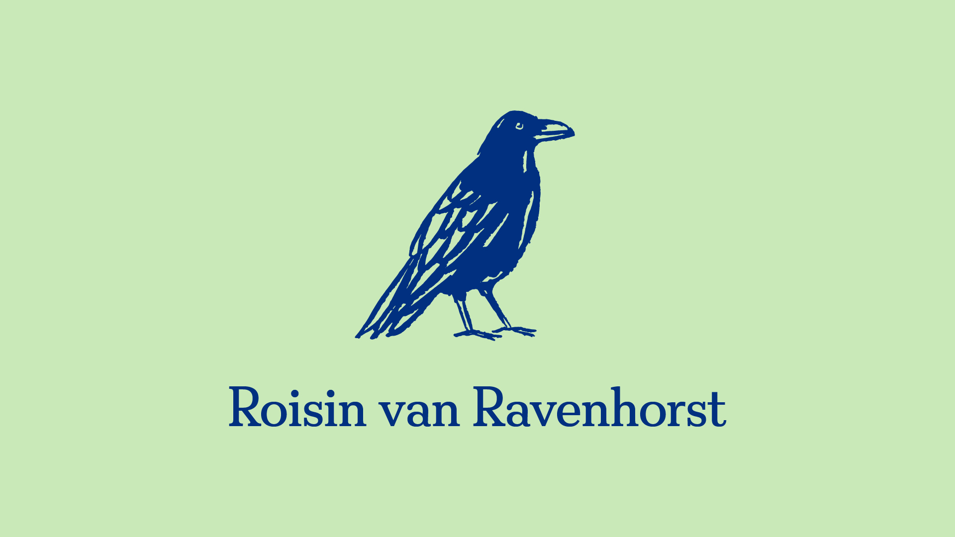
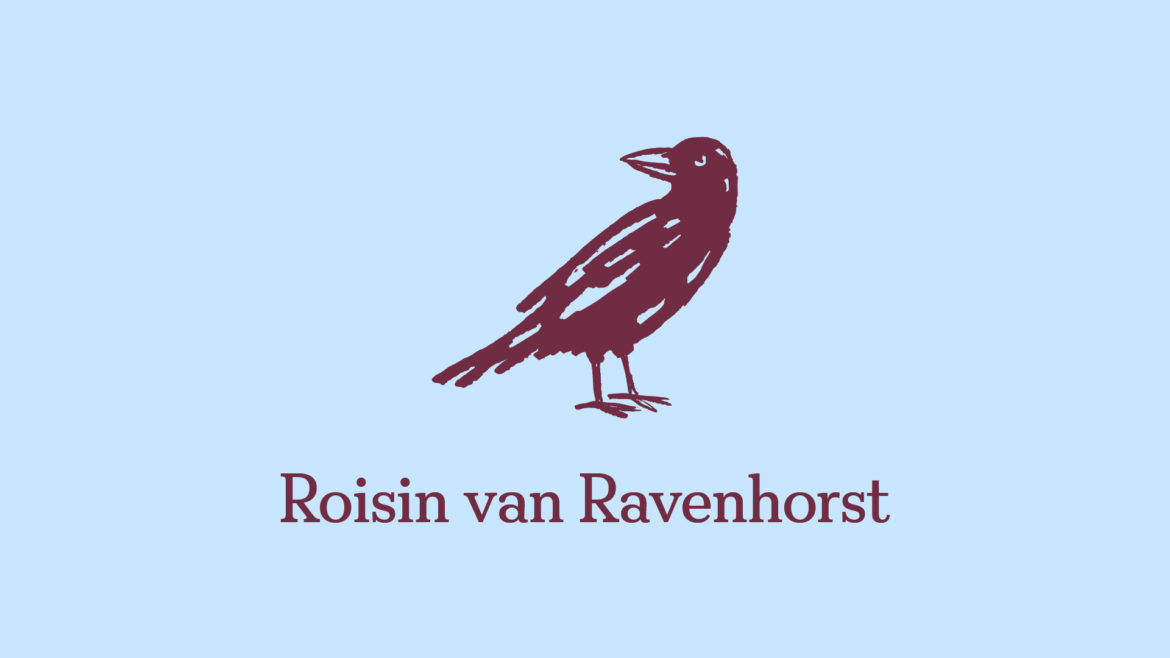
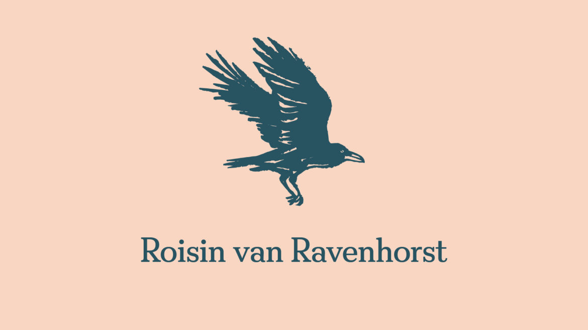
Roisin comes from the Netherlands. In old Dutch, her surname means ‘of the raven’s nest’. This rather magical image sparked in Roisin a great interest in these intelligent, curious creatures. She wrote this beautiful blog post about them.
She explains that, for her, the image of the raven’s nest has something of the fairytale to it. She sees the negative associations that some make with these birds as positives, referring to the beauty that can come from looking into the ‘darker parts of ourselves, our realities or our relationships’.
She goes on to explore some of the mythological tales which reflect ravens as wise and perceptive, before talking about their smart, fun-loving social behaviours. Apparently, these birds ‘have the cognitive abilities of a 7-year old, can solve complex puzzles, plan ahead, feel empathy, roam around in teenage gangs, make and play with toys just for the fun of it, and remember people’s (and ravens’) behaviours.’
Roisin understands people well. She brings lightheartedness and wit into conversations, and she reminds people that work, for most of us, is not a matter of life or death. I came to the conclusion that visualising the subject of her family name would be appropriate and fun. This solution was also distinctive – provoking curiosity, and standing apart from the soft-spoken brands of many of her competitors.
Friendly and wise
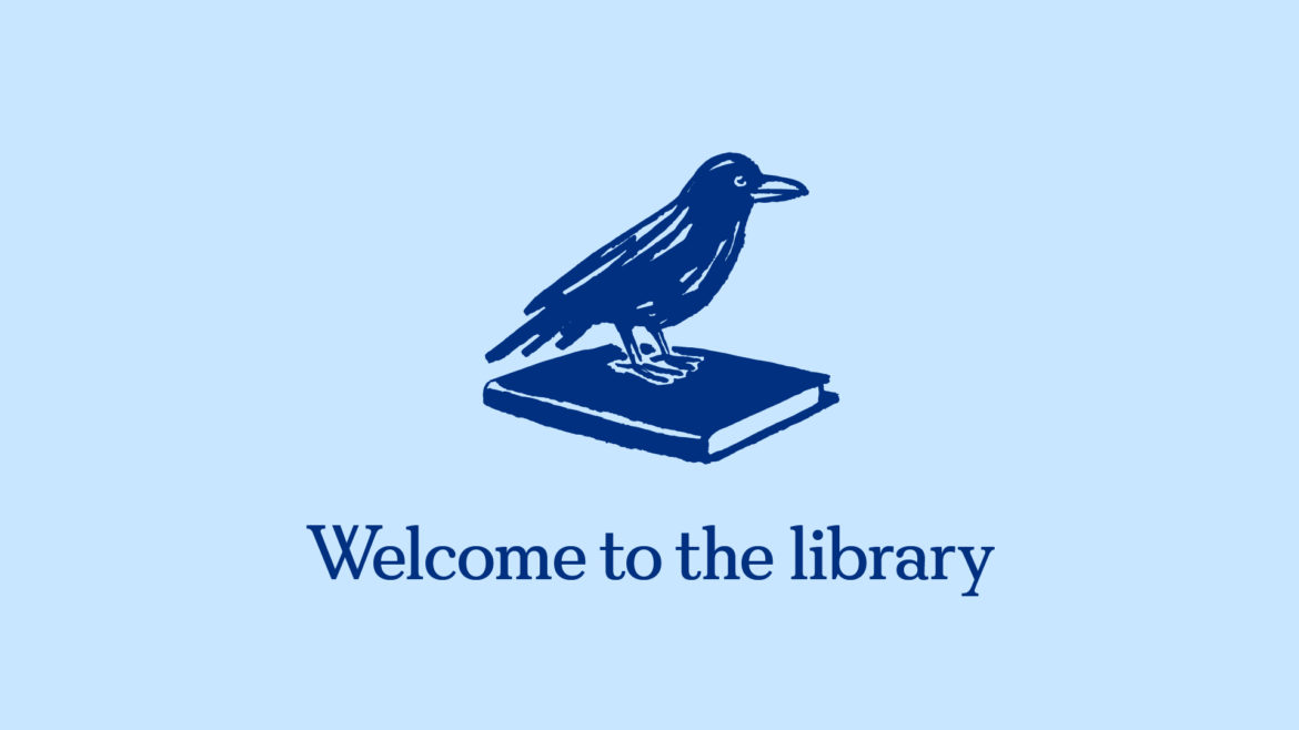
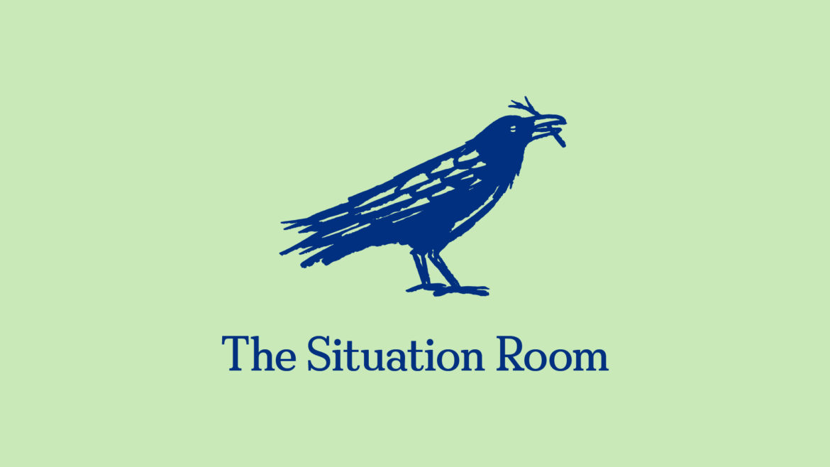
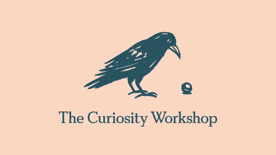
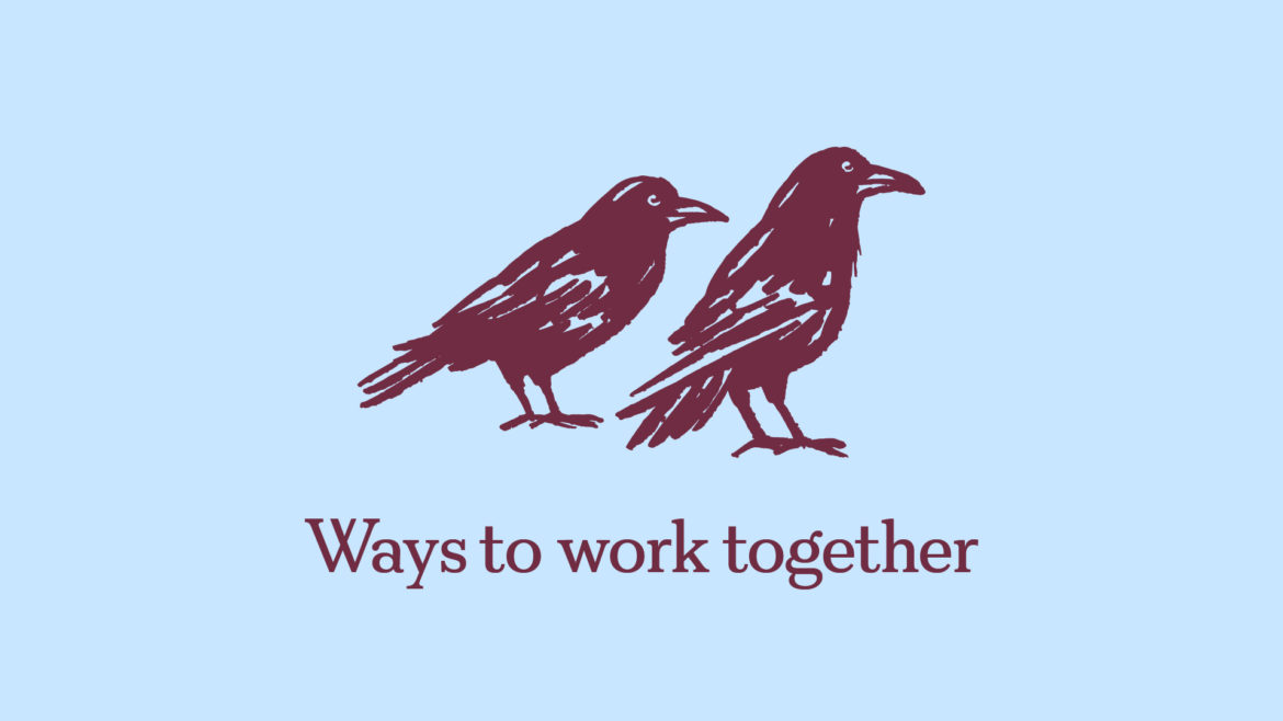
I commissioned Iancu Barbarasa to draw a set of ravens. We didn’t want to anthropomorphise these creatures but one warms to his ravens, which are friendly and wise. Roisin suggested that Iancu could add some symbolic references to the website pages in his drawings, so we see a raven on a book for the library page, for example.
Colourful
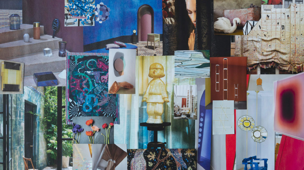
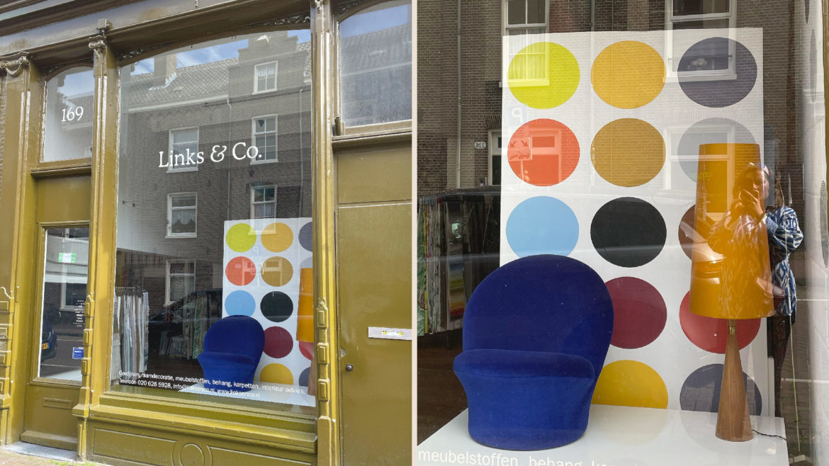
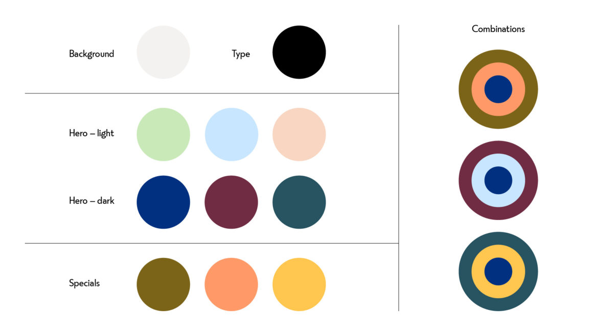
From the start of this project, Roisin said that she wanted her brand to be colourful. The job of a visual identity is to communicate the right messages effortlessly. I find that colour is the best tool for getting this job done. A particular palette speaks volumes without a single word.
Roisin created a colour mood board. We found an interiors shop in Amsterdam with a colour palette with just the right spirit: bold, fun and sophisticated. Using these references as inspiration, I finalised the colour palette.
A Split Personality
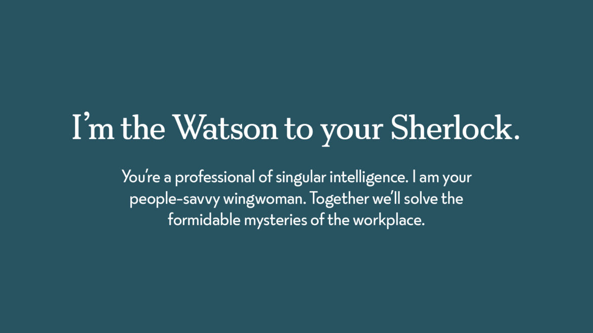
The FS Split typeface family caught my attention when it was released in 2020. Designed by my friends Jason Smith and Fernando Mello at Fontsmith, it comprises a serif and a sans family which are distinct and yet which work well together. Beautifully crafted, the fonts draw from the past whilst demonstrating a contemporary wit and flair. They felt just right for Roisin’s brand.
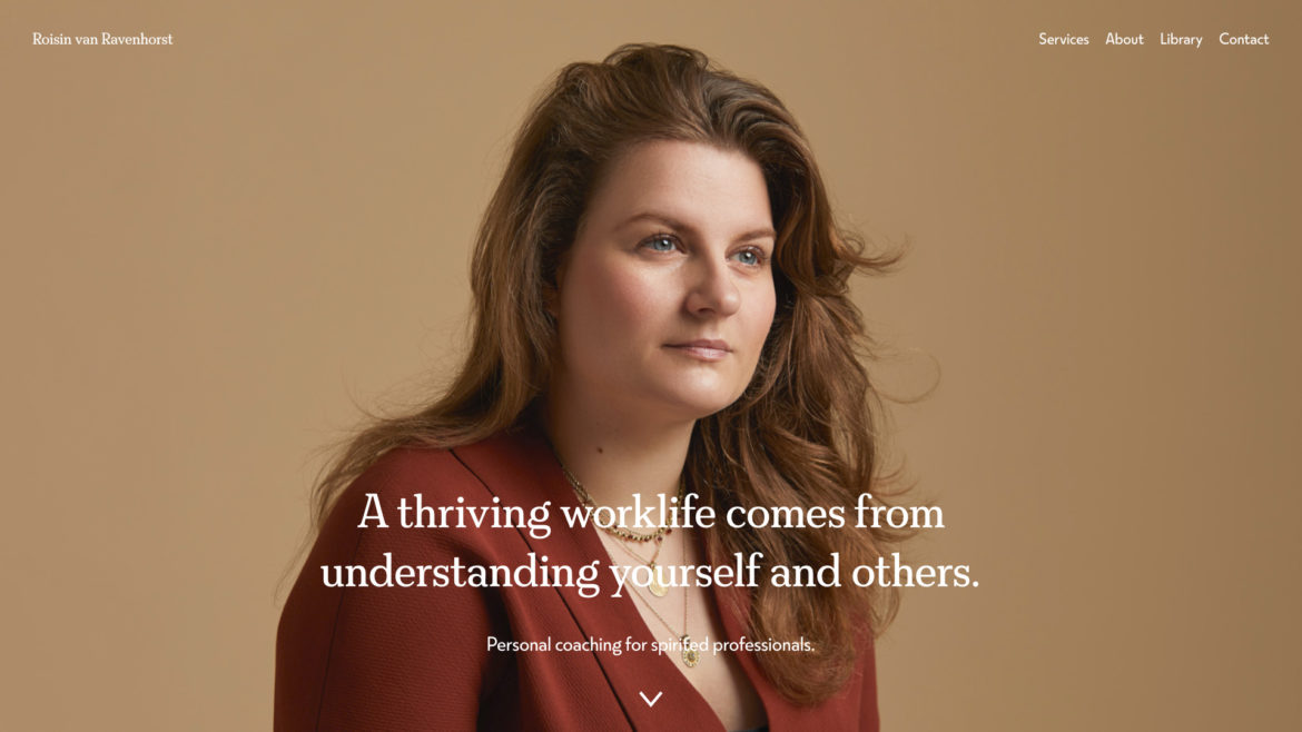
Worth a thousand words
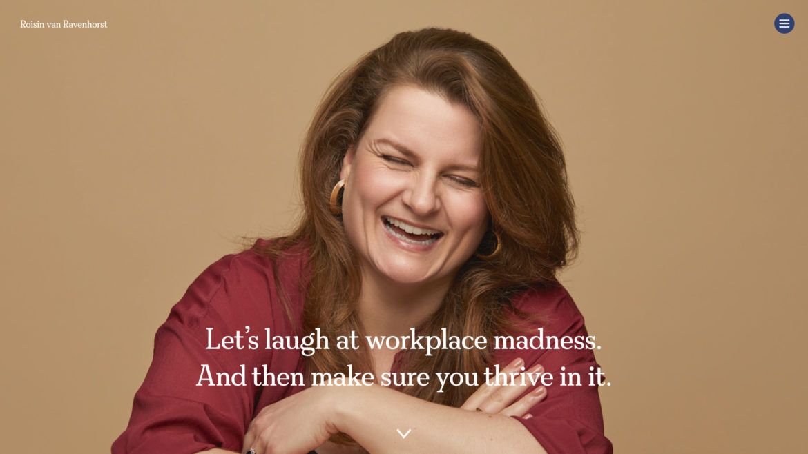
For me, art is a personal activity, whilst brand design is done in gangs. The gang begins with me and my client. And then there are specialists – experts who have spent their lives learning their craft. On this project we had font designers Jason Smith and Fernando Mello, illustrator Iancu Barbarasa, web developer Steve Jones and lastly, photographer Ranald Mackechnie.
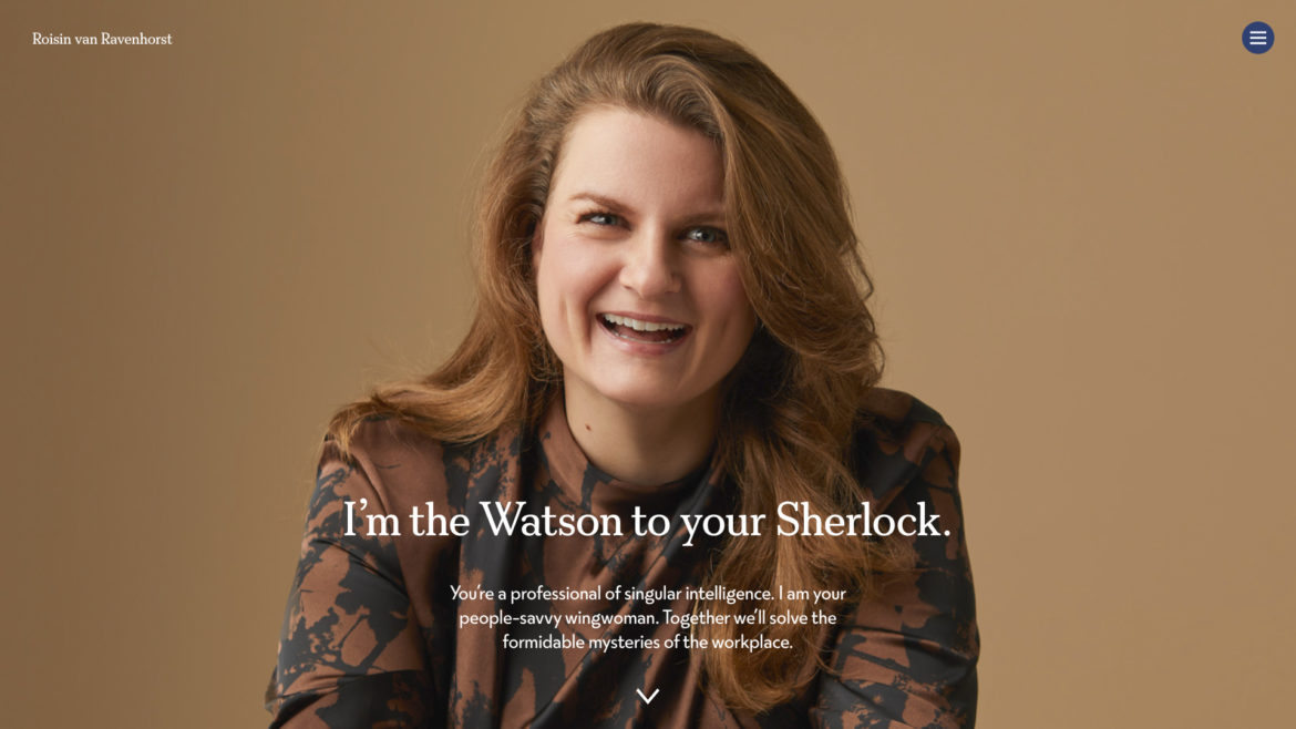
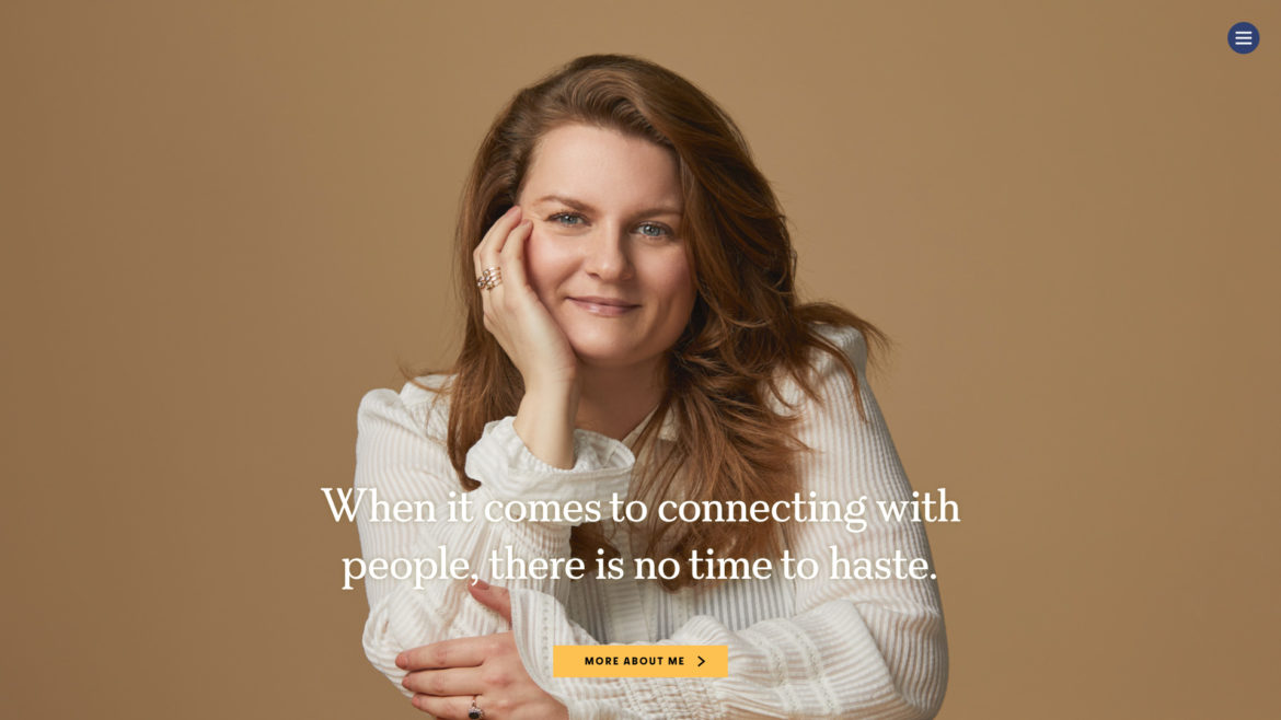
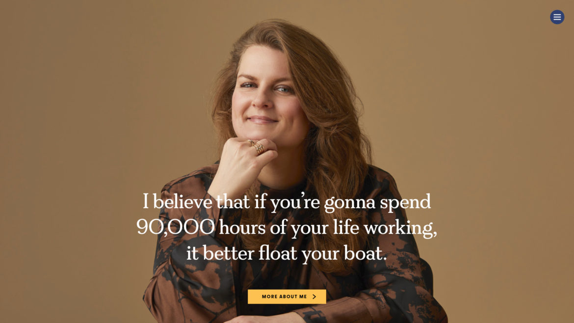
Ranald’s portraits manage to communicate truthful things about their subjects. As you glance over the grid of beautiful portraits on Ranald’s website (where you will see the very last portraits made of the Queen), one feels the stories rising from the images. Roisin and I had several good conversations with Ranald before the shoot and I think these enabled Ranald to capture Roisin’s story in his photographs. When I look at the portrait on the homepage, I feel her calmness, her kindness, her ability to listen well and her rather un-English abilty to speak directly and clearly, encouraging those around her to do the same.