A NEW LOOK FOR A NEW TV ENVIRONMENT
Founded in Plymouth in 1989 as an independent television production company, Twofour has grown to become an award-winning producer with offices in Devon and London. Now part of ITV Studios, the company makes non-scripted programmes across all genres from documentaries to entertainment including The Reluctant Traveller, I Kissed A Boy, Loaded in Paradise, The Hotel Inspector, Comic Relief Red Nose Challenge, The Real Marigold Hotel, Educating… and Make Me Prime Minister.
Last year Twofour asked me to create for them a new visual identity. This came in the wake of a major leadership change in 2020. There was to be a shift in emphasis in the company’s output and an expansion of its customer base to include streaming services like Apple TV+.
UNIQUE PERSONALITY
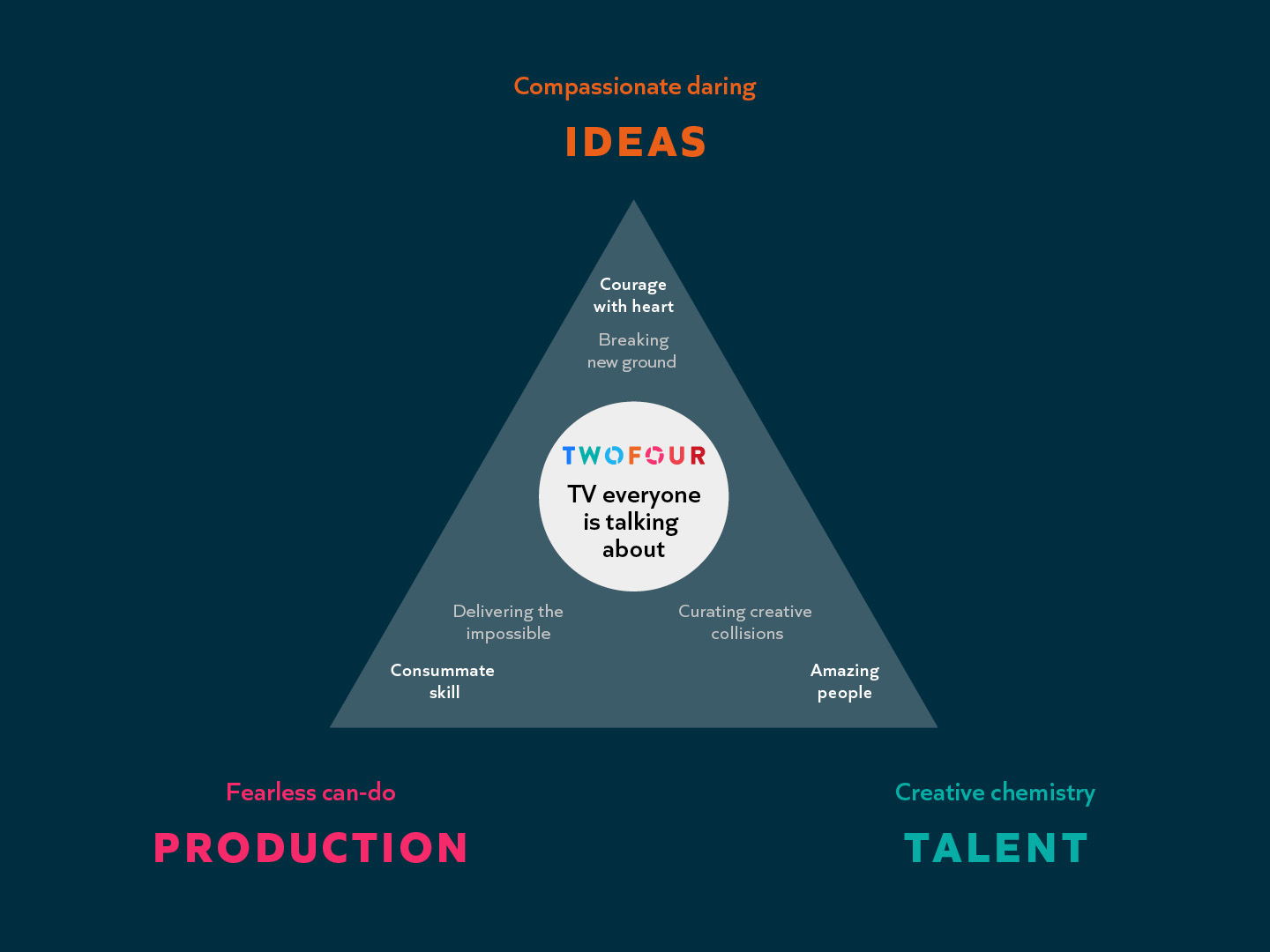
We kicked the project off with a workshop with Twofour’s senior leaders. The mission was to uncover the unique personality of the organisation, so that we could distil this into a brand positioning. This would become a useful tool for the organisation, and it would inform the development of the new identity, as well as the verbal messaging on the new website.
We found that three key building blocks in combination gave rise to Twofour’s particular complexion, and separated them from their competitors: strong ideas, talented people and powerful production capability.
CONFIDENT BUT NOT SHOUTY
At the heart of the brand positioning, we came up with a strapline which summarised the essence of the brand and established its position in the marketplace. The idea for this line grew from our sense that Twofour were confident but not shouty. Rather than talk about how good their work was, our strapline summarised its impact: ‘TV everyone is talking about’.

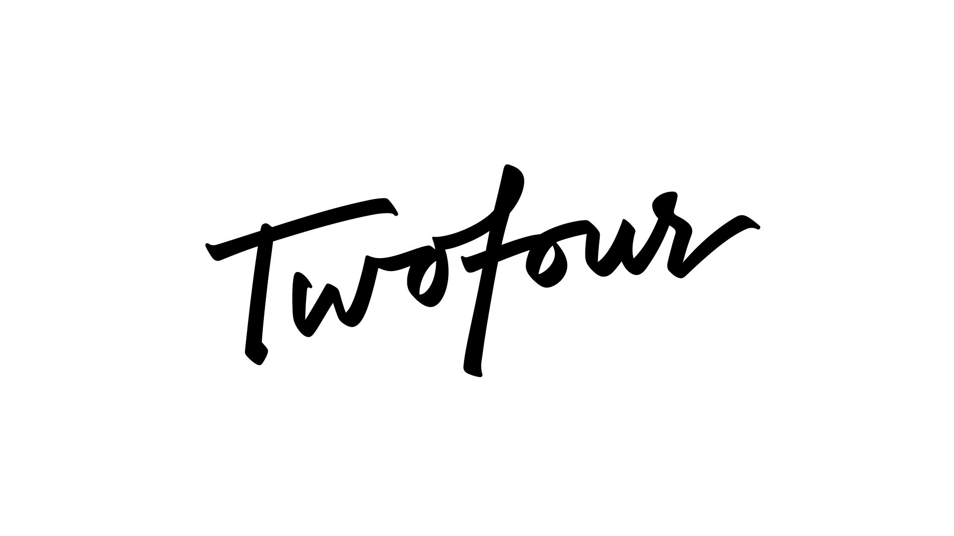
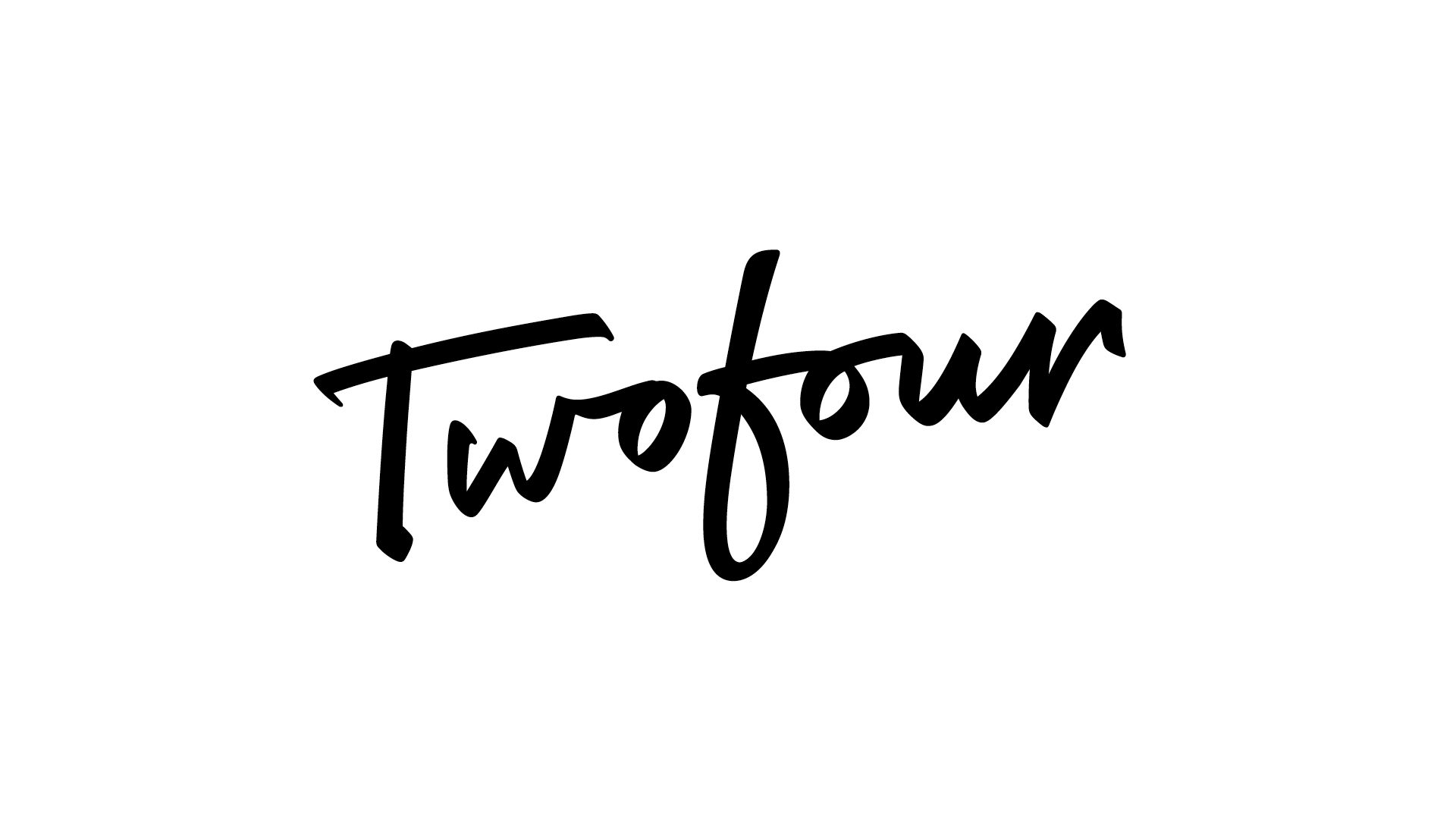
HANDWRITTEN MARK
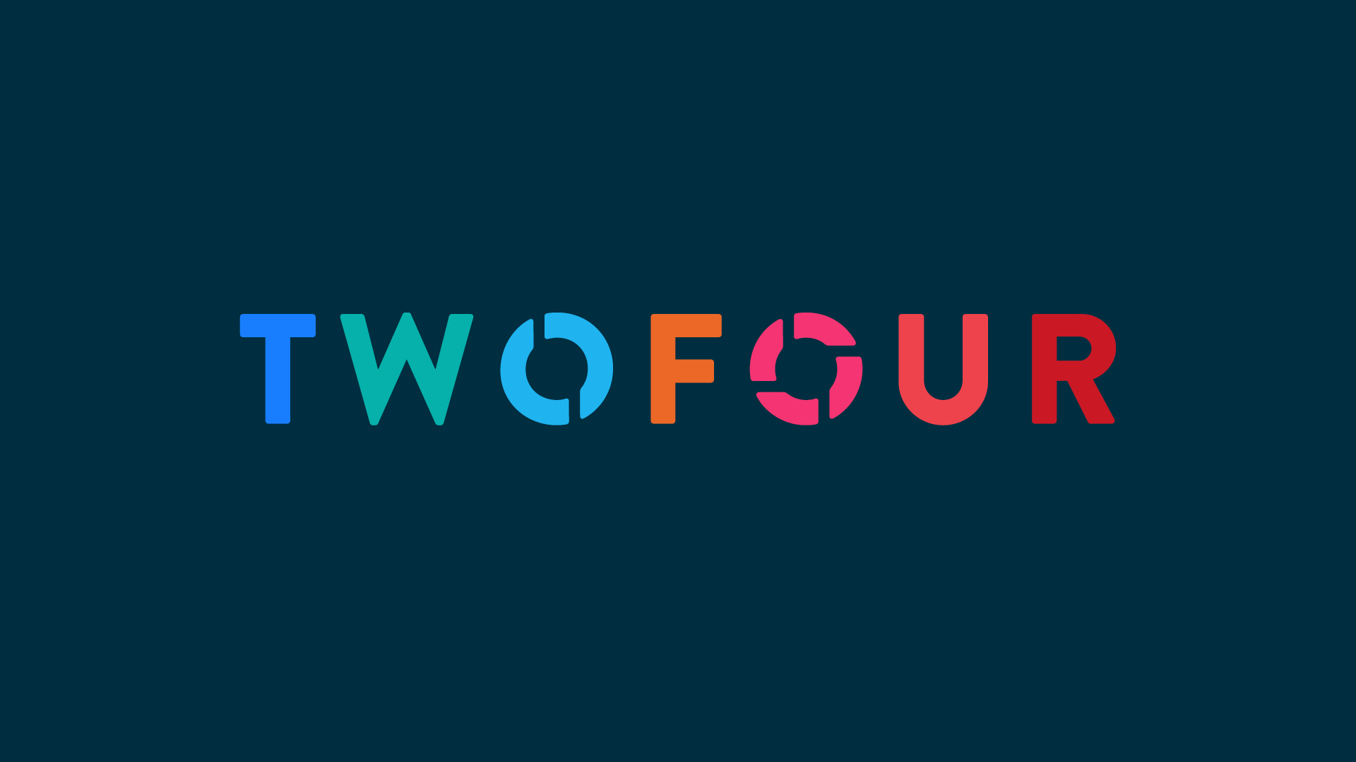
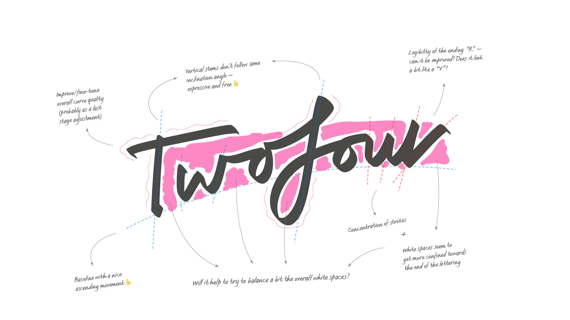
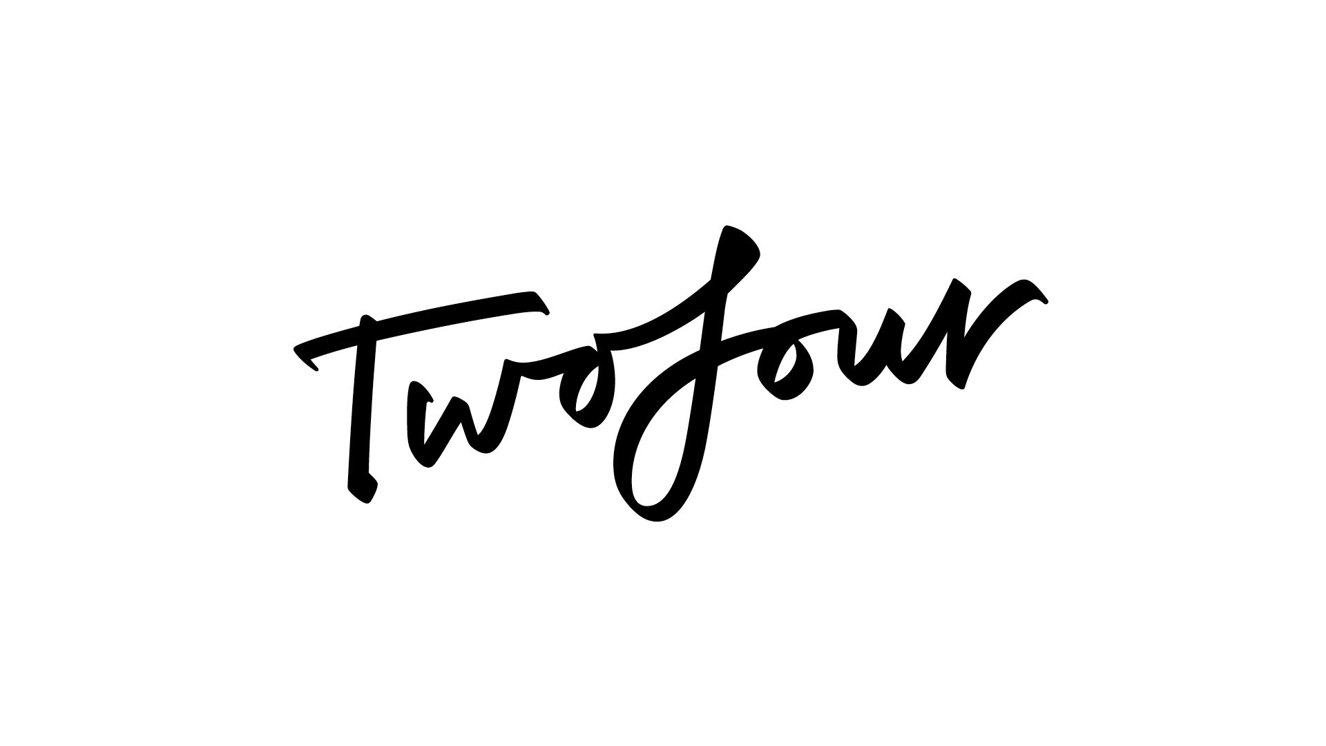
I began by proposing three logo ideas. There was a lot of love for a handwritten mark. It seemed to put Twofour’s amazing people into the heart of the logo. I enlisted the help of a type designer. To begin with, he analysed my drawing of the mark, considering the angles, spacing and legibility. This review informed his new improved version of my logo drawing, and led to a couple of new versions with alternative F and R characters.
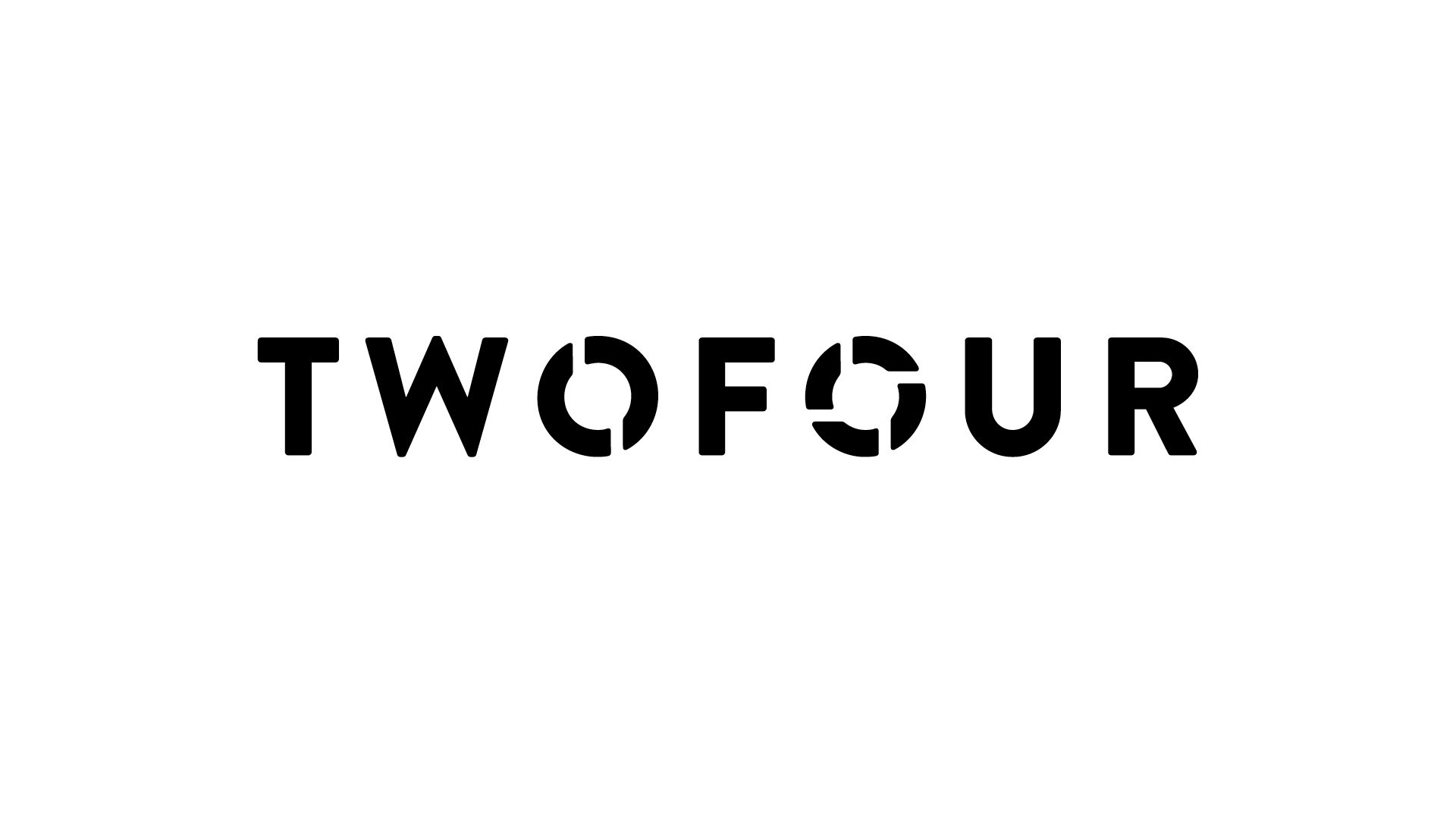
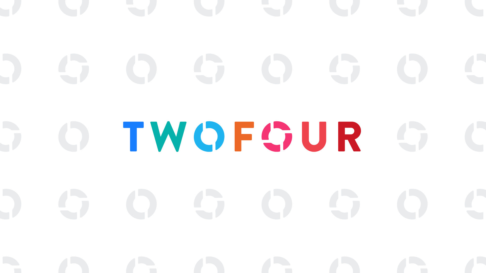
PUTTING THE TWO AND FOUR INTO TWOFOUR
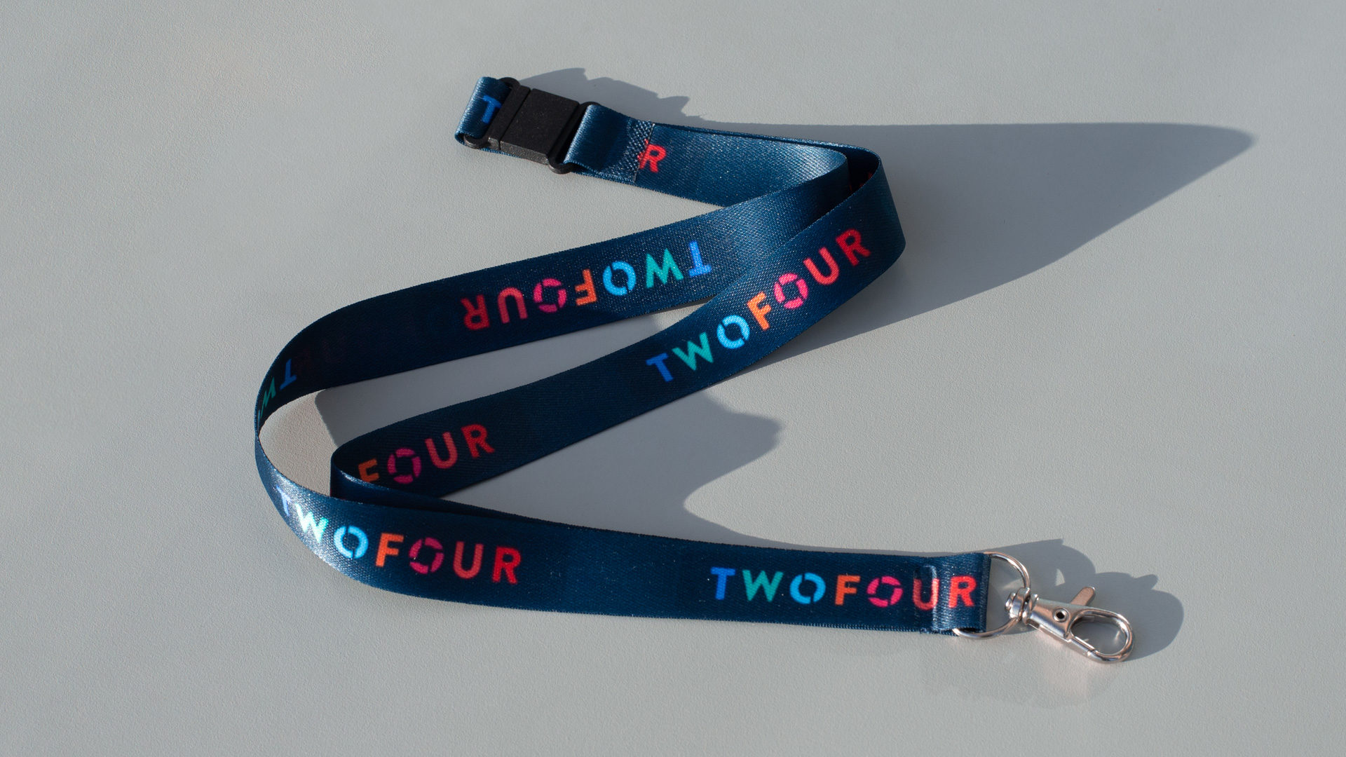
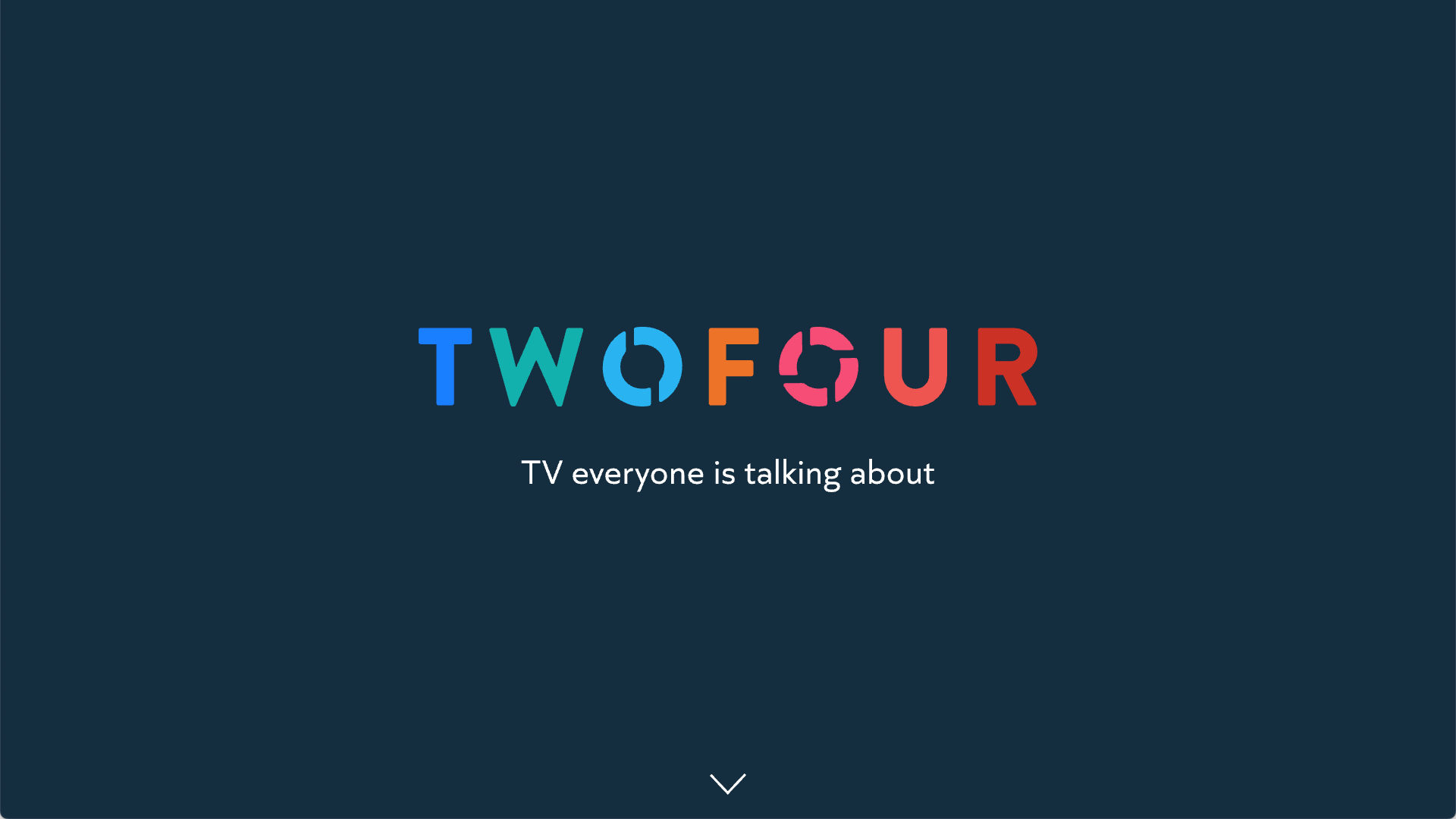
One of my earlier logo ideas visualised the concept of two and four with dots alongside the word. The logo was rather dull and corporate. I looked for other, more subtle ways of referencing the two numbers, and arrived at a stencil approach. The reference to the two and the four is subtle, but it is satisfying when you notice that the letter O within the TWO is divided into two, and the letter O within the FOUR is divided into four.
COLOURS
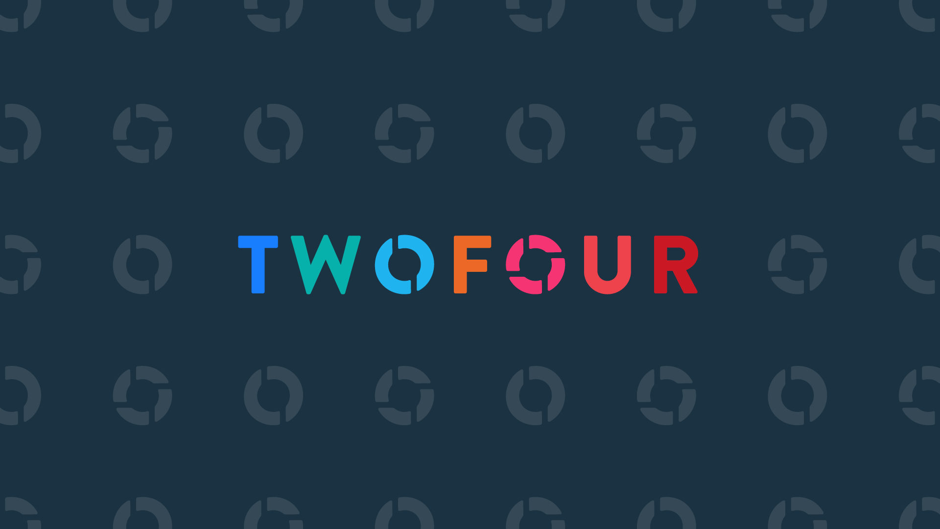
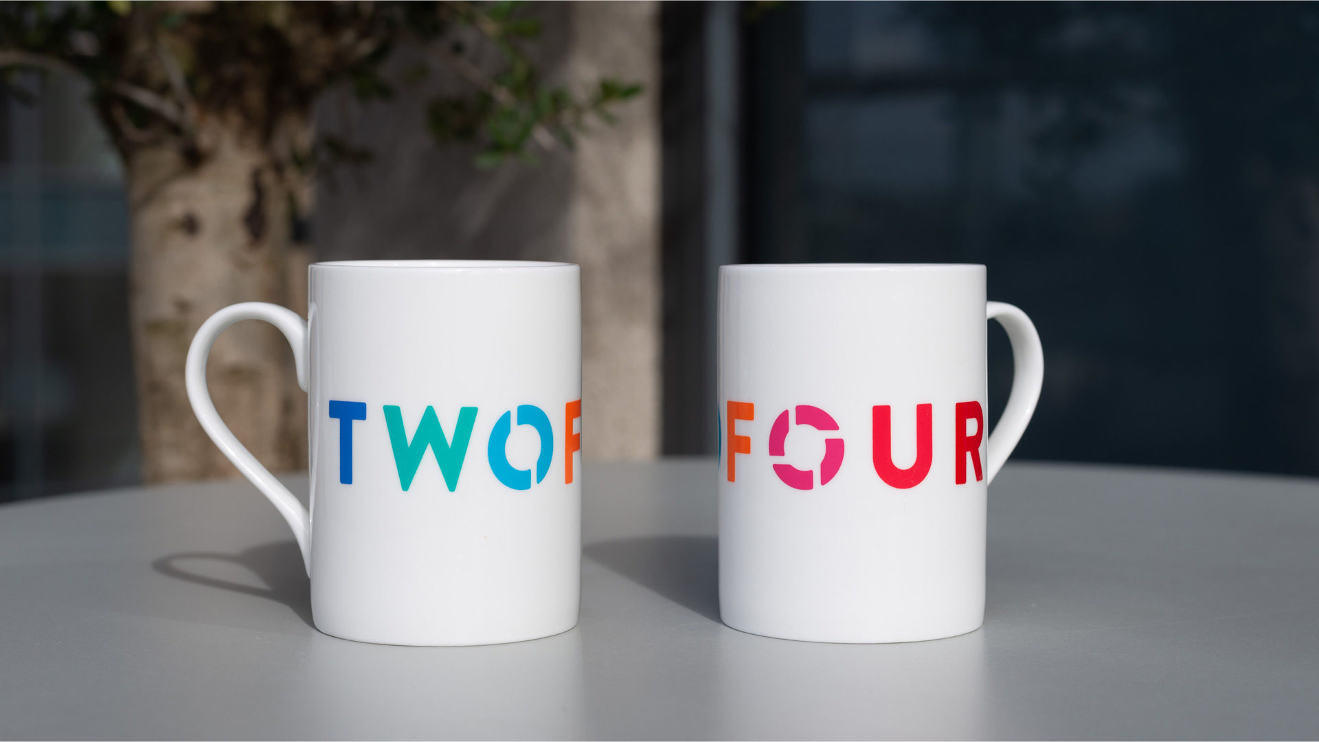
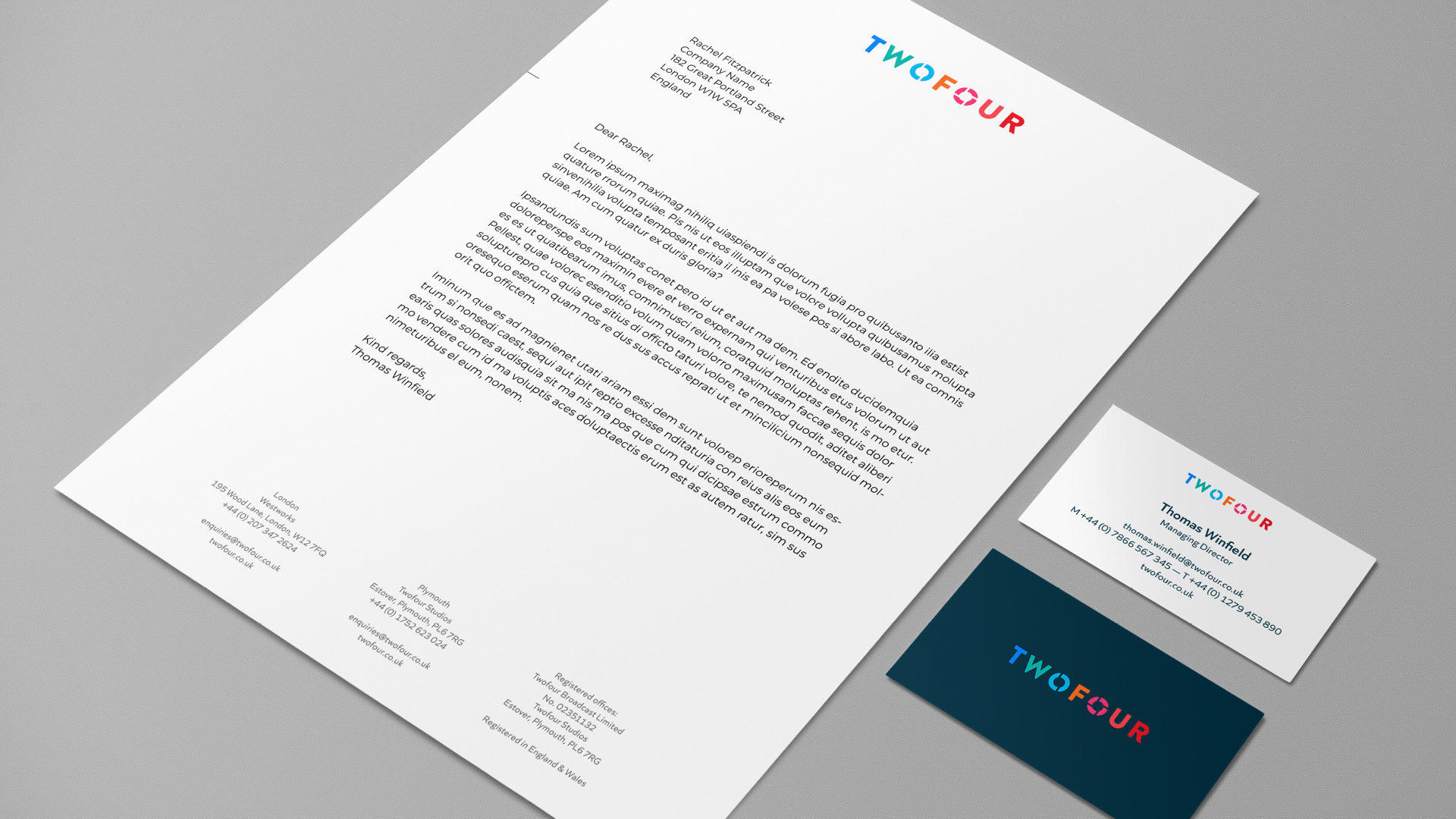
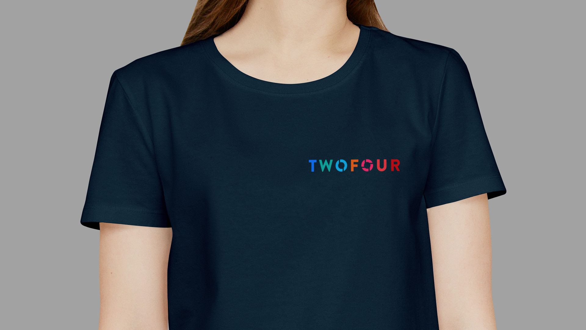
The Stencil route was chosen. From the beginning, I visualised a palette of cool and warm colours for this logo and for related communications like the website. The bright set of colours needed to speak of lively creative chemistry and of entertainment, and it also needed to feel sophisticated and grown-up in order to work alongside Twofour’s varied output.
I knew these colours would glow satisfyingly out of a dark background and that this would be the primary approach, but I made sure they would be equally legible on a white background.
Knowing that in the West we read from left to right, it was interesting to consider whether to begin the logo colour sequence with the cool or the warm colours. Cool was the winner, as this meant that as you read the logo, you travel out of the cold and into the warm. As there were four letters in FOUR and only three letters in TWO, this order also meant that the logo would feel more warm than cold. This emphasis on the warm colours felt emotionally right for Twofour.

PATTERN
I created a useful brand pattern from the logo’s two stencil O letters.
IN USE
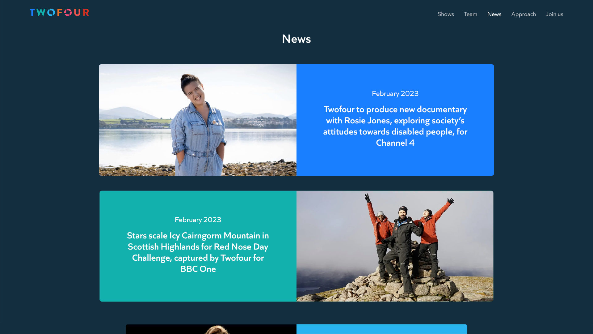
Here are some examples of the new brand in use.
WEBSITE
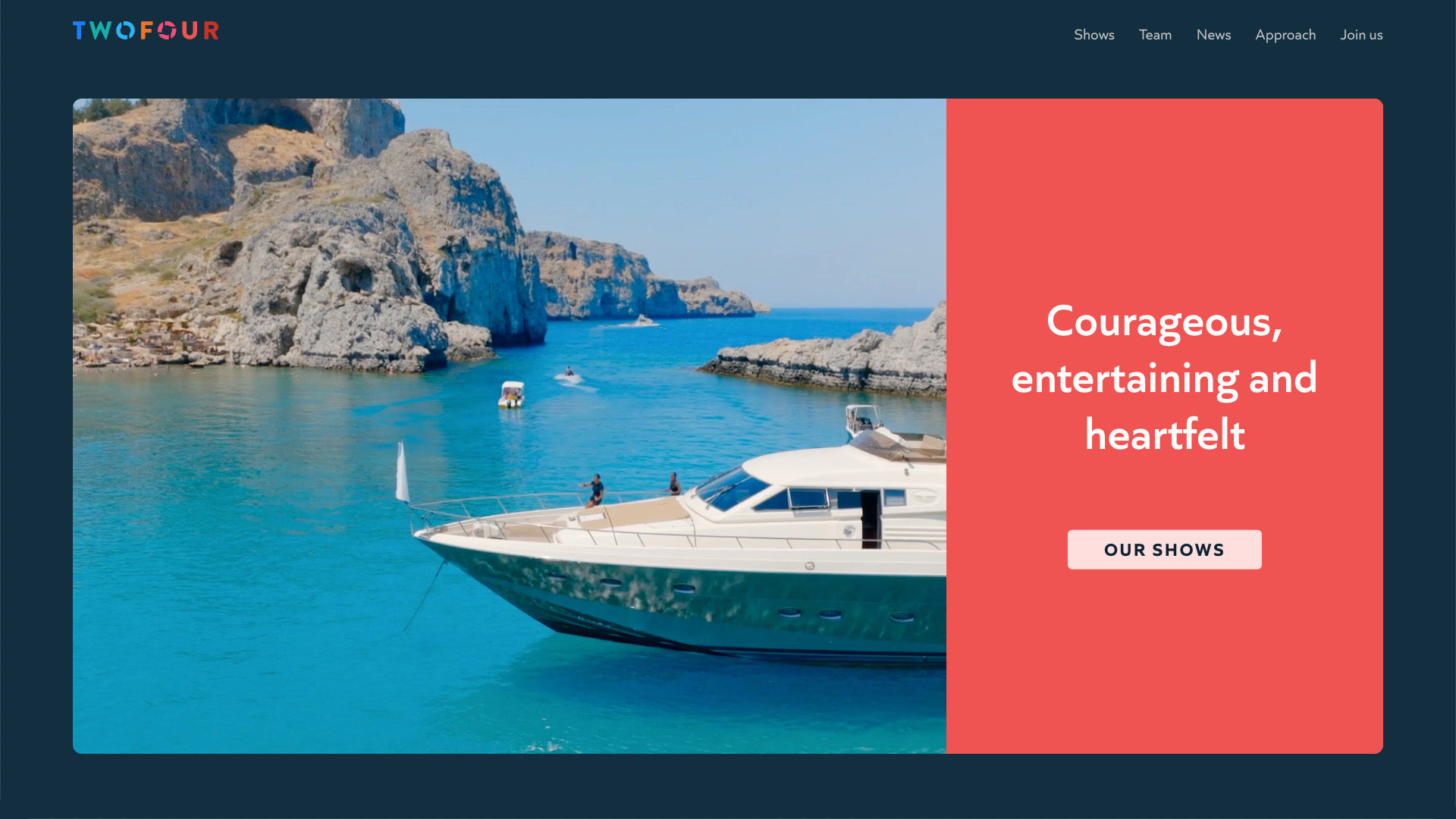
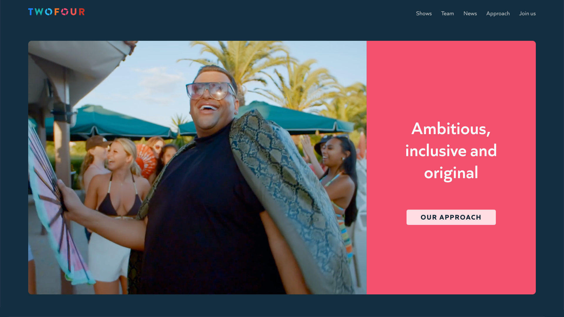
We created an easy-to-maintain WordPress website for Twofour. The site has the new brand positioning and visual identity at its heart. When you first arrive, you see an animating formation of the logo and strapline. It is clear that exciting new things are happening at Twofour.
As you scroll down the homepage, you see three auto-playing video sequences which are coupled with succinct written messages. These video and text units communicate the three key building blocks of the brand positioning. When commissioners, current and prospective employees and the viewing public visit the website, they are getting not only compelling examples of recent work, but also meaningful insights into Twofour’s unique strengths and abilities.

STYLE GUIDE
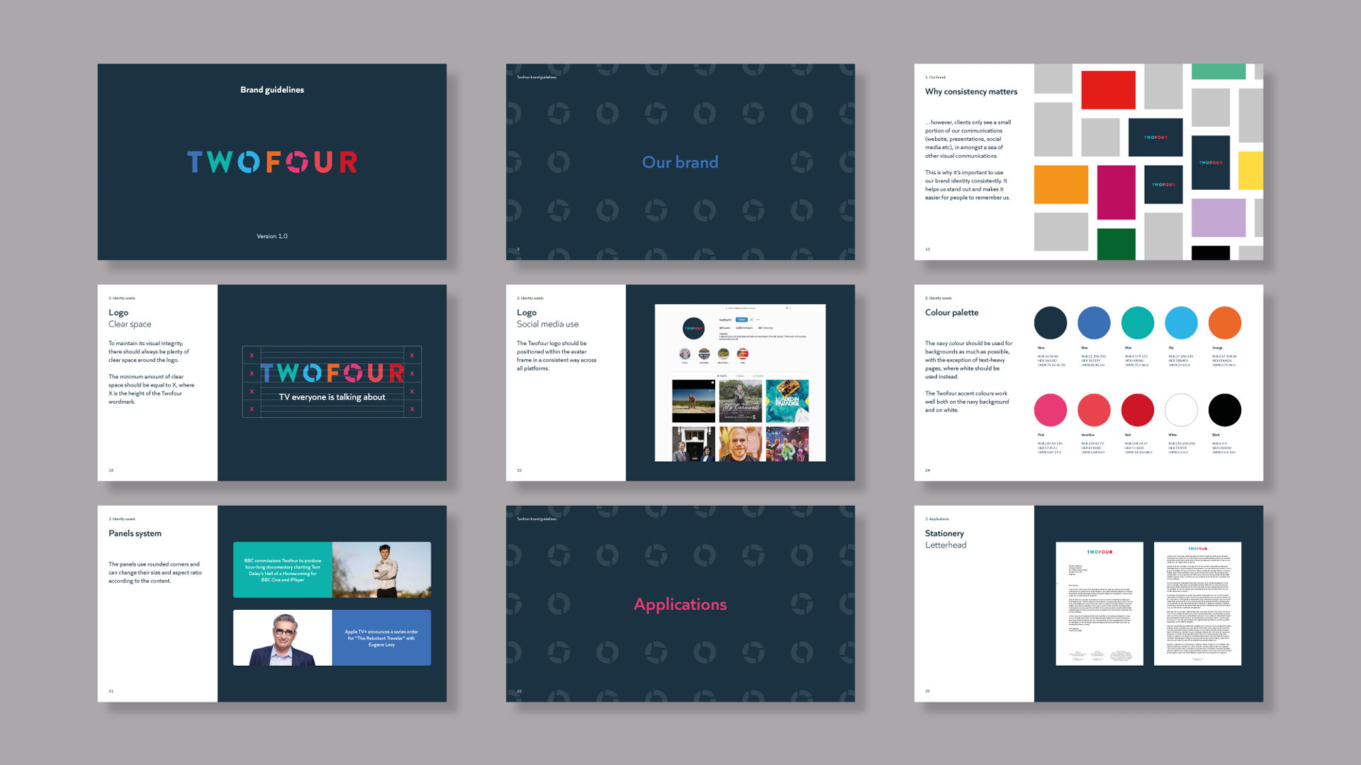
We made a comprehensive style guide which captures all aspects of the new brand positioning and visual identity.
THANK YOU
Thank you very much to my friends and collaborators: Michael Thomson (brand stategy), Fernando Mello (type design), Iancu Barbarasa (print design) and Steve Jones (digital).
Thanks also to the team at Twofour, and particularly to Shireen, whose creativity, enthusiasm and trust made for the an enjoyable process and the best possible results.
THE CLIENT, ON WORKING TOGETHER
“It was a big step to find a team we could trust with our brand identity renewal but from the first meeting we knew Matt understood what we were trying to achieve.
The process from start to finish was not only collaborative but fun. After a download of values and a workshop with key stakeholders, Matt delivered well researched thought out options. The sessions with Michael Thomson helped to crystallise the messaging which followed through to the final text on the website and also into our wider communications.
As with all creative projects there were rounds of changes and Matt set a good pace and is particularly gifted in presenting his ideas. We had space and time to consider the options and in the end we trusted Matt’s expertise with the final colour decision and haven’t looked back since. The final result still makes us smile when we see it.”
Dan Adamson, Managing Director and Shireen Abbott, Director of Production