A few month’s ago we were asked by top ten independent creative agency St Luke’s to get involved with their work for the fast-growing online department store Very.co.uk. The agency were producing great TV ads which, everyone agreed, were being let down by lacklustre sign-off branding.

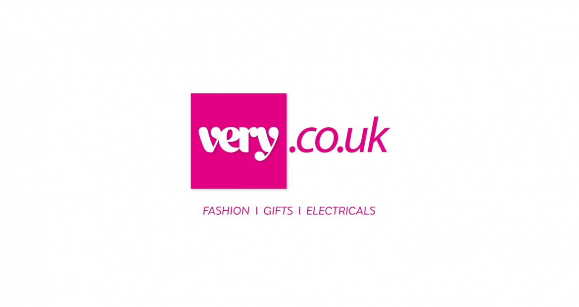
The logo sign-off did not animate, and there were questions about the logo design. Originally, the marque was created for print. The nice Very type was drawn by the mighty Miles Newlyn. The co.uk was later hastily added and did not feel confident.
Our research went far and wide. The Very type and the pink colour were sacrosanct, but everything else came into question – the texture and shape of the square, the lighting on the logo and the background, what to do with the .co.uk. Very were already using a cube in some of their communications and we considered the benefits of the logo as a cube rather than a 2D square.
St Luke’s had thought of Rudd Studio for this project because they liked the way our ITV branding fused with the channel’s content. Our idea for the Very animation involved pulling back through the type, implying that the ad had taken place within the world of Very.co.uk. We created the feeling that Very was a gateway to a more stylish, exciting life. In this way, the brand and its products became strongly linked.
The previously flat pink square became a glossy object, reminiscent of glamorous nail varnish. It was felt that the web address info no longer had to shout so loudly, so the big co.uk was removed and a small, centred URL was added, allowing the Very logo pink square to become big, iconic and centre-stage.
The scene has been set with this animation for future iterations which firmly establish the marque as a cube. This will open up all sorts of possibilities for a multi-faceted department store, where exciting goods get delivered in pink boxes.