Founded in 1840 by Morris Angel and still run by the family, Angels is the leading costumier to the film and television industry, and the pre-eminent fancy dress supplier to the public. Angels owns the largest collection of costumes and accessories anywhere in the world, with eight miles of clothes racks.
Costume design Oscars abound for films supplied by Angels, starting with Hamlet in 1948 and most recently this year with The Grand Budapest Hotel.
With this incredible backdrop, we were excited to be asked by Tim Angel OBE and Jeremy Angel to look at the company’s logo and visual identity. We started by having a good look at the company’s logo history. Here are some examples.


We were asked to come up with a simple and modern logo which incorporated a reference to the company’s 175 year anniversary. There was a discussion about our ITV logo design. Tim felt that there was something in its spirit that was appropriate for Angels.
To begin with we thought about the structure of the logo. What should the hierarchy of the elements be? How should we deal with the addition of the 175 Years message? How important was the crest?

Influenced by some great wallpaper patterns in the ticket hall at the Palace of Versailles which reinterpreted classical patterns in a modern way, we looked at modernising the drawing of the crest.


Thinking about the ITV logo, we looked at joined up letters, which gave the logo a less formal, more friendly personality.
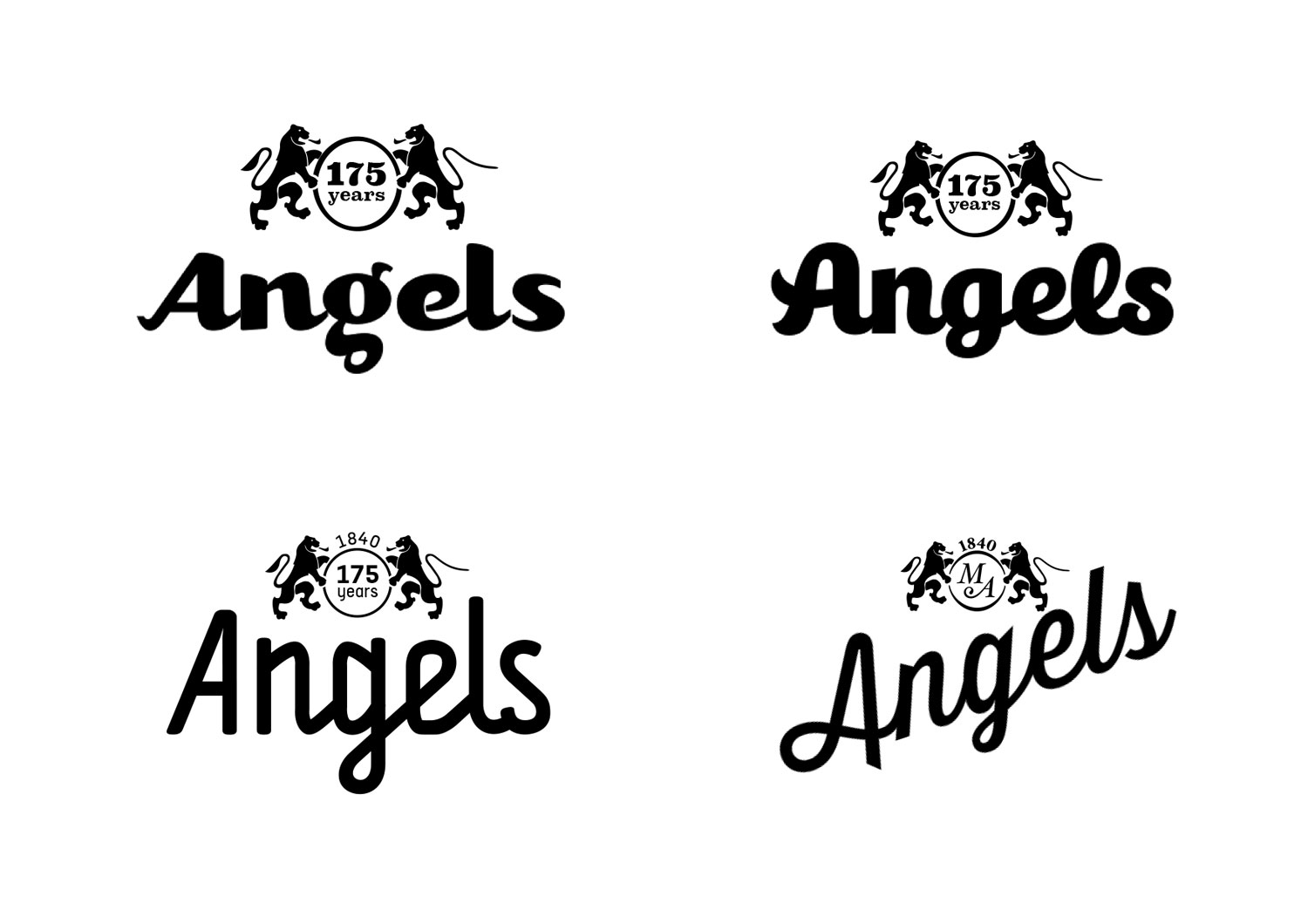
We went on to draw this joined up logotype. The former Angels logo began with a distinctive, forward-sloping A and we echoed it here. There was a feeling that the preceding Angels logos were a little light and did not hold up at distance, so we moved towards a bolder weight for the new logo.

In conversation with Tim and Jeremy Angel, we decided that the crest was not sacrosanct, and in the spirit of simplification and modernisation, we explored alternatives. A different icon above or below the word would help to distinguish the Costumes and Fancy Dress sides of the business.


We all began to feel that it was the multicoloured aspect of the ITV identity which felt appropriate for Angels. This suggested the huge variety of costumes and the joy of fancy dress. We started thinking about how we could use a range of colours in the logo.


We looked at different typefaces. We also explored the possibility of using a different range of colours for the two sides of company.

Working closely with our client, we arrived at a solution which couldn’t be simpler. Each part of the final logo says the right thing.
The FS Ingrid typeface for Angels is warm but authoritative. The multiple colours speak of variety, showbusiness and fun. The underline is a bridge from the preceding logo and the prominent, central, double-storey g brings to mind the logo before that – perhaps the best known logo in the company’s history.

What an enjoyable project.