Slinky
In order to avoid favouring either of the divisions that were merging, we were asked to come up with something completely new. Our solution would need to reflect two things – that this was a significant, global organisation, and that Red Arrow Studios was in the business of entertainment. We presented our clients with several logos and ‘slinky’ was chosen, because it was felt that this design would best reflect these two aspects of the organisation.
A Sense of Movement
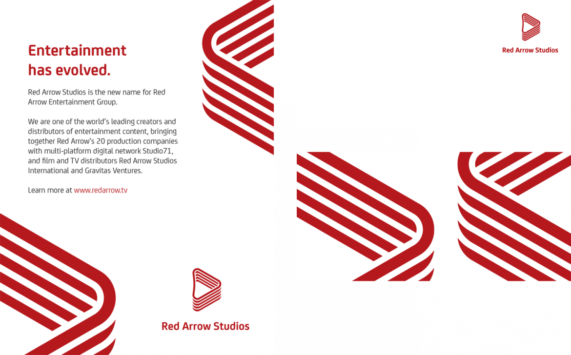
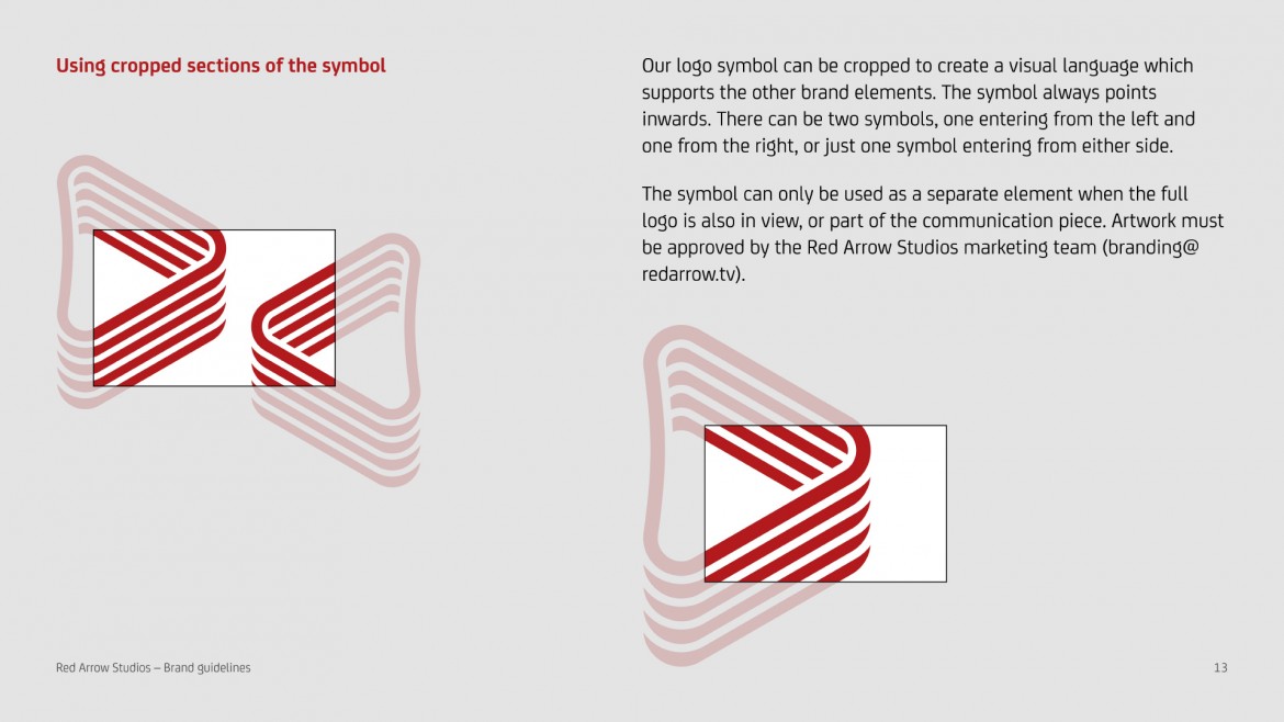
Large cropped logo symbols bring a sense of movement to the static graphics. Below is a magazine advert and the front and back of a comp slip.
Playful tone
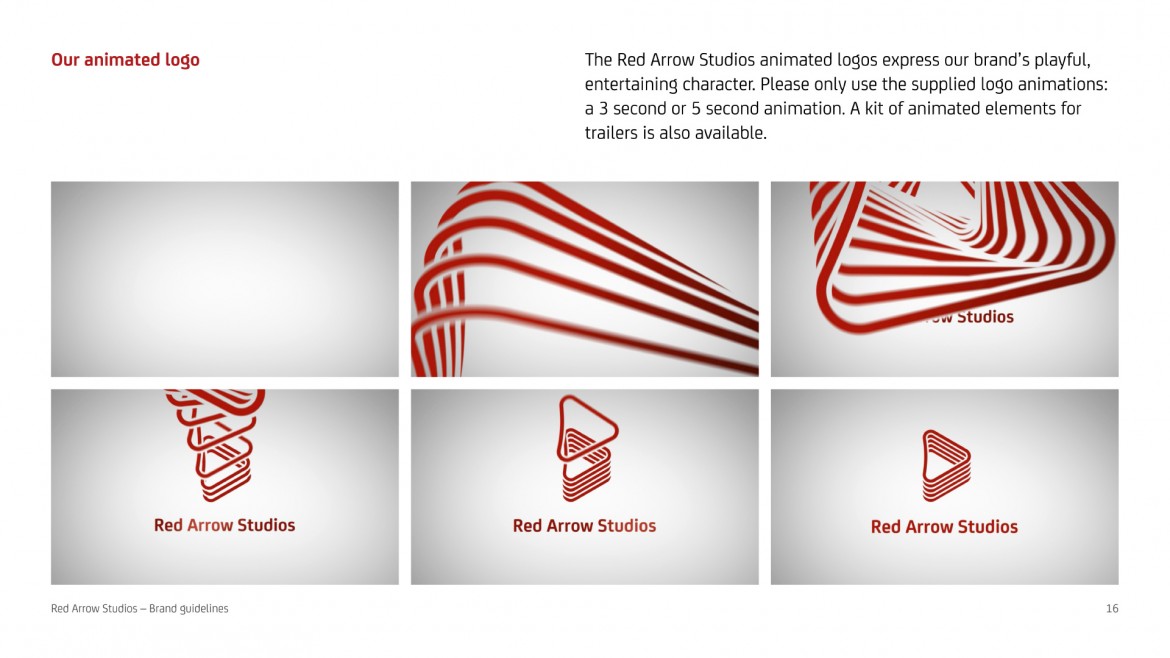
We created stings and promo graphics which leave no doubt about the logo’s slinky origins. The playful tone of the animations sits comfortably alongside Red Arrow Studios’ entertaining content. Here is a five second logo sting.
New Website
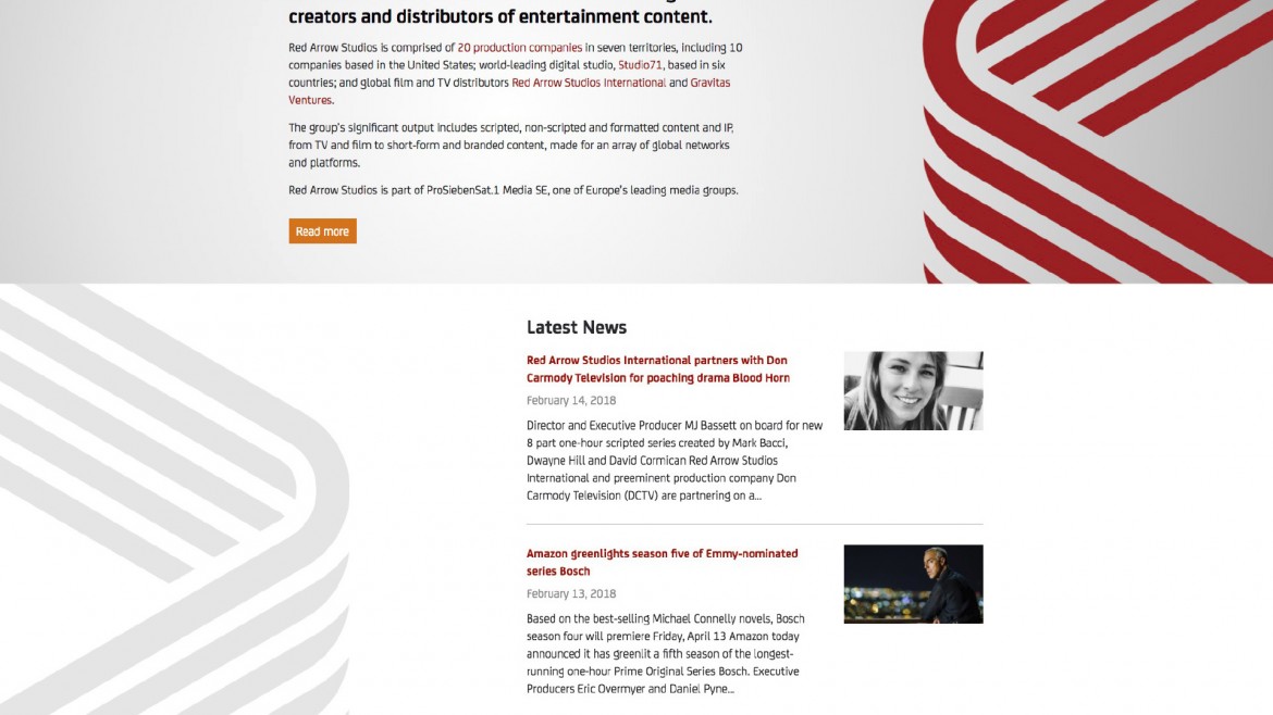
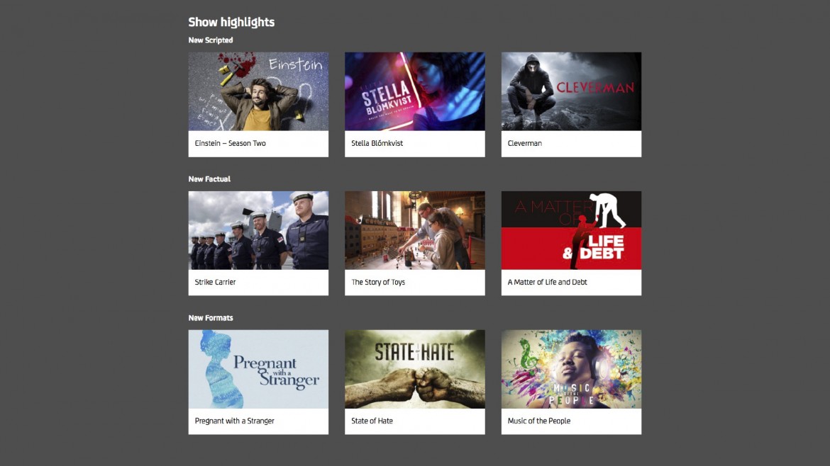
We employed the new brand principles when building the new website. The home page features a full frame video clip, which is book-ended with our logo animations. The cropped logo symbols which appear across the website move with gentle parallax as the user scrolls.

Brand Guidelines
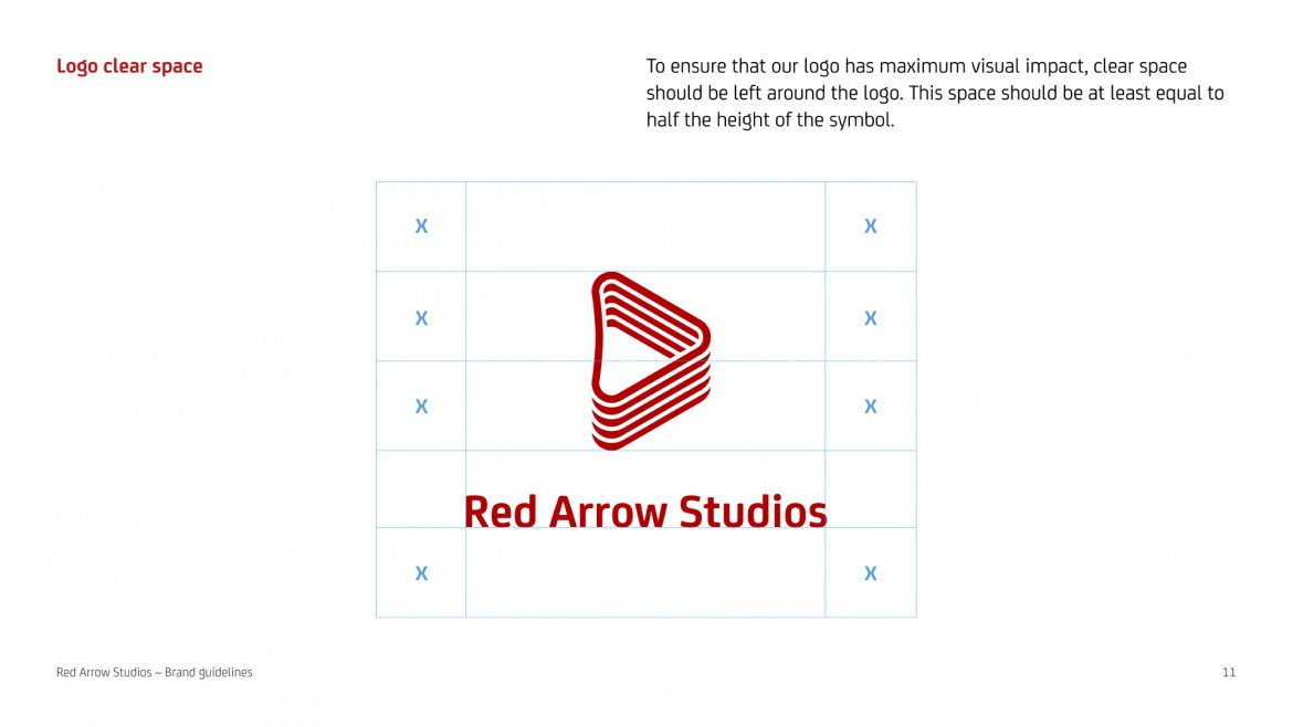
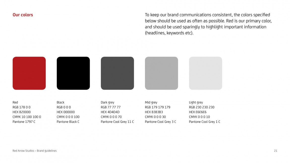
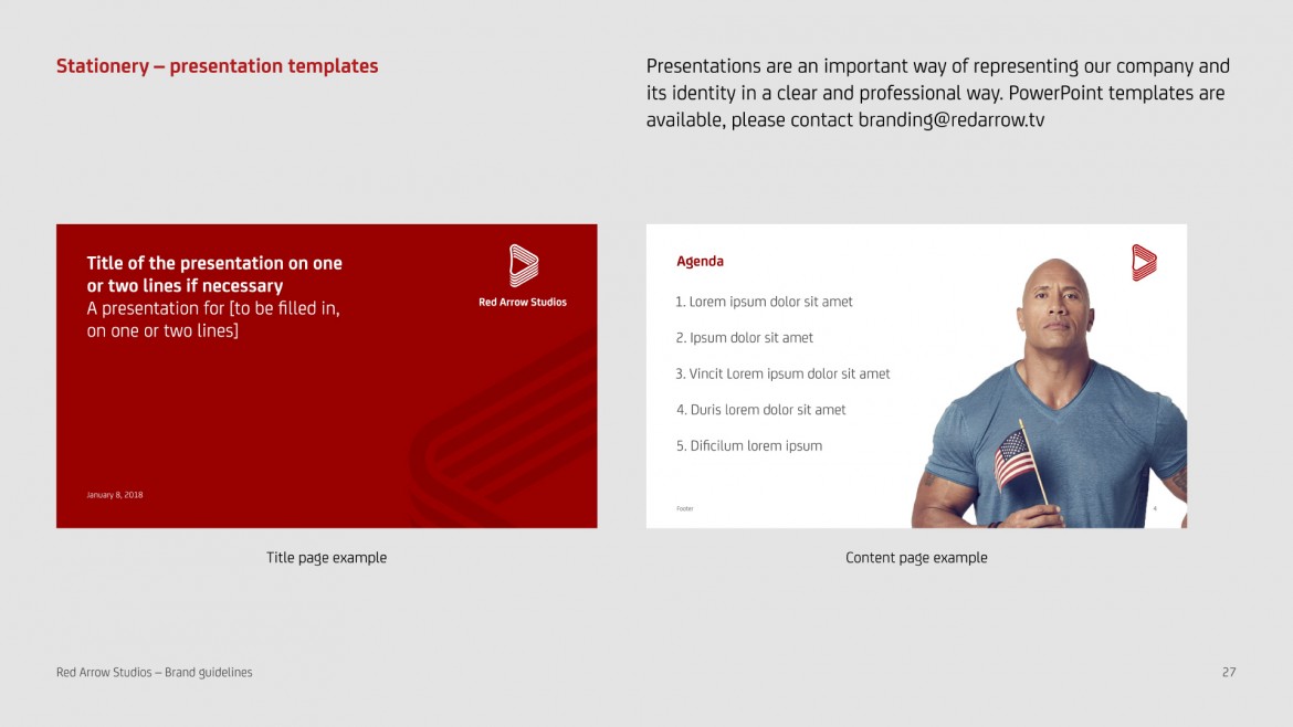
The comprehensive brand guidelines detail the new identity.
Thank You
Thank you to our clients at Red Arrow Studios, particularly to EVP Marketing and Communications Paul Raven. Thanks also to Matt’s collaborators – designer Iancu Barbarasa, animator and composer Oscar Gonzalez and developer Steve Jones.
the client, on working together
“Working with Matt and his team on our new brand identity was a joy from the beginning to the end. It’s rare to find someone who is not only incredibly creative and talented, but also has the ability to look at a project from totally different angles, can immerse themselves in understanding your business and its challenges, is collaborative, professional, and focused on delivering everything you need, when you need it. I can’t wait for an opportunity to work with him again.”
Paul Raven, EVP Marketing & Communications, Red Arrow Studios