A mission to rebrand Framestore
The history of the Framestore identity
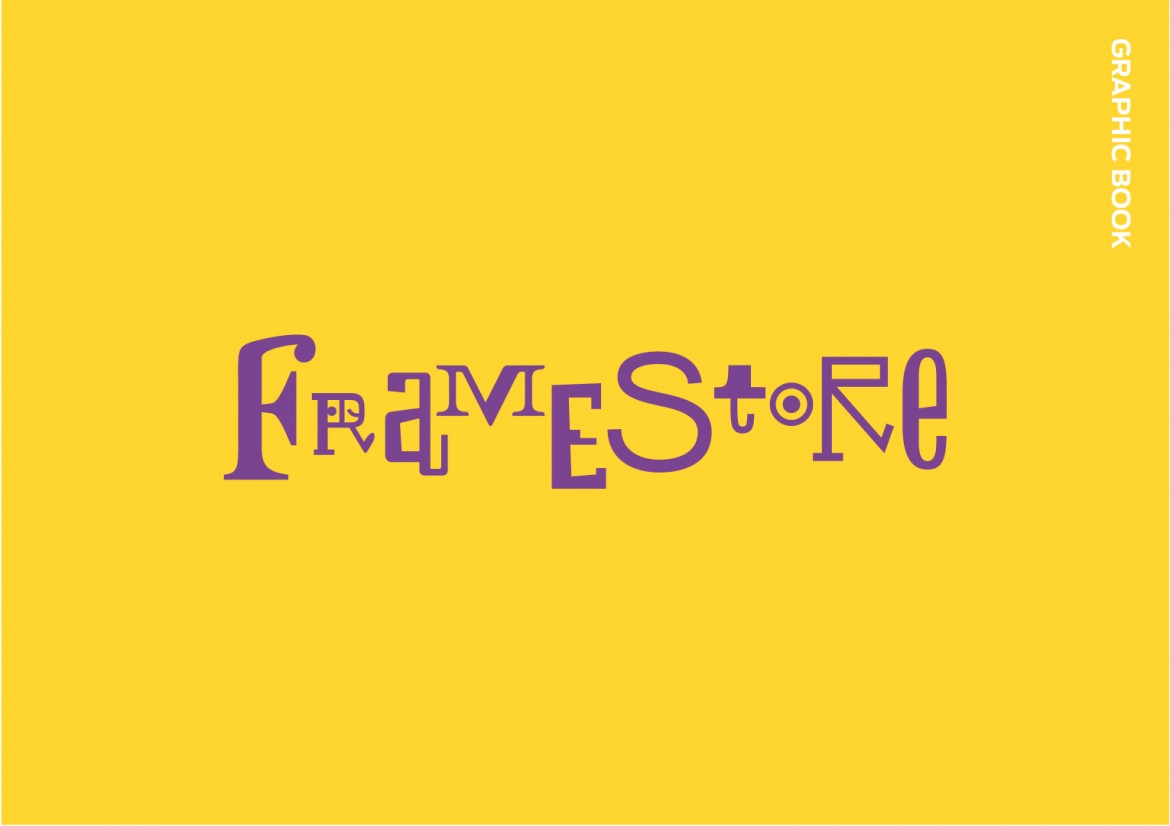
As you would expect for a company that knows all about image, the history of the company’s brand identity is an impressive story. Since its inception in 1986, Framestore has worked with the great Javier Mariscal. He has reflected the incredible and diverse range of talents that make up Framestore with energetic, unique, witty visuals.
Presenting the F icon in a new way
This non-conformist brand was part of Framestore’s DNA and we agreed with our client that our task should be about evolution rather than revolution. The evolution should reflect the bigger, more international, more diverse nature of the company today. It felt appropriate to make the brand a little more formal and corporate. We wanted the new brand to speak with confidence and calmness.
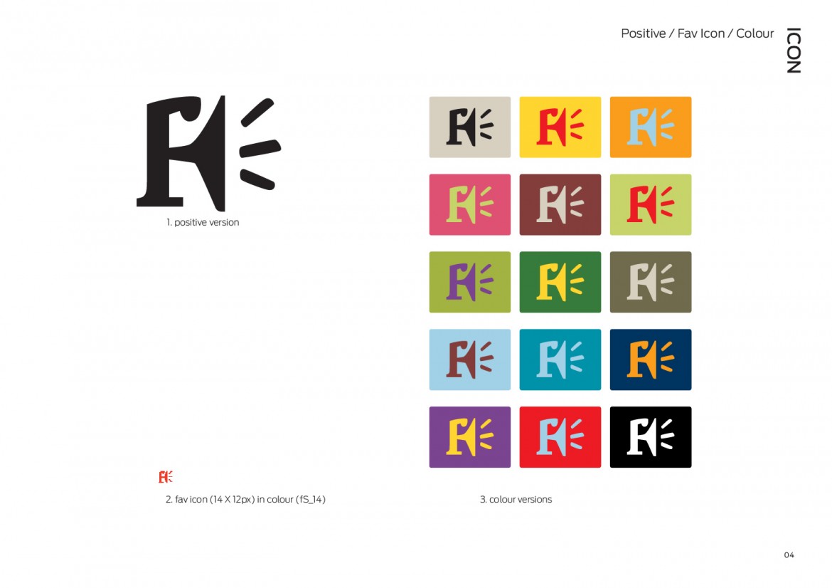
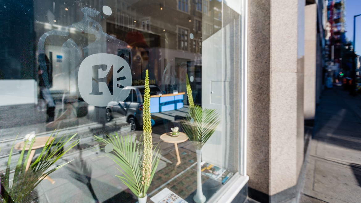
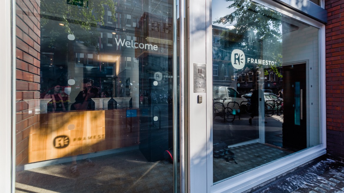
The F icon had become very well-known and was often in use on its own. We decided to keep it, and present it in a way that was less eccentric. After lots of research and dialogue with our client, we arrived at the ‘squircle’, which was a distinctive new shape to add into the mix, and which housed the F icon well. The next stage in creating the new version of the logo was to use the font Antenna (already in use by Framestore) in widely spaced caps for the word Framestore. This set of elements, with the F icon at the heart, nodded to Framestore’s heritage, and spoke of its place now and in the future – as a global player in the advertising, entertainment and film industries.
DEVELOPING A VISUAL LANGUAGE
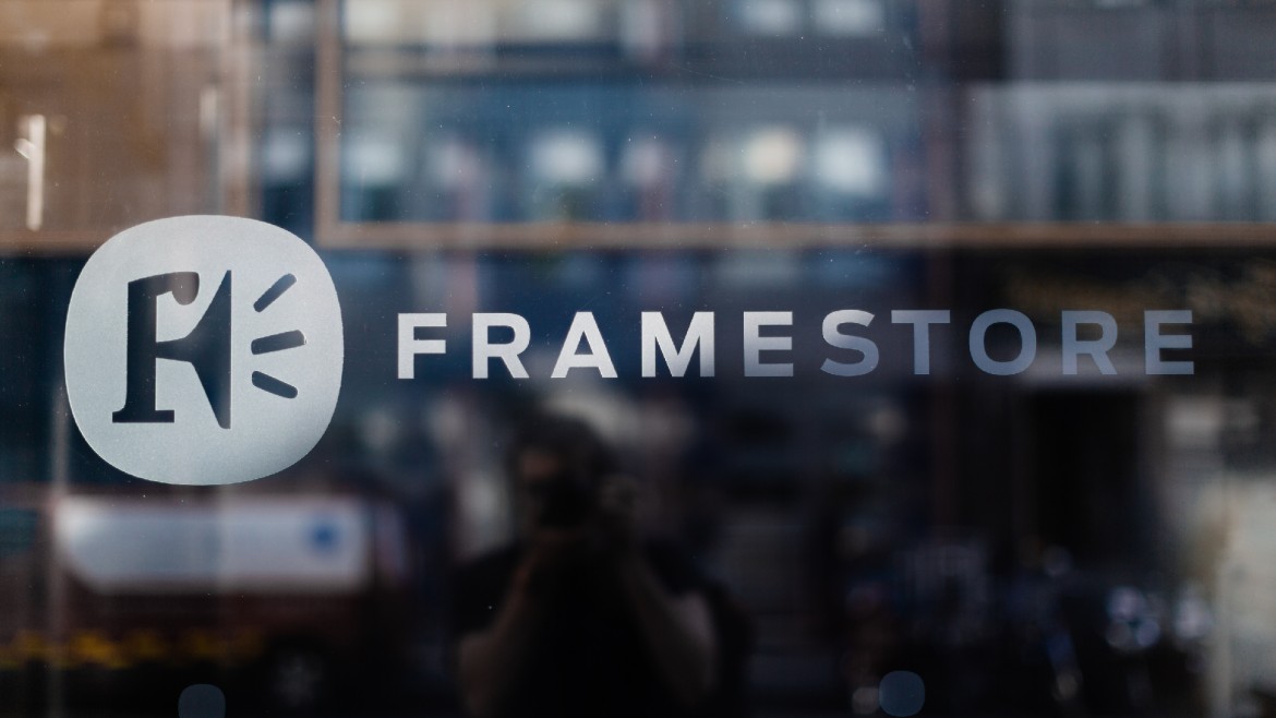
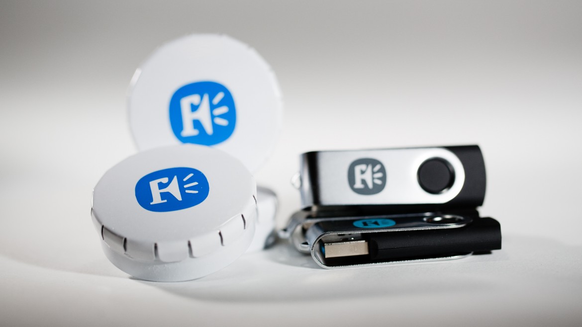
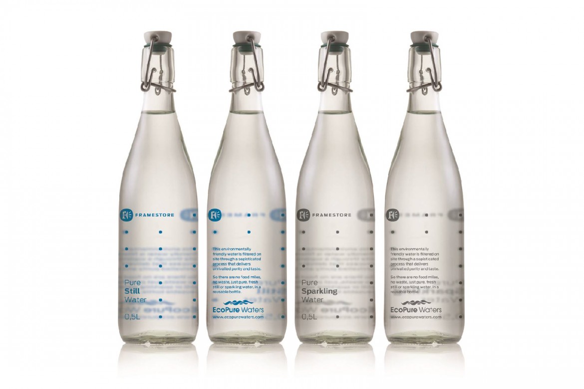
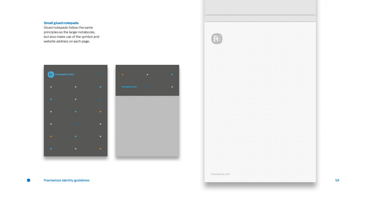
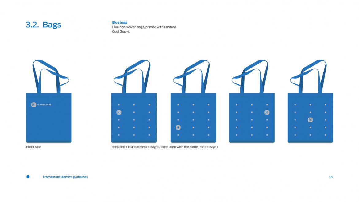
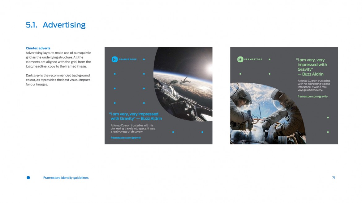
The new element in the mix was the squircle, and we chose to use this simple but characterful shape to create a pattern which we could use across the buildings, signage, merchandise and so on. We made a rule that the F icon could be used on its own, but the Framestore type would always be accompanied by the F icon.
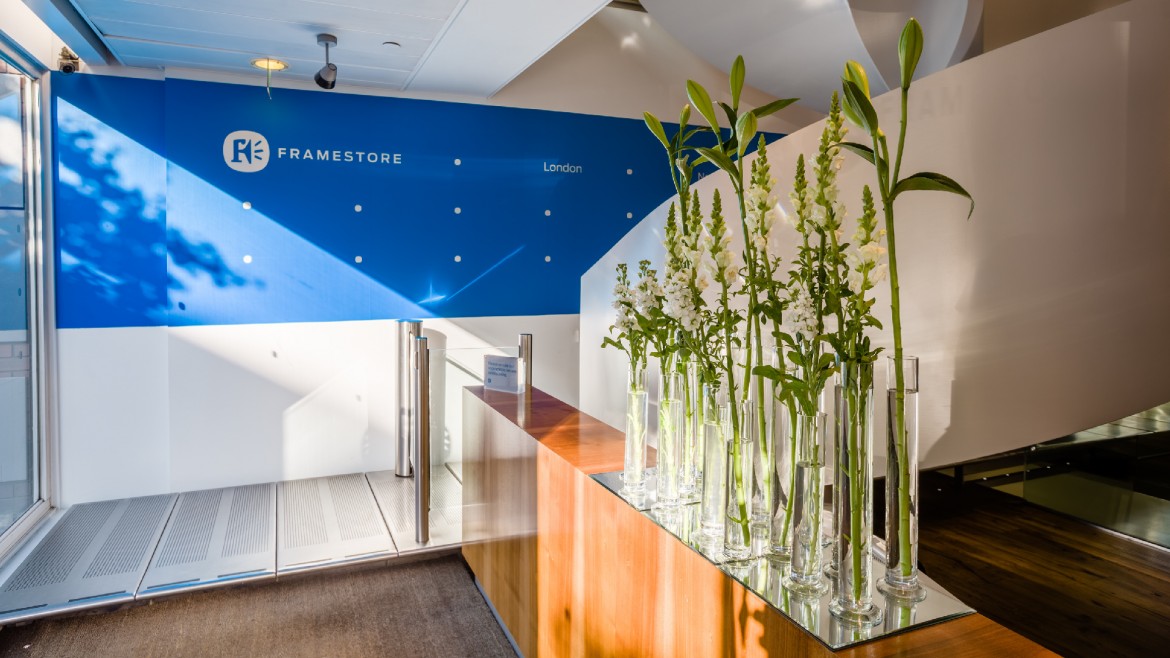
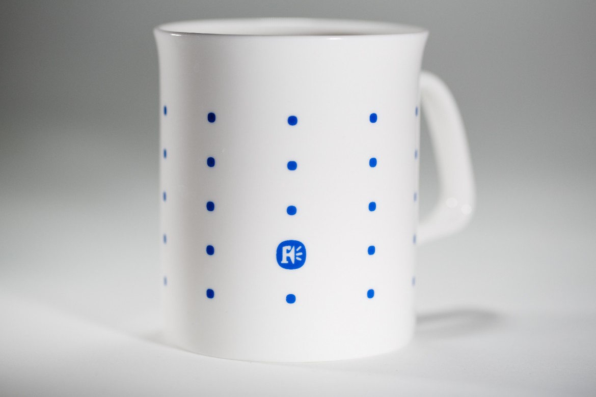
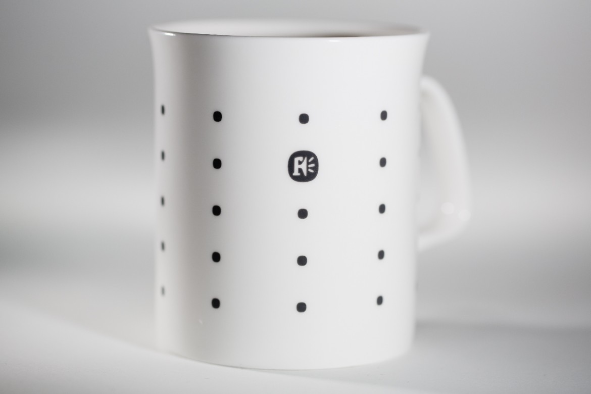
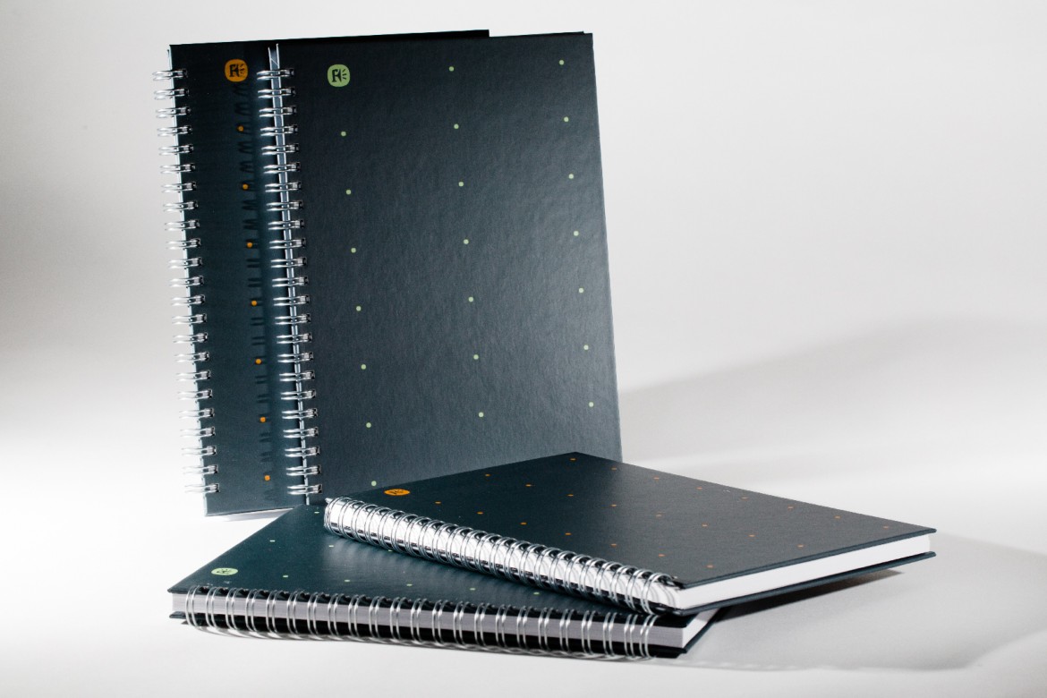
A versatile colour palette
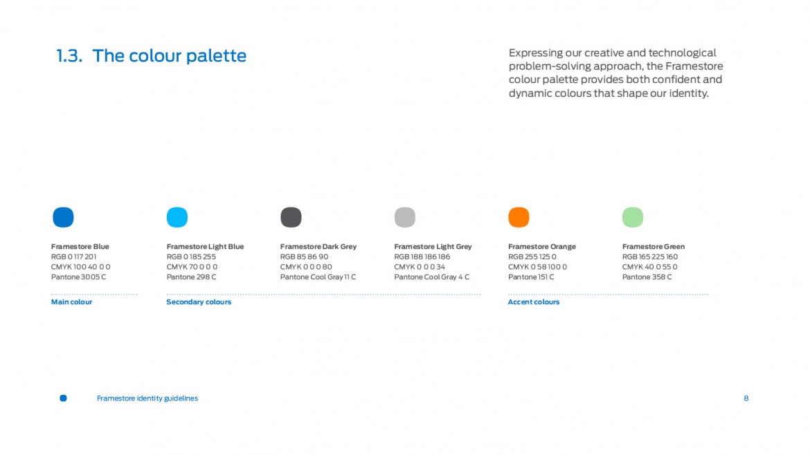
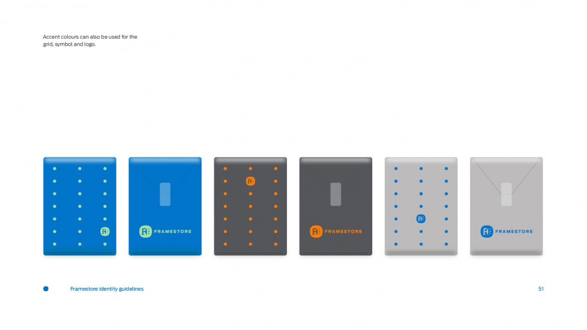
The new colour palette has a ‘hero’ blue. There is a secondary blue, two neutral greys and then two accent colours. This minimal set of colours can be configured in different ways to create various moods, which are distinctive and yet clearly from the same stable.
The final word
This short film was made to tell Framestore employees globally about the new identity. To begin with Framestore co-founder and creative director Mike McGee introduces the project. Then Matt Rudd talks about the development of the new identity.
THE CLIENT, ON WORKING TOGETHER
“Refining the Framestore brand required careful craft and sensitivity. As a large organisation, with five international offices and an ever-evolving creative output, there were many elements and applications to consider. Matt Rudd and his team listened to our requirements and through careful questioning and collaboration have successfully managed to incorporate both Framestore’s heritage and future goals into their response. We are very pleased with the results, and I look forward to working with Matt again.”
Mike McGee, Co-founder and Chief Creative Officer, Framestore