
THE BACKGROUND
Our relationship with Channel 4 in the UK began in the early noughties. We worked during 2003 and 2004 on a radical rebrand of the main channel. Creative Director Brett Foraker had come up with the concept for the live action idents where the logo forms for just an instant, and he asked us to consider all the other on-air elements, as well as the look in print.
Brett’s concept for the idents put the iconic and much-loved logo centre-stage again, as it had been in the original identity launched in 1982. We made the logo big and three-dimensional again. On-air, it was always in motion and always changing its appearance with different images filling the 4.
OFF-AIR
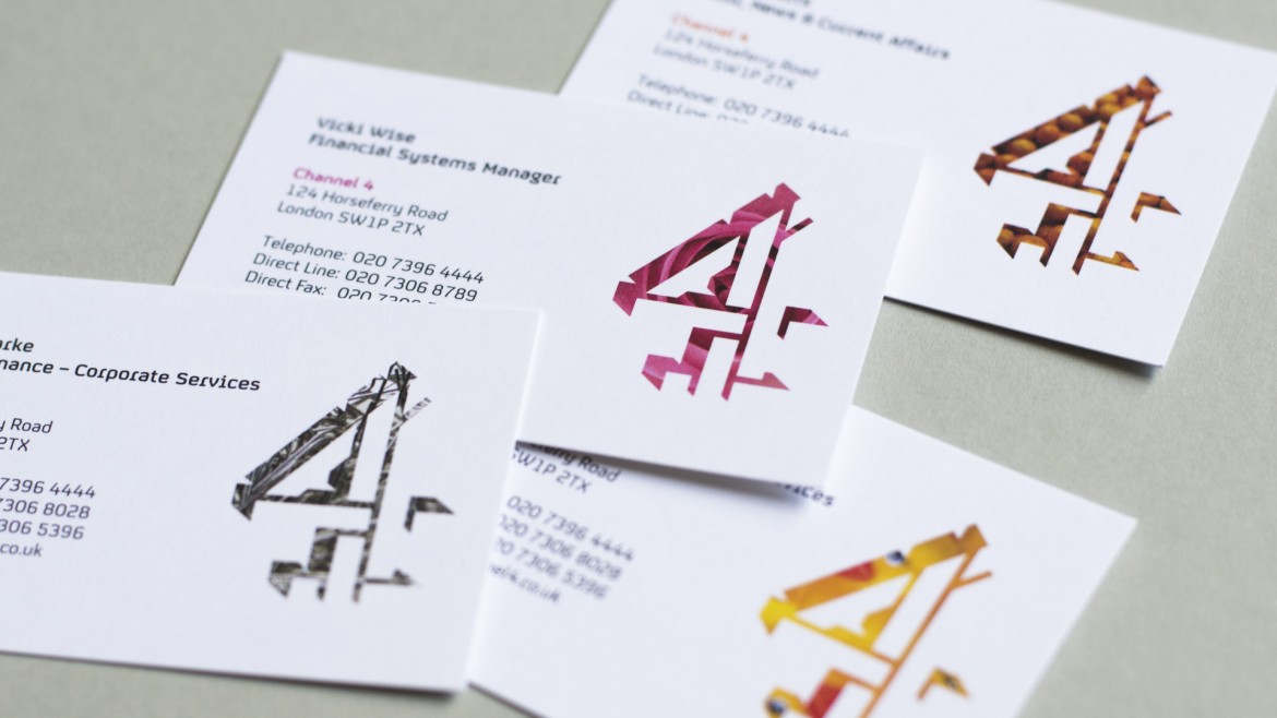
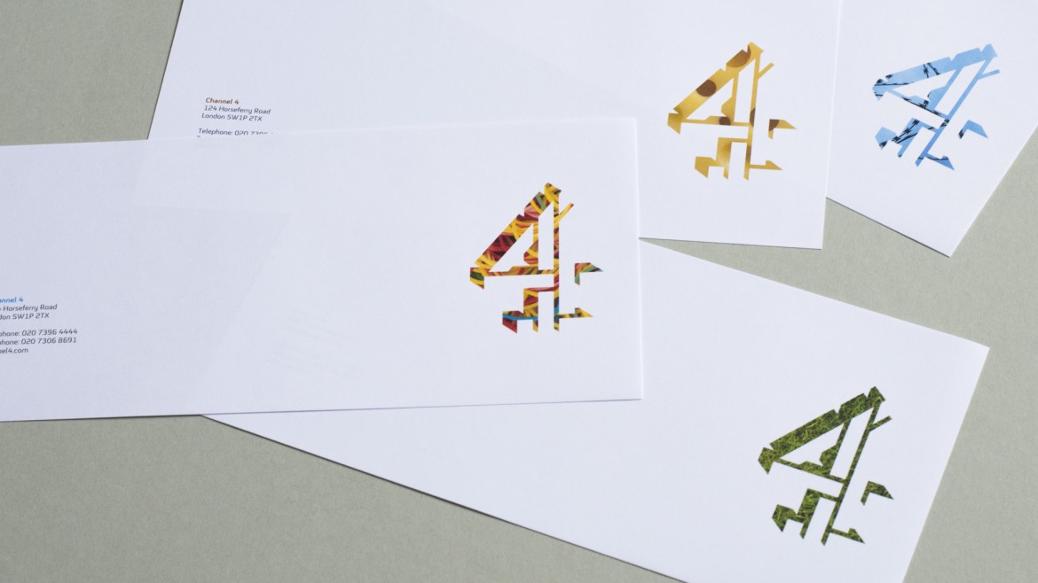
In print, we created a robust version of the logo which had depth but was distinct from the subject because of its lack of perspective. We developed a simple set of off-air brand rules which clearly asserted the Channel 4 brand while putting the content first. Like the on-air logos, we filled the logos on the stationery with varied and unexpected images.

STYLE GUIDE
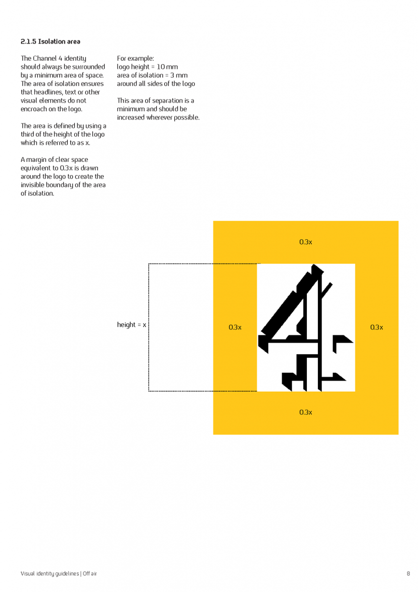
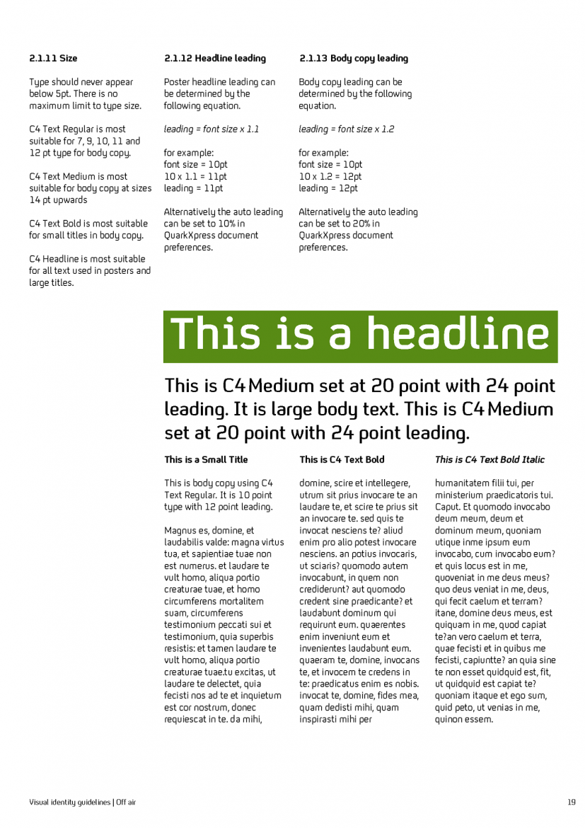
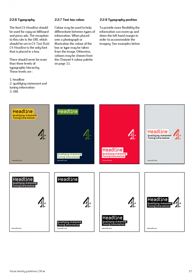
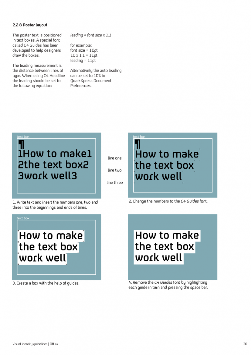
In the pages below from the off-air style guide, there are sections about the logo position and the distinctive headline type blocks. The bespoke typeface created by Fontsmith helped to make the brand undeniably Channel 4.
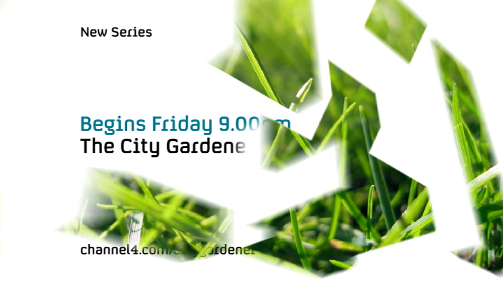
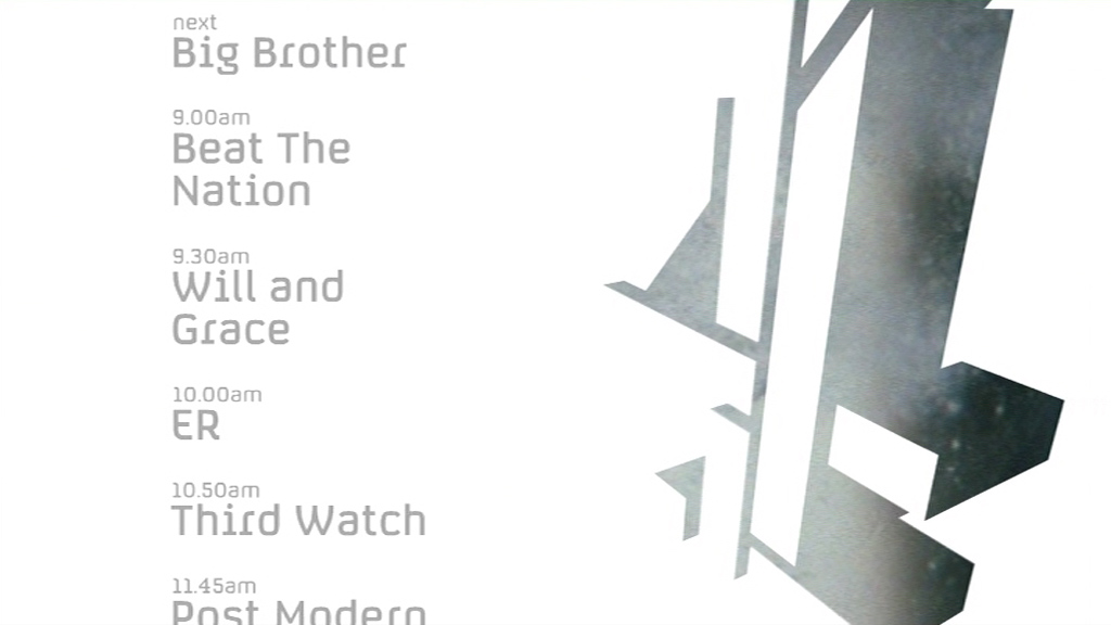
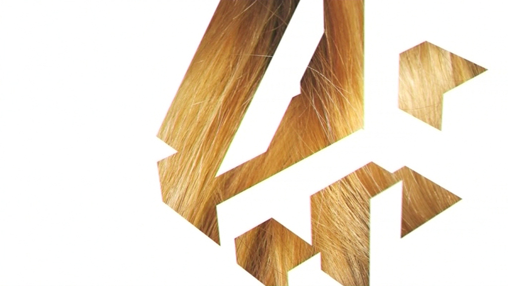
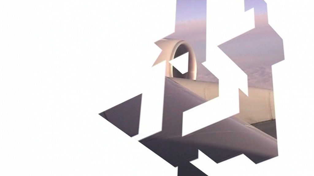
Updating the identity
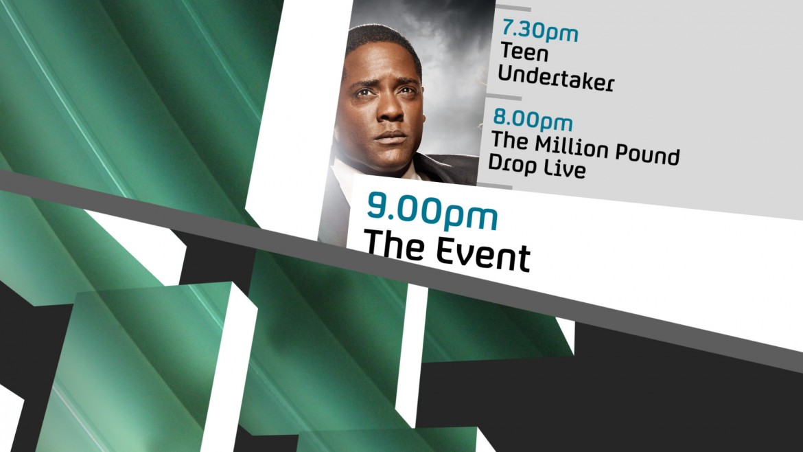
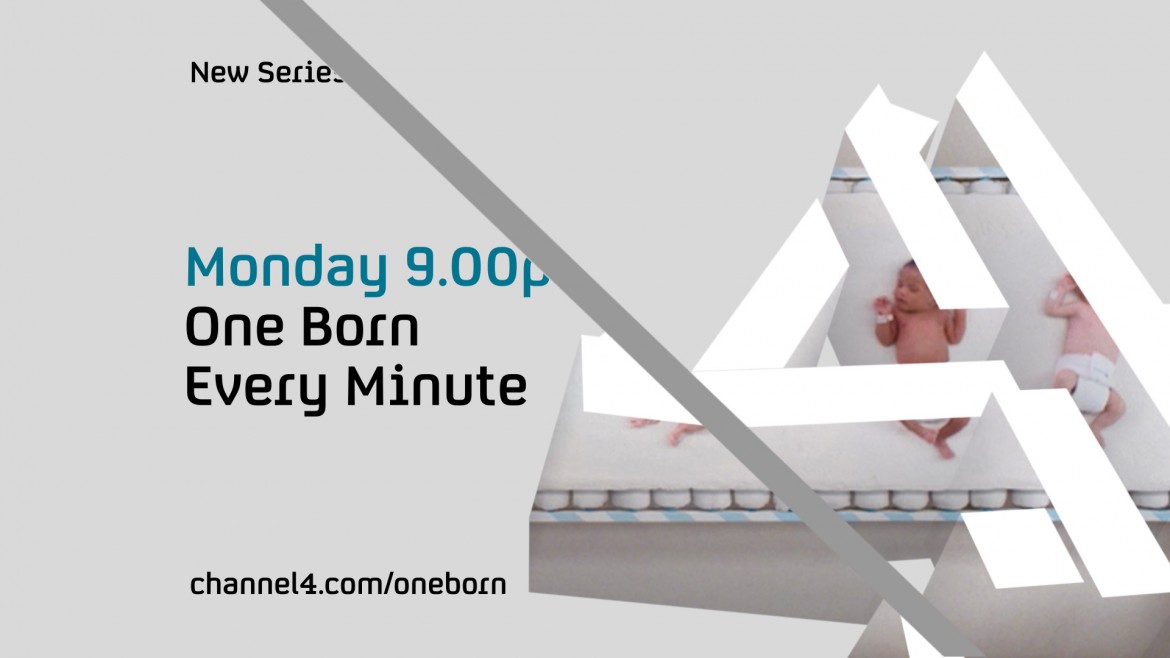
In 2010 we were asked to look again at the channel’s identity, in particular to develop a new look for all the on-air graphics which accompanied the idents. The logo was to remain the hero. We suggested looking at it from different angles. Conceptually, it seemed appropriate for Channel 4 to be looking at things from unusual angles. The Channel 4 logo, designed by Martin Lambie-Nairn in 1982, was iconic enough to withstand our cubist treatment. Here are some stills and a video of our new on-air look for the channel.


10 YEARS IN TELLY
From the beginning, Channel 4 set an agenda to stand out as a brand, to lead rather than to follow. It has been a great pleasure to be part of this story. The challenge with television branding is to find a solution which remains engaging over time, and which somehow rises above the ebb and flow of fashion. Perhaps the best measure of a brand’s success, therefore, is how long it lasts. This one lasted for 10 years.
THE CLIENT, ON WORKING TOGETHER
“Matt is a brilliant talent and the go-to man for cutting-edge design that makes brands stand out in a cluttered market.”
Rufus Radcliffe, Marketing Controller, Channel 4