Hello
I am Matthew Rudd. As a brand designer, I work directly with clients to deliver brand identities. As a rebrand consultant, I advise organisations who are undergoing rebrands. My clients range from one-person businesses to global organisations.
Beginnings
My parents are both artists. I grew up surrounded by art (and sawdust, as my father renovated our old house). I studied Visual Communication at Central Saint Martins and The Royal College of Art, spending a couple of years at design agency Intro between the courses.

Artistic sensibility
I set up Rudd Studio in 2002 with a view to bringing an artistic sensibility to brand projects. Our 2010 Channel 4 Rebrand, for example, was inspired by Cubism and our rebrand for the Warwick Arts Centre owes a debt to the Dada art movement. I approach brand work in an artistic way because this helps me to make original, effective brand identities which engender love and pride in employees and customers, and which connect with audiences in an emotional way.

Interesting technology
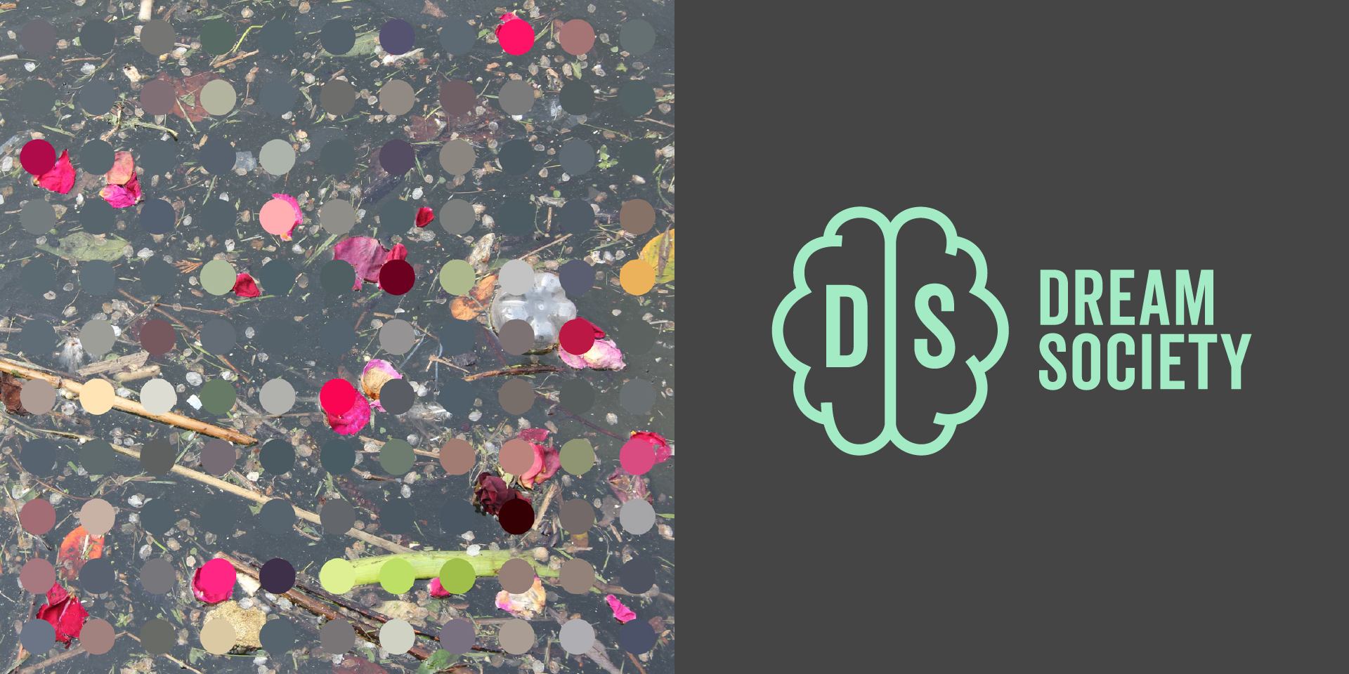
I find technology to be exciting and inspiring. My augmented photography artworks are created with the help of specially-written code. AI was a provocative collaborator in the creative process for the Dream Society logo project.
Making art
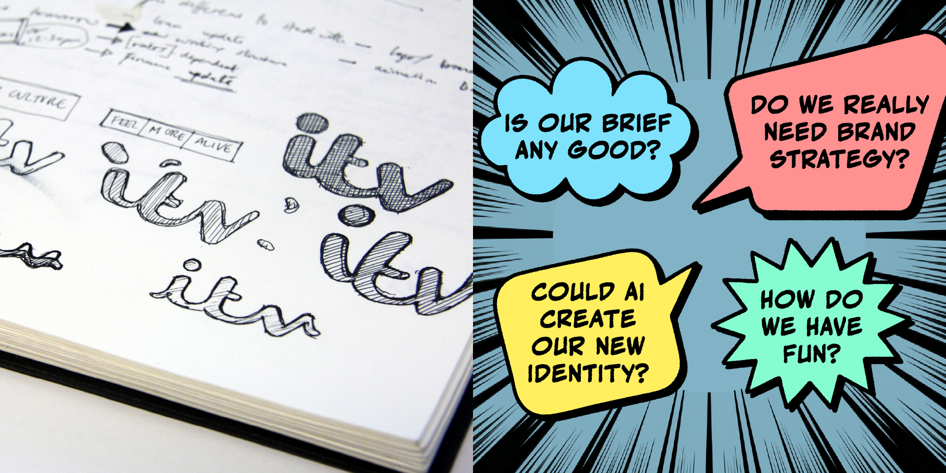
I make my own art. Have a look at my art website. I originally started to make art in order to explore colour ideas that I had developed for the ITV rebrand. Now, I find that the art that I am making gives me ideas for my brand projects.

Find out more
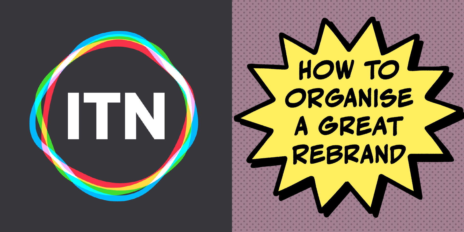
Read about the Brand Design work. Read about the Rebrand Consultancy. Read my article: How To Organise A Great Rebrand (For Business Leaders Who Have Never Done it Before). Don’t hesitate to get in touch if there is something you’d like to discuss.