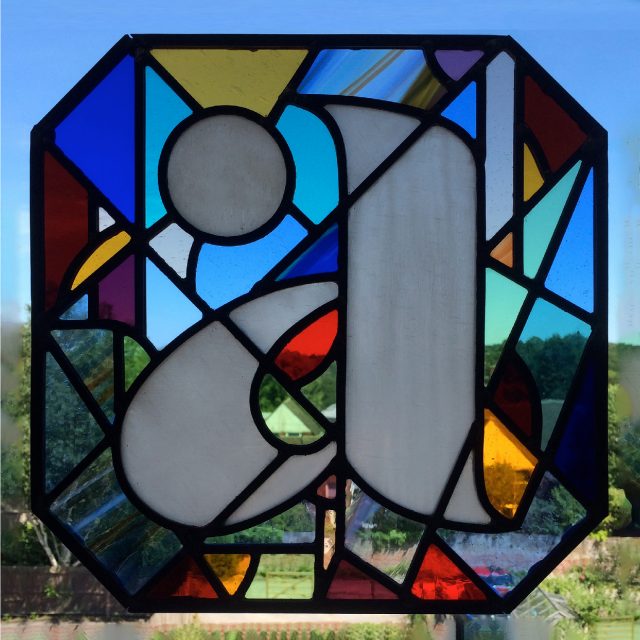
I have just designed this logo for financial advice company Abacus Advice Tax & Trusts. I loved the stained glass version of the mothership ‘Abacus Advice’ logo which company director Mike Hardy showed me.

I wanted to have some of the spirit of this beautiful stained glass in the new logo, so I drew a new version of the lower case ‘a’ letterform which had three distinct sections, and I chose three colours from the stained glass. I chose colours which were contemporary, upbeat, and which spoke of experience and trustworthiness. The dot is stronger than the other shapes, suggesting a bead on an abacus counting frame.
