First sketches
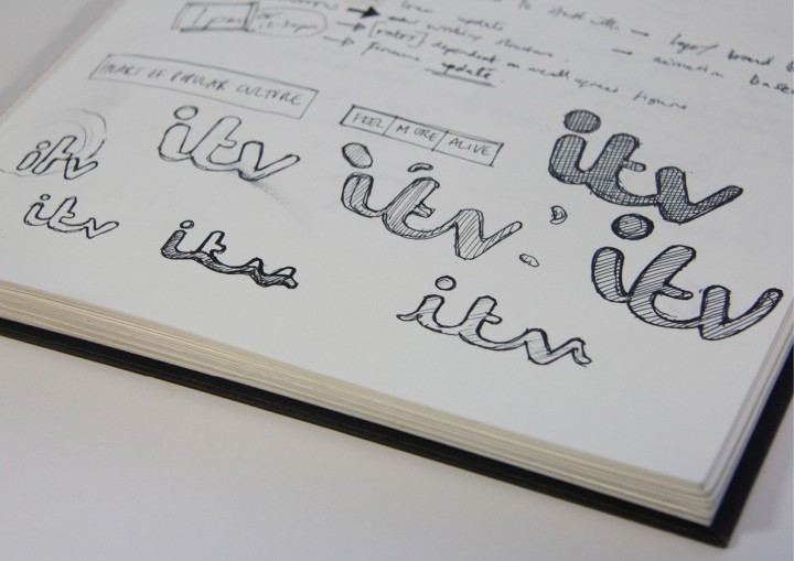
I wanted the ITV logo to get off the fence and stand for something. Alongside the informative BBC and the provocative Channel 4, ITV is friendly and warm. It brings about shared emotional experiences. I felt that the logo should be based on handwriting, and also I thought that the letters might be lower case and joined up.
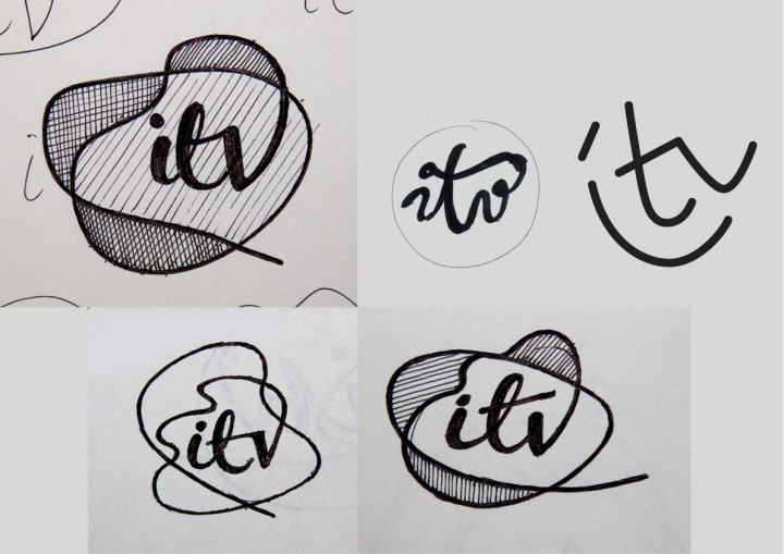
In the drawings below I was thinking about the flowing rhythm along the bottom of the letterforms. The little stroke flowing into the first letter enhanced this sense of flow, but it tended to make the whole unit feel less like a logo. I explored different levels of life and energy within the marque.
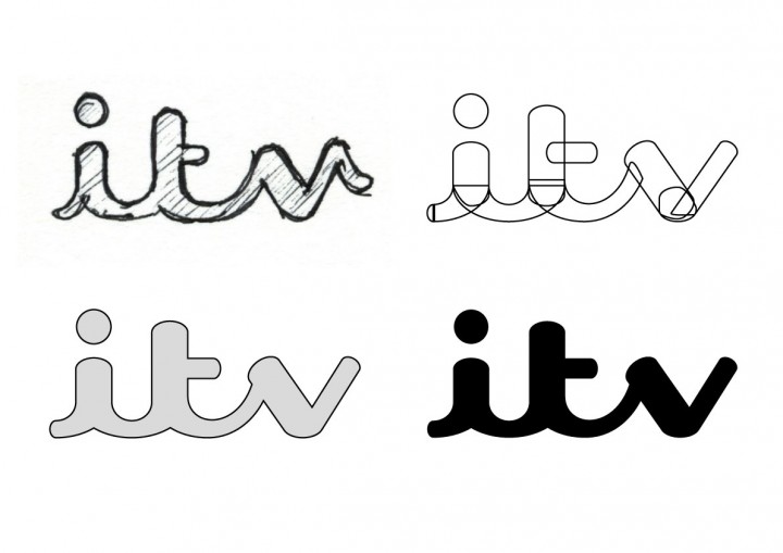
Below are the first digital drawings of the logo.
Symbols
I wondered whether the use of symbols within the V might work across the sub-brands.
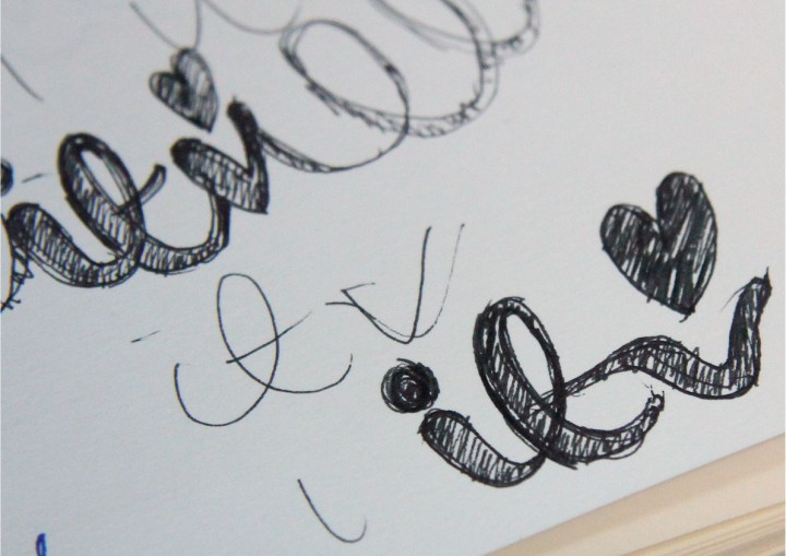
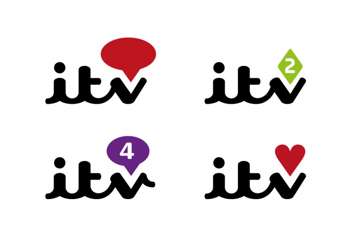
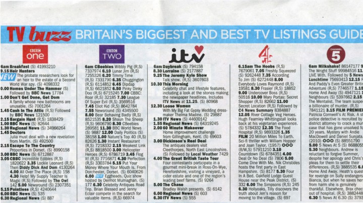
Below is the first look at the new marque alongside other broadcasters’ logos. I felt that it was distinctive and legible, but the heart symbol was too much. The typography alone had enough warmth in it.
Working with Fontsmith
At this point, I started to work with my old friends at Fontsmith. It was great getting into the detail. As well as considering weight and proportion, we wanted to formalise the marque so that it had authority and gravitas, whilst retaining its human DNA.
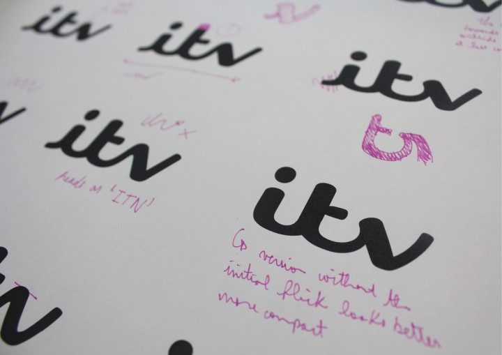
Since we dropped the idea of slotting a heart shape into the logo, we no longer had to make the V symmetrical. We all began to favour drawings of the logo without the stroke leading into the first letter.