Too much fun to ignore
Perhaps the most important part of developing a brand is the search for ‘the big idea’ – the concept that will form the foundation of everything that follows. I have always sought inspiration for this idea by studying the brand strategy and the brief, by talking with my client, by looking at books and websites and by visiting galleries and museums. Now I also use AI as a ‘supercharged’ way to get inspiration. It’s just too much fun to ignore.
As a fun exercise, I thought I would ask an AI platform called Ideogram to make me a new Rudd Studio logo. Below are some of the better results. For each logo I will share the prompt I used, and then describe what I think is interesting about Ideogram’s output. In some cases, I used Ideogram’s ‘magic prompt’ which ‘enhanced’ my own prompt.
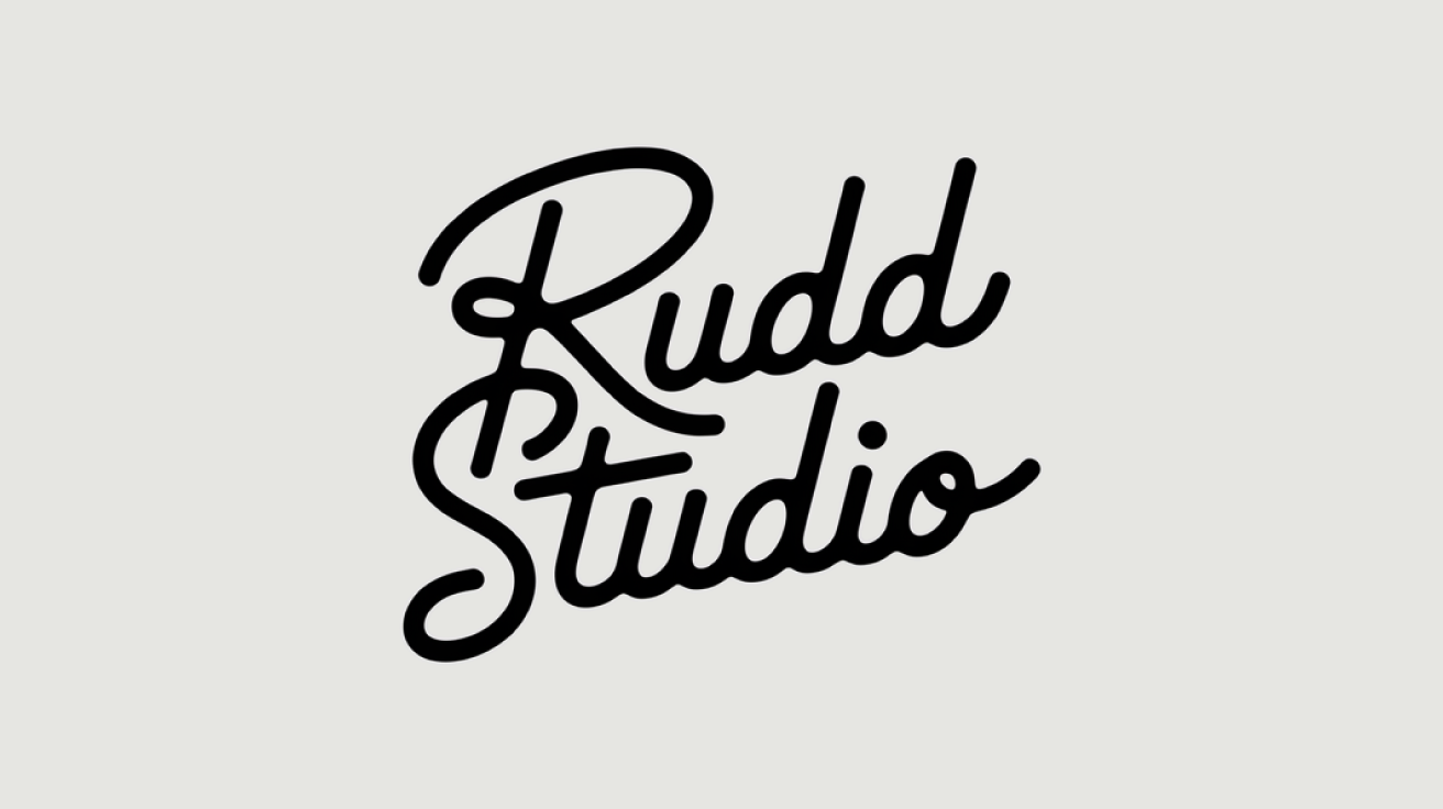
Ideogram Logo no. 1
What was the prompt?
‘Generate a type-only logo with the words: ‘Rudd Studio’. Create the feeling of a modern fashion brand like Paul Smith, one where the logo has the feeling of a signature.’
What’s interesting?
Perhaps Ideogram didn’t know the Paul Smith logo! But I find the relationship of the R, the S and the T characters interesting. A nice confusion of activity binds the whole thing together and begins to suggest a logo rather than a couple of words.
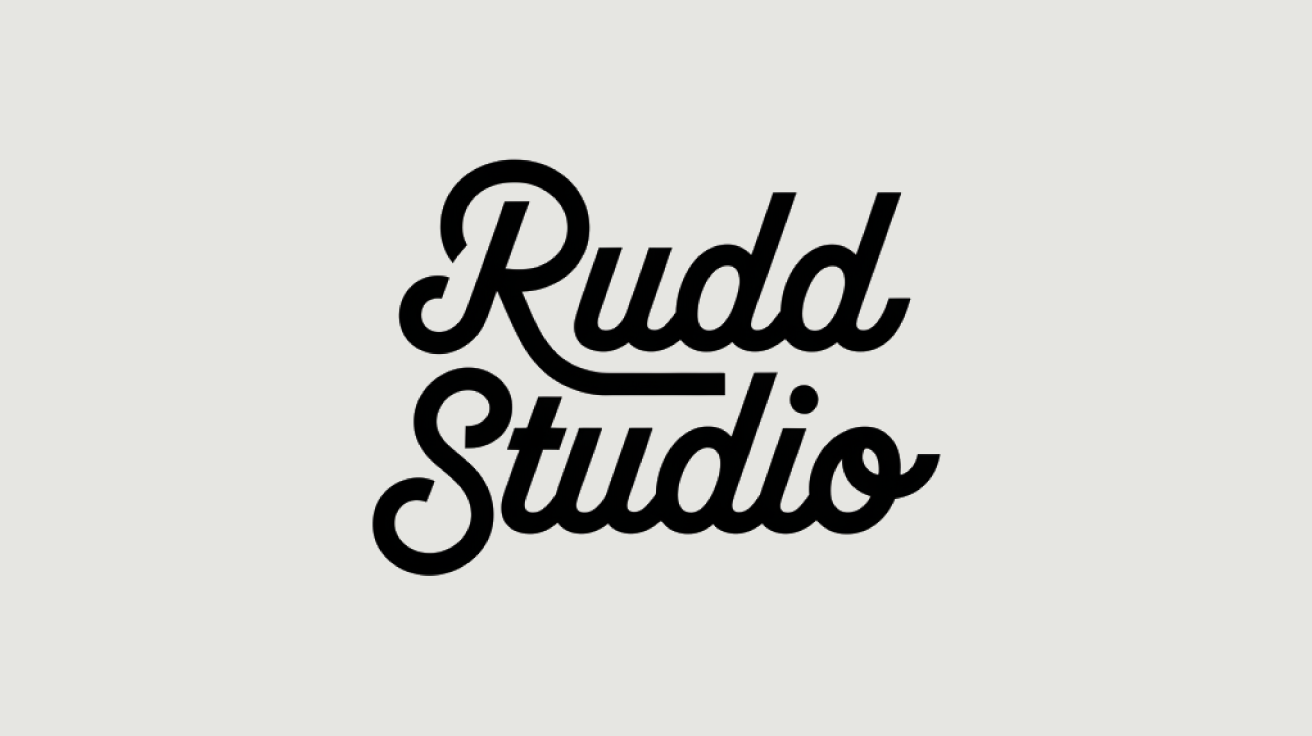
Ideogram Logo no. 2
What was the prompt?
‘A simple, single-colour typographic logo which reads ‘Rudd Studio’. White background. The words are in line, not stacked. The mood is 50s American. The logo could exist on a American kitchen appliance company from the 1950s.’
What’s interesting?
Again, Ideogram has found an interesting way to bind the two words together. In this case, the extended leg of the R fills the empty space between the T and D ascenders. The words are italisised in such a way that the R and S feel left-aligned, which I like. I think Ideogram did a good job at capturing the American 1950s thing.
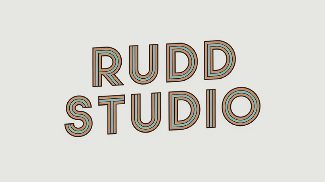
Ideogram Logo no. 3
What was the prompt?
‘A simple, single-colour typographic logo which reads ‘Rudd Studio’. The words are in line, not stacked. The mood is 50s American. White background. The 50s feeling comes from the style of the typography.’
What’s interesting?
I would never have thought of making this tri-line, retro typeface head uphill like this. It feels quite airy and optimistic. Does it look like the letters are slightly leaning backwards to you?!
Ideogram Logo no. 4
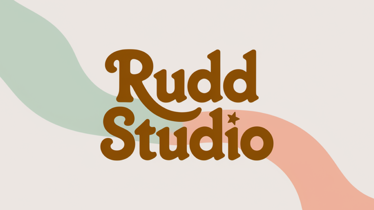
What was the prompt?
‘A simple, single-colour typographic logo which reads ‘Rudd Studio’. The words are in line, not stacked. The mood is 50s American. White background. The 50s feeling comes from the style of the typography.’
What’s interesting?
Another sweet lock-up of the two words, with the leg of the R perfectly fillng the space in the middle of the logo. I would never have stumbled across this friendly typeface, which I really like. It feels like it comes straight from a 1960s American coffee and donuts chain, the finishing touch being the star on the i character.
Ideogram Logo no. 5
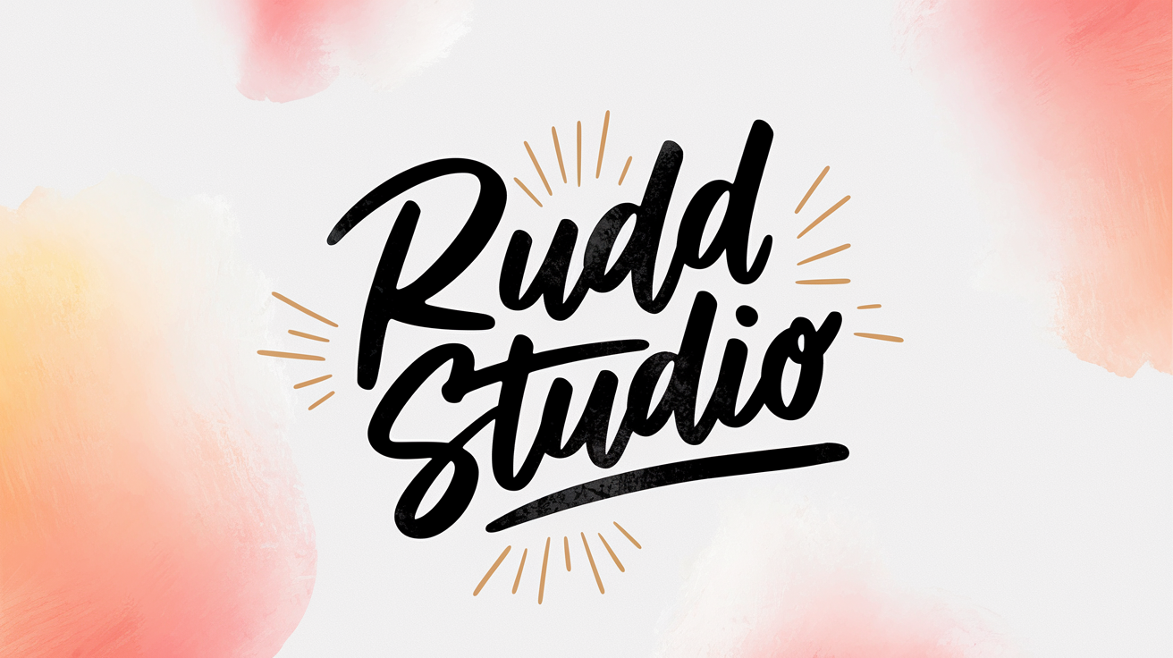
What was the prompt?
‘A hand-painted logo which reads ‘Rudd Studio’. It is painted with just black ink. The type has a traditional ‘signwriter’ style to it. It feels upbeat and positive. The background is pure clean white.’
What’s interesting?
Working with AI is like working with a very enthusiastic intern, or perhaps 100 enthusiastic interns. You can keep asking it for more! I asked Ideogram to make lots of these ‘signwriter’ logos and they all had interesting qualities. This one is not perfect but I like its energy. I like the cartoony ‘glow’ lines.
Ideogram Logo no. 6
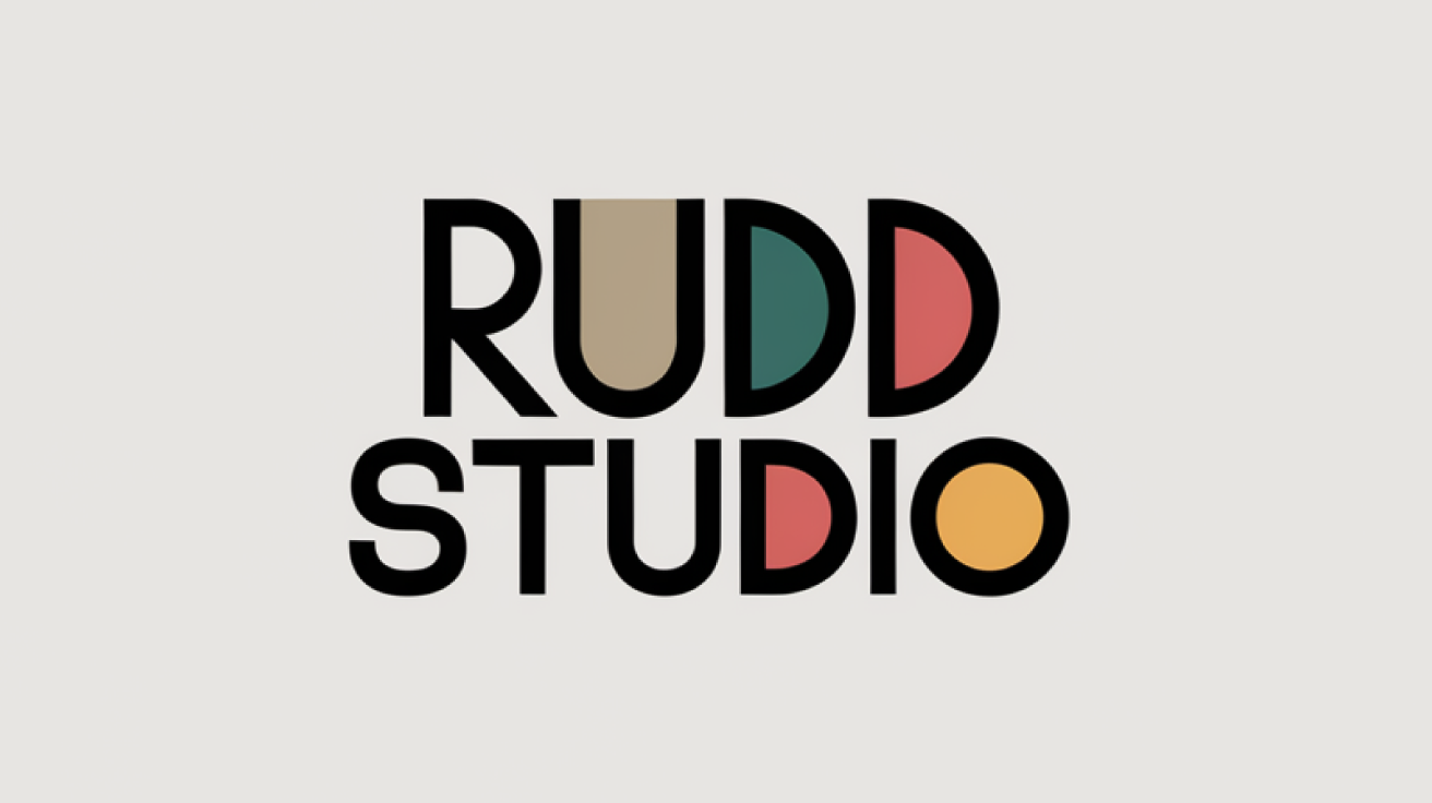
What was the prompt?
‘A Bauhaus style logo which reads ‘Rudd Studio’.
What’s interesting?
Traditional software often pushes creatives in a particular direction: music software encourages musicians to compose ‘on the grid’ and graphics software makes designers stick to particular typefaces within a unit of type. As AI scours the internet, it draws things together in a more freeform way and this can be interesting. The RUDD contrasts nicely here with the STUDIO, and the S feels foreign, in a way which has potential for development.
Ideogram Logo no. 7
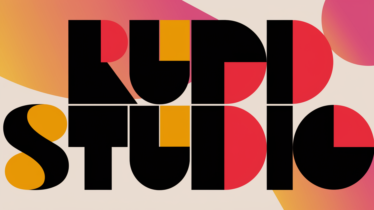
What was the prompt?
‘A logo which reads ‘Rudd Studio’. The words are made up of straight lines and circles. The shapes in the logo are either black, red or yellow.’
What’s interesting?
Often, the lack of a coherent idea in Ideogram’s outputs leads to boring results. But sometimes its untrained eye leads to inspiring possibilities. In this case, I like the fact that all three D characters are rendered differently.
Ideogram Logo no. 8
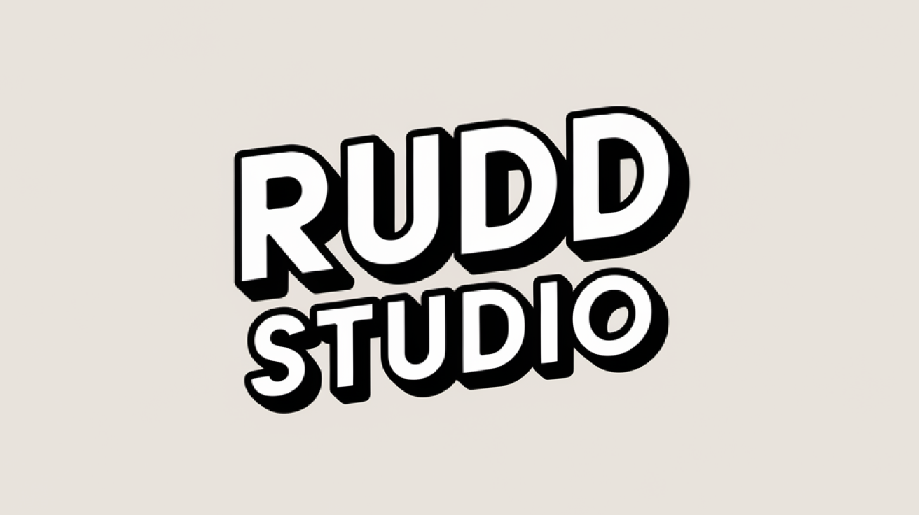
What was the prompt?
‘A logo which reads ‘Rudd Studio’ and feels like it owes a debt to the world of comics – DC Comics and Marvel Comics. The logo could be for a new superhero character who is called Rudd Studio.’
What’s interesting?
There is something youthful and witty about the oversized RUDD. It feels like the word is momentarily springing towards us in a cheeky gesture of bravado.
Ideogram Logo no. 9
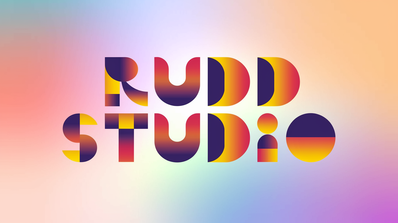
What was the prompt?
‘A type-only logo which reads ‘Rudd Studio’. The letters in the words ‘Rudd Studio’ are constructed only from circles, squares and rectangles. Each shape in the letters of the logo has its own vibrant colour.’
What’s interesting?
When I am designing a bespoke piece of type for a logo, I am looking for some sort of logic that creates a meaningful idea. It is hard to spot any logic in this logo, but it is somehow appealing. I like the way that AI drawings stretch my mind, encouraging me to develop new kinds of logic for a logotype.
Ideogram Logo no. 10
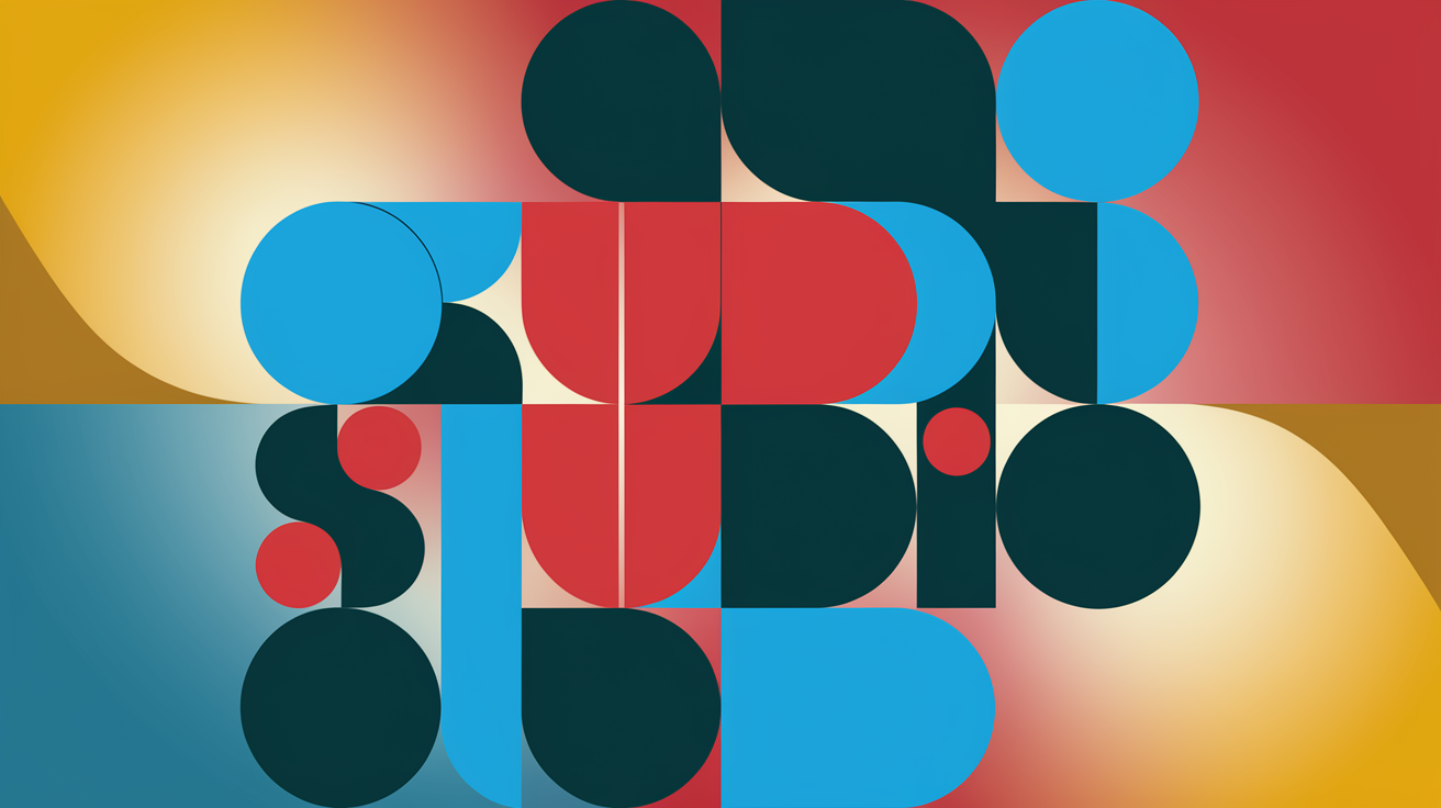
What was the prompt?
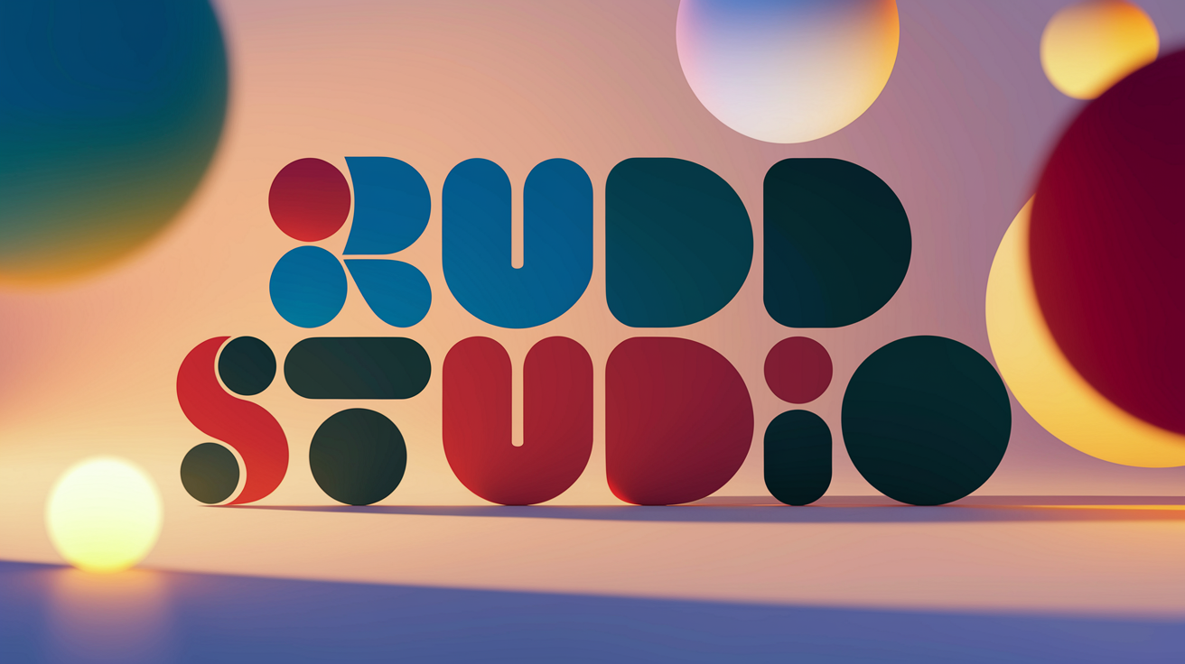
‘A type-only logo which reads ‘Rudd Studio’. The letters in the words ‘Rudd Studio’ are constructed only from different size circles. Each circle in the letters of the logo is one of three strong colours, which are blue, red and dark green.’
What’s interesting?
Haha can you spot the RUDD STUDIO in this drawing? The focus of this exercise has been logo design. This drawing is interesting because it suggests not only a logo design but also the beginnings of a ‘visual language’ to go with the logo.
Ideogram Logo no. 11
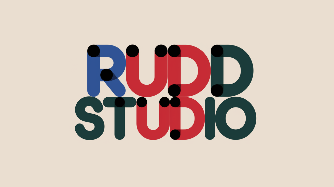
What was the prompt?
‘A type-only logo which reads ‘Rudd Studio’. The letters in the words ‘Rudd Studio’ are constructed only from different size circles. Each circle in the letters of the logo is one of three strong colours, which are blue, red and dark green.’
What’s interesting?
As a creative director talking ideas with my team, I sometimes put a distinct idea on the table, not worrying about whether it is good or bad, and invite people to react to it. AI does the same thing by putting something concrete on the table for us to react to. I don’t like the way this logo picks out the UD in both words. But it is helpful as a reminder of the similarity between the words RUDD and STUDIO.
Ideogram Logo no. 12
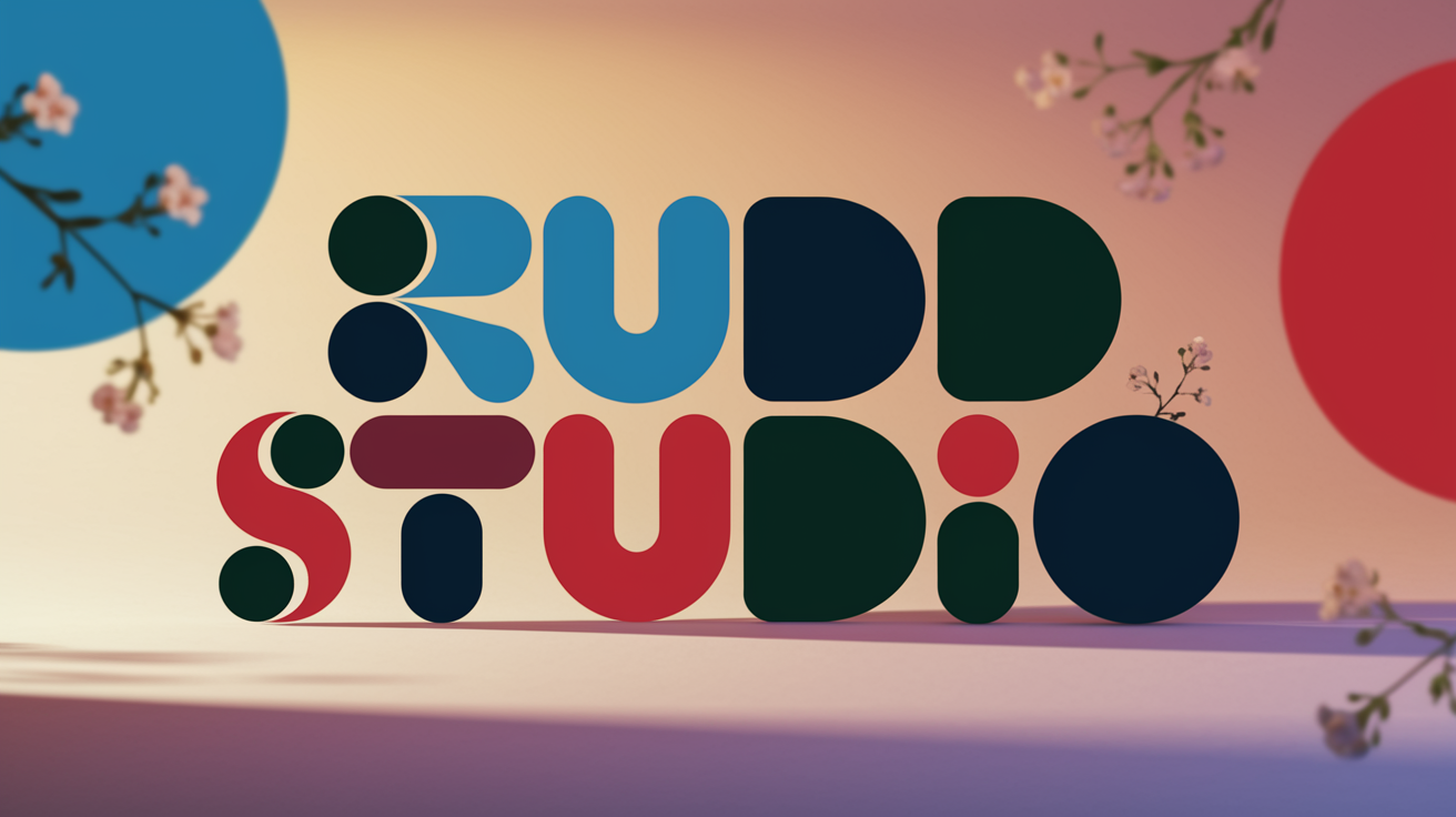
What was the prompt?
‘In a vibrant digital illustration, the words “Rudd Studio” are composed exclusively of various sized circles in a mesmerizing interplay of blue, red, and dark green hues. Warm ambient lighting casts gentle shadows, adding depth and dimension to each circular element. A softly blurred gradient background of complementary colors enhances the visual impact of the logo, while delicate floral patterns in soft pastel tones gently frame the composition, maintaining a minimalist yet captivating design.’
What’s interesting?
Above is one of Ideogram’s ‘magic prompts’ which ‘enhanced’ my prompt. The result is nuts! As a designer I am always fighting the tendency to stay in safe and familiar territory. AI is powerful way to upset the applecart.
So how helpful is AI in brand design?
There is no doubt that companies with simple requirements can now make their own logos with AI. But AI cannot solve complex brand challenges yet. For organisations who need distinct logos and identities which elevate them above the noise of their competitors, there is no avoiding the need for human experience, creativity, judgement and craft.
However, as AI is getting better and better at making things, and it can supercharge this human endeavour. As these logo experiments have shown, being creative with AI can be quite a haphazard process, but the eccentricity of its thinking can be a good thing – pushing designers in unexpected directions, and leading them briskly towards fresh and lively outcomes for their clients.